
Introduction:
Finding the right colors for your brand or project can be a game-changer. A Turquoise Color Palette is a unique blend of blue and green that represents balance, energy, and clarity. In the world of design, it is a versatile choice that can feel either calm like the ocean or vibrant like a tropical gem.
Have you ever wondered why some designs instantly grab your attention while others feel dull? The secret often lies in how you mix your shades. Using the right Turquoise Color Palette Combinations for Modern Graphic Design can make your work look professional and high-end with very little effort. It is the perfect way to stand out in a crowded digital space.
In this guide, we will explore how to pair turquoise with other trending colors to create a fresh look. We will look at specific hex codes and visual examples that work for logos, websites, and social media. These combinations are designed to help you master modern aesthetics quickly and easily.
Earthy Turquoise Color Palette for a Natural Feel:
An earthy turquoise color palette brings the beauty of the outdoors into your design. This style mixes the cool tones of water with warm, sandy browns and soft clay oranges. It feels grounded and very organic. Using these colors together creates a sense of balance that reminds people of a peaceful desert landscape or a hidden tropical beach.
This specific palette is perfect for brands that want to feel eco-friendly and approachable. It moves away from “bright neon” vibes and focuses on more muted, natural tones instead. These combinations work beautifully for organic packaging or lifestyle blogs. It is a great way to use color to tell a story that feels honest, calm, and deeply connected to nature.
Top 5 Turquoise Color Palette Combinations:
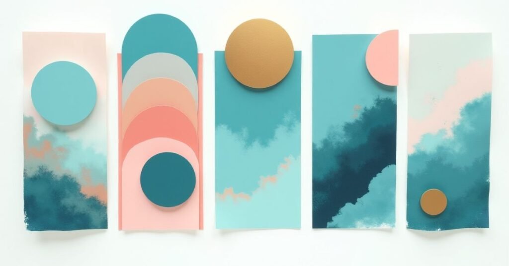
Choosing the right colors to go with turquoise can change the whole mood of your project. Since turquoise is a mix of warm and cool, it plays well with many different shades. You can go for a high-contrast look or keep things soft and subtle. Here are five popular combinations that work every time:
- Turquoise and Coral: A classic tropical duo that feels high-energy and fun.
- Turquoise and Gold: Perfect for a luxury look that feels elegant and high-end.
- Turquoise and Slate Grey: A sophisticated, modern choice for professional websites.
- Turquoise and Cream: Soft, airy, and very easy on the eyes for home decor.
- Turquoise and Navy Blue: A monochromatic style that feels deep and trustworthy.
Each of these pairings serves a different purpose depending on your goal. For example, using gold adds a touch of class, while coral is better for a summer-themed brand. The key is to pick one main shade of turquoise and let the other colors support it. This keeps your design clean and prevents the colors from fighting for attention.
Essential Hex Codes for Your Design Toolkit:
Having the right hex codes makes it easy to keep your designs consistent. A hex code is just a simple six-digit code that tells your computer exactly which shade of turquoise to use. This saves you from guessing or picking a color that looks different on every screen. Whether you want a bright neon or a soft seafoam, these codes are the “secret ingredients” for your project.
Below is a list of essential turquoise shades and their perfect pairing colors. You can copy and paste these directly into your design software like Canva, Photoshop, or Figma. These combinations are chosen to make sure your text stays readable and your backgrounds look professional.
| Style Name | Turquoise Hex | Pairing Color 1 | Pairing Color 2 | Best Use Case |
| Tropical Bright | #00CED1 | #FF7F50 (Coral) | #FFD700 (Gold) | Summer posters & logos |
| Modern Minimal | #40E0D0 | #F5F5F5 (White Smoke) | #333333 (Dark Grey) | Clean website headers |
| Deep Ocean | #008B8B | #E0FFFF (Light Cyan) | #191970 (Midnight) | Professional reports |
| Vintage Teal | #48D1CC | #D2B48C (Tan) | #8B4513 (Saddle Brown) | Earthy or retro brands |
| Soft Pastels | #AFEEEE | #FFF0F5 (Lavender) | #F0FFF0 (Honeydew) | Invitations & nursery |
| High Contrast | #00FFFF | #000000 (Black) | #FFFFFF (White) | Tech-focused UI design |
| Coastal Chic | #7FFFD4 | #F0E68C (Khaki) | #4682B4 (Steel Blue) | Interior design blogs |
Best Practices for Using Turquoise Color Palette in Branding:

Using turquoise in your brand can make it feel fresh and modern. It is a color that people often associate with trust and clear thinking. However, avoid overdoing it. You should use turquoise as a primary color for your logo or as an accent to highlight important buttons and links. This helps your brand look professional without tiring out the eyes of your customers.
To get the best results, you need to think about balance and readability. Turquoise is bright, so it needs a strong secondary color to keep the design grounded. Here are some quick tips to keep in mind:
- Check Contrast: Make sure your text is easy to read against a turquoise background. Darker greys or crisp whites usually work best.
- Know Your Audience: Use bright turquoise for high-energy brands and muted teal tones for luxury or health services.
- Limit Your Palette: Stick to two or three main colors so your brand identity stays clean and easy to remember.
- Test on Screens: Turquoise can look different on phones versus laptops, so always check your colors on multiple devices.
Why Turquoise Is Big in Graphic Design:
Turquoise is a favorite for many designers because it stands out without being aggressive. It sits right between blue and green, which makes it feel both calming and full of life. Many people associate it with the ocean or the sky, giving it a very open and friendly feel. Because it is so bright and clear, it works perfectly for digital screens where you want to grab someone’s attention quickly.
In the world of modern design, turquoise is used to show innovation and clarity. It is a great alternative to standard navy blue because it feels more youthful and creative. Many tech companies and health brands use it to look approachable and modern. It is a very flexible color that can look high-tech or natural depending on how you use it. This versatility is why it remains a top choice for designers everywhere.
How to Pick the Right Turquoise Shade:
Picking the right shade of turquoise depends on the “mood” you want to create. Not all turquoises are the same. Some have more blue and feel very cool and professional. Others have more green and feel warm, earthy, and natural. Think about how you want people to feel when they see your design. A bright, neon turquoise is great for energy, while a soft, pale turquoise is better for relaxation.
You should also think about where the color will be used. If you are designing for a website, make sure the shade isn’t too bright for the eyes. If you are printing business cards, remember that colors often look a bit darker on paper than on a screen. Always test your chosen shade next to your other colors to make sure they don’t clash. The right shade should make your whole design feel balanced and complete.
How to Balance Turquoise with Warm vs. Cool Tones:

Balancing turquoise is all about understanding its “temperature.” Even though turquoise is a cool color, it has a lot of yellow in it. If you pair it with cool tones like blues and purples, the design will feel very calm and watery. This is great for a relaxing look. However, if you add warm tones like orange or gold, the turquoise will “pop” and look much brighter.
The secret is to decide which side you want to highlight. Warm colors create a high-energy contrast that feels sunny and bold. Cool colors create a smooth blend that feels professional and quiet. You can use a table to see how these temperatures change the mood of your project. This helps you pick the right balance for your specific brand or room.
| Pairing Tone | Color Examples | Visual Effect | Best Mood |
| Warm Tones | Coral, Copper, Gold | High contrast and vibrant | Energetic & Fun |
| Warm Tones | Terracotta, Mustard | Earthy and grounded | Organic & Rustic |
| Cool Tones | Navy Blue, Deep Teal | Monochromatic and sleek | Trustworthy & Calm |
| Cool Tones | Soft Lavender, Mint | Airy and light | Gentle & Sweet |
| Neutral Tones | Charcoal Grey, Slate | Modern and sharp | Corporate & Tech |
| Neutral Tones | Beige, Sand, Cream | Natural and breezy | Coastal & Relaxed |
Common Mistakes to Avoid with Turquoise Palettes:
Even though turquoise is a beautiful color, it is easy to make mistakes if you aren’t careful. One of the biggest issues is using too much of it at once. When turquoise covers every part of a design, it can become very tiring for the eyes. It is also common to pick shades that are too bright for the background. This makes it very hard for people to read your text or focus on your images.
Another mistake is forgetting how lighting and screens change the way turquoise looks. A shade that looks perfect on your phone might look completely different in print. To keep your design looking professional, try to avoid these common pitfalls:
- Using Neon Text: Avoid bright turquoise text on a white background, as it is very hard to read.
- Clashing Brights: Don’t pair bright turquoise with other neon colors like hot pink unless you want a very loud, “80s” look.
- Ignoring Contrast: Always make sure there is enough difference between your turquoise and your other colors.
- Forgetting Neutrals: If you don’t use enough white, grey, or beige, the palette can feel messy and disorganized.
Turquoise Color Palette Inspiration for Social Media:

Turquoise is a secret weapon for social media creators. It is one of the most “scroll-stopping” colors because it stands out against the white and grey backgrounds of most apps. When people are quickly flicking through their feeds, a bright pop of turquoise can grab their attention instantly. It feels fresh, trendy, and very “aesthetic,” which is exactly what you want for a successful post.
To make your feed look professional, you should use turquoise consistently. You don’t have to use it in every single photo, but having it as a recurring theme creates a beautiful “grid” look. Here are some great ways to use turquoise on your social channels:
- Story Backgrounds: Use a soft turquoise for your text slides to make them feel calm and easy to read.
- Highlight Icons: Create a set of matching turquoise icons to give your profile a polished and organized feel.
- Photo Overlays: Use a subtle turquoise filter to give all your images a cool, cohesive coastal vibe.
- Call-to-Action Buttons: Make your “Link in Bio” or “Shop Now” buttons turquoise so they are the first thing people see.
Creating Accessibility: Turquoise in Web Design (WCAG):
When you use turquoise on a website, you must think about accessibility. Accessibility means making sure everyone can read your content, including people with vision challenges. Turquoise can be a tricky color because it is often very bright or light. If you put white text on a light turquoise button, it might be impossible for some people to see. Always check that there is enough contrast between your background and your text.
To follow web standards, known as WCAG, you should use tools to test your colors. A “contrast checker” will tell you if your turquoise shade is dark enough for your font size. If your favorite shade is too light, try using it for decorative borders instead of for important information. You can also use a darker version of turquoise, often called teal, for buttons to keep things safe. This ensures your website is beautiful and easy for everyone to use.
Conclusion:
In conclusion, using a turquoise color palette is a fantastic way to bring life to your designs. It is a flexible color that can feel either high-energy or very relaxing depending on how you mix it. By choosing the right shades and pairing them with the best accent colors, you can create a look that is both modern and professional.
Remember that the best designs always focus on balance and clarity. Don’t be afraid to experiment with different combinations, but always keep your audience in mind. Whether you are building a new brand or refreshing your social media, turquoise is a choice that will always feel fresh and inviting.
FAQs:
1. What colors go best with a turquoise color palette?
Turquoise works beautifully with warm tones like coral and gold for contrast, or cool tones like navy and grey for a sleek look.
2. Is turquoise a warm or a cool color?
Turquoise is technically a cool color, but because it contains yellow, it feels warmer and more energetic than a standard blue.
3. Can I use turquoise for a professional business brand?
Yes, darker shades like teal or turquoise paired with charcoal grey look very professional, modern, and trustworthy.
4. How do I make sure my turquoise text is readable on a website?
Always use a dark turquoise for text on light backgrounds, or use white text only on very dark, “deep sea” turquoise shades to ensure high contrast.
5. Why is turquoise so popular on social media?
It is a “scroll-stopping” color that stands out against white backgrounds, making it perfect for grabbing attention in busy newsfeeds.

Welcome to Digital Pin Media! I’m Usama Ijaz, an AI-Powered SEO, and Content Write with 4 years of experience.
I help websites rank higher, grow traffic, and look amazing. My goal is to make SEO and web design simple and effective for everyone.
Let’s achieve more together!


3 Comments