
Introduction
A Color Palette for Websites is a specific set of colors chosen for your website design. It includes your main brand colors, accent colors for buttons, and neutral tones for the background. Think of it as a visual toolkit that keeps your site looking clean and organized. When these colors work together, they create a professional look that represents your business.
Have you ever left a website because it felt too messy or hard to read? Most people decide if they trust a site within just a few seconds of landing on it. The colors you choose play a huge role in that first impression. The right combination can guide a visitor’s eyes exactly where you want them to go, like a “Buy Now” button or a sign-up form.
In this guide, we will explore how to pick colors that actually help you grow your business. We will look at how different shades influence how people feel and act while browsing. You will also learn simple tips for keeping your design balanced and easy for everyone to use. By the end, you will know exactly how to turn a simple website into a high-converting machine.
What Is a Color Palette for Websites?
A color palette is a specific group of colors chosen for your website. It acts like a visual roadmap for your entire brand. Usually, it includes a main primary color, a few secondary colors, and neutral shades like gray or white. These colors work together to make your site look organized and professional rather than messy.
Beyond just looking good, a palette sets the “mood” for your visitors. For example, bright blues can feel trustworthy, while bold oranges feel energetic. By sticking to a set list of colors, you ensure that every page on your site feels like it belongs to the same story. It helps users recognize your brand instantly, no matter where they click.
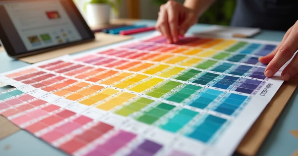
Top Color Palette for Websites Tools You Should Use
Finding the right colors doesn’t have to be a guessing game. There are several amazing tools available online that help you create professional palettes in just a few clicks. These tools are built to handle the technical side of color theory, so you can focus on the creative part of your project. Whether you need a quick idea or a full brand system, these resources are perfect for any skill level.
Most of these platforms allow you to export your colors directly into your code or design software. They often include features like accessibility checkers to make sure your text is easy to read against your chosen background. Using these tools ensures your website looks modern and stays consistent across every page.
- Coolors: A lightning-fast generator where you can create palettes simply by pressing the spacebar.
- Adobe Color: A professional tool that uses a color wheel to help you find perfectly balanced shades based on classic design rules.
- Color Hunt: A curated collection of beautiful, pre-made palettes updated daily by a community of designers.
- Khroma: An AI-powered tool that learns which colors you like and creates personalized combinations just for you.
- Canva Color Generator: A simple way to upload an image and instantly pull out the main colors to use on your site.
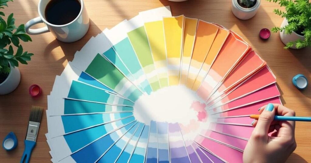
100 Color Palette for Websites Ideas for Website Design
Finding the right inspiration is the first step toward a great design. You can look at the world around you to find Color Palette for Websites that naturally fit together. Nature, city life, and even your favorite snacks can spark new ideas for your website. When you have a wide variety of palettes to choose from, it is much easier to match your site to the specific message you want to send.
Below is a list of various color combinations to help you get started. Each one uses a mix of primary and accent colors to create a unique look. You can use these as a starting point and adjust the shades until they feel just right for your brand.
| Palette Name | Primary Color | Secondary Color | Accent Color | Vibe/Mood |
| Ocean Breeze | Deep Navy | Seafoam Green | Sandy Beige | Calm & Professional |
| Sunset Glow | Warm Orange | Soft Pink | Deep Purple | Energetic & Artistic |
| Forest Floor | Pine Green | Earthy Brown | Mossy Yellow | Natural & Stable |
| Modern Tech | Slate Gray | Electric Blue | Pure White | Clean & Innovative |
| Berry Mix | Royal Plum | Raspberry Red | Creamy White | Bold & Playful |
| Desert Sand | Terracotta | Muted Gold | Sage Green | Warm & Organic |
| Midnight Sky | Charcoal | Starry Yellow | Silver | Elegant & Mysterious |
| Coffee Shop | Espresso Brown | Latte Tan | Soft Cinnamon | Cozy & Inviting |
| Cyberpunk | Neon Purple | Hot Pink | Cyan Blue | Futuristic & Edgy |
| Spring Bloom | Sky Blue | Petal Pink | Grass Green | Fresh & Cheerful |
| Industrial | Steel Blue | Cool Gray | Rust Orange | Strong & Reliable |
| Vintage Film | Sepia | Muted Teal | Burnt Sienna | Nostalgic & Classic |
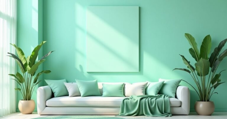
| Minty Fresh | Mint Green | Crisp White | Light Gray | Clean & Simple |
| Royal Gold | Burgundy | Rich Gold | Black | Luxurious & High-end |
| Tropical Fruit | Mango Yellow | Lime Green | Coral Reef | Vibrant & Fun |
Color Psychology and Color Palette for Websites
Color psychology is the study of how different colors affect human behavior and feelings. When a person visits your website, their brain processes the colors before they even read a single word. Each color can trigger a specific emotional response. For example, blue often creates a feeling of trust and security, while red can create a sense of urgency or excitement.
Choosing the right colors helps you guide how your visitors feel about your brand. If you want to look professional and calm, you might choose soft greens or deep blues. If you want to grab attention for a sale, bright yellows or oranges work well. By understanding the meaning behind each shade, you can build a website that connects with your audience on a deeper level.
How to Pick Your Color Palette for Websites in 5 Steps
Choosing the right Color Palette for Websites for your site is easier when you follow a clear path. You should start by understanding your brand’s personality and who your audience is. Think about the message you want to send before you look at any color wheels. Once you have a goal, you can begin picking a primary color that represents your brand best.
After you have your main color, you can build the rest of your palette by adding supporting shades. It is helpful to use a simple formula so your design does not look cluttered. Most designers use a mix of light, dark, and bright tones to keep things balanced. Follow these five steps to create a professional look for your project:
- Step 1: Define your brand’s mood. Decide if you want to feel professional, playful, or high-tech.
- Step 2: Pick a primary color. This will be the main color people associate with your website.
- Step 3: Choose 2-3 secondary colors. These colors should complement your primary shade and add variety.
- Step 4: Select a background color. Usually, a neutral white, light gray, or dark tone works best for readability.
- Step 5: Test for accessibility. Make sure your text stands out clearly against your background colors so everyone can read it.
Accessible and WCAG‑Friendly Color Palette for Websites
Creating an accessible website means making sure everyone can use it, including people with visual impairments. One of the most important parts of accessibility is color contrast. This is the difference in brightness between your text and the background. If the contrast is too low, many users will find it very hard to read your content. Following accessibility guidelines ensures that your site is welcoming to every visitor.
The Web Content Accessibility Guidelines, or WCAG, provide clear rules for designers to follow. You should always check that your buttons and links stand out clearly from the rest of the page. It is also a good idea not to rely on color alone to explain something, like using only a red border for an error. By picking a high-contrast palette, you make your website more professional and much easier for everyone to navigate.
Monochromatic vs Complementary Color Palettes for Websites
Choosing between a monochromatic or a complementary palette depends on the look you want. A monochromatic palette uses different shades and tints of just one single color. This creates a very clean, calm, and organized feeling on a website. It is hard to mess up because all the Color Palette for Websites naturally match. It is a great choice for brands that want to appear elegant and simple.
On the other hand, a complementary palette uses colors from opposite sides of the color wheel. Complementary pairs include blue and orange, purple and yellow, for example. These palettes are much more bold and high-energy. They create a strong contrast that makes buttons and important information pop out. If you want your website to feel exciting and modern, this is often the best way to go.
| Feature | Monochromatic Palette | Complementary Palette |
| Colors Used | Different shades of one color | Two colors from opposite sides |
| Vibe | Calm, smooth, and consistent | Bold, energetic, and high-contrast |
| Ease of Use | Very easy to keep balanced | Requires careful balance to look good |
| Visual Interest | Subtle and professional | Striking and attention-grabbing |
| Best For | Minimalist designs and portfolios | Call-to-action buttons and creative sites |
| Risk | Can sometimes look boring | Can look messy if too many colors are added |
| Example | Light blue, medium blue, and dark navy | Deep blue paired with bright orange accents |
Best Free Color Palette Generators for Websites
Finding the perfect Color Palette for Websites for your project is much easier when you use the right digital tools. Many high-quality generators are available for free and can help you create professional schemes in seconds. These platforms often include advanced features like AI suggestions and accessibility checks to ensure your design is both beautiful and functional. Using these resources allows you to experiment with different moods and styles without needing any expert design experience.
Most of these tools allow you to export your final choices directly into your website’s code or design software. They are designed to save you time by handling the complex math of color theory for you. Whether you want to pull colors from a favorite photo or generate a random palette with one click, these tools are essential for any modern web project:
- Coolors: A lightning-fast tool that lets you generate and lock colors simply by pressing the spacebar.
- Adobe Color: A professional-grade generator that uses a color wheel and classic harmony rules to build balanced palettes.
- Color Hunt: A curated library of thousands of trendy, hand-picked palettes that you can browse for instant inspiration.
- Khroma: An AI-powered tool that learns your personal style to create limitless color combinations tailored to your taste.
- Canva Color Generator: An easy way to upload any image and instantly extract its dominant colors to use as a palette.
Color Palette for Websites Examples From Top Brands
Looking at famous brands is a great way to see color theory in action. For example, Apple uses a minimalist palette of white, black, and light gray. This choice makes their website feel expensive, clean, and very easy to navigate. On the other hand, Google uses a mix of bright red, blue, yellow, and green. These colors together signal that their tools are friendly, energetic, and made for everyone to use.
Other brands use specific colors to build an emotional connection with their users. Spotify uses a bold “Neon Green” against a black background to feel modern and alive, like a concert. Airbnb uses a soft coral pink called “Rausch” to feel warm and welcoming, helping travelers feel at home. By studying these choices, you can see how a few simple colors can define a brand’s entire personality and make a lasting impression on visitors.
Convert Website Inspiration Into a Custom Palette
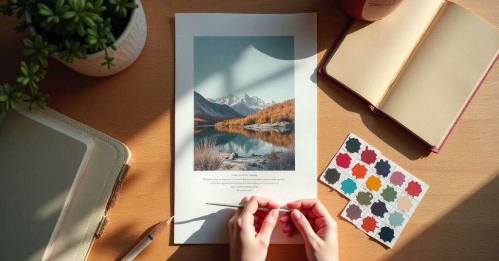
You can find great Color Palette for Websites everywhere, from a beautiful photograph to your favorite physical store. The key is to look for the “dominant” colors that set the overall mood of the scene. Once you find an image or a website you love, you can use a color picker tool to grab the exact codes for those shades. This allows you to take a real-world feeling and turn it into a digital design that works for your brand.
After you have your base colors, you need to refine them to make sure they work well on a screen. Sometimes a color that looks great in a photo is too bright or too dark for a website background. You can adjust the saturation or brightness to keep the original vibe while making it easy on the eyes. Following a few simple steps will help you turn your inspiration into a professional custom palette:
- Take a screenshot: Capture the specific website or image that caught your eye.
- Use an eyedropper tool: Use a browser extension or design app to click on the colors and get their Hex codes.
- Identify the roles: Decide which color will be for your background, which is for text, and which is for your “call to action” buttons.
- Check for balance: Make sure you have at least one light neutral and one dark tone to provide contrast.
- Test on your layout: Apply the colors to a sample page to see how they feel when you are actually scrolling through content.
Conclusion
Choosing the right Color Palette for Websites is one of the most important steps in building your website. It is about more than just picking colors you like. A good palette makes your site easy to read, professional, and welcoming for every visitor. When you balance beauty with accessibility, you create a space where people want to spend their time.
Take a moment to experiment with the tools and tips we have discussed. Do not be afraid to try different combinations until you find the one that feels just right for your brand. Once you have your colors set, your design will start to fall into place naturally. Happy designing, and enjoy the process of bringing your creative vision to life!
FAQs
1. How many colors should I include in my website palette?
It is best to stick to 3–5 colors. This usually includes one primary color, one or two accent colors, and two neutral shades for backgrounds and text.
2. What is a Hex code and why do I need it?
A Hex code is a six-digit number (like #000000 for black) used by browsers to identify specific colors. It ensures the exact shades you pick look the same on every screen.
3. Can I change my color palette after my website is live?
Yes, you can update your colors at any time through your website’s CSS or theme settings. However, it is better to pick a solid palette early to keep your brand looking consistent.
4. What is the 60-30-10 rule in web design?
Using this rule, the dominant color should comprise 60%, the secondary color 30%, and the accent color 10%. It helps create a perfectly balanced look that isn’t overwhelming.
5. How do I know if my text is easy enough to read?
You should use a contrast checker tool to compare your text color against your background. Following WCAG guidelines ensures that your content is accessible to all users.

Welcome to Digital Pin Media! I’m Usama Ijaz, an AI-Powered SEO, and Content Write with 4 years of experience.
I help websites rank higher, grow traffic, and look amazing. My goal is to make SEO and web design simple and effective for everyone.
Let’s achieve more together!


One Comment