Introduction
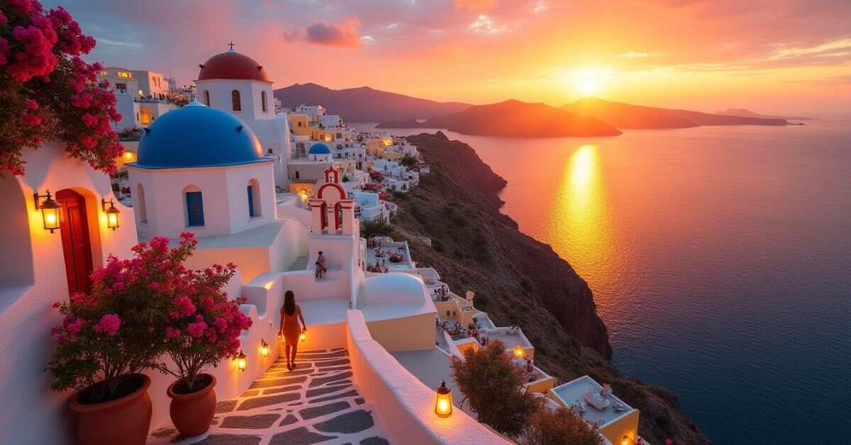
Warm color palette are the hues that remind us of heat, sunlight, and fire. This palette primarily includes reds, oranges, and yellows, along with various shades of pink and gold. In design, these colors are used to create a sense of energy, comfort, and physical warmth.
Have you ever walked into a room and immediately felt a sense of belonging and peace? That is the power of a “glowing” design at work. By using the right mix of amber and crimson, you can transform a cold, sterile project into something that feels alive and welcoming.
In this guide, we will explore how to balance these fiery tones without overwhelming your audience. You will learn how to pick the perfect accent shades to make your graphics pop and your layouts shine. Let’s look at some specific color combinations that can give your next project that radiant, sun-kissed finish.
Warm Color Palette Ideas
Warm colors are the shades that feel cozy and energetic. These colors include red, orange, and yellow. They are often linked to things like sunlight, autumn leaves, and fire. When you use them in your designs, they make people feel happy and invited.
Using these colors correctly can really change the mood of your work. You can mix deep tones with lighter shades to create a balanced look. Here are a few simple ways to use them:
- Sunlight Mix: Use bright yellow and soft gold for a cheerful vibe.
- Autumn Glow: Combine deep orange with rusty red for a rich, earthy feel.
- Soft Sunset: Mix peach and pink to make things look calm and sweet.
- Bold Heat: Use bright crimson to grab attention and show passion.
Best Warm Color Palette Combinations
Finding the right mix of warm colors can make your project stand out. You want to choose colors that look good together and share a similar mood. For example, mixing a bright yellow with a deep orange creates a very energetic look. If you want something softer, try using peach with a light cream color.
The best combinations often use one bold color and two softer shades to keep things balanced. This prevents the design from looking too busy or straining the eyes. Using a variety of tones helps your work feel more professional and thoughtful. Below is a list of some great warm color sets you can use for your next design.
| Palette Name | Primary Color | Secondary Color | Accent Color | Vibe/Feeling |
| Morning Sun | Bright Yellow | Soft Gold | Cream | Cheerful & Fresh |
| Desert Sand | Terracotta | Muted Beige | Burnt Orange | Earthy & Natural |
| Tropical Heat | Fiery Red | Mango Orange | Deep Pink | Bold & Exciting |
| Harvest Time | Rust Red | Mustard Yellow | Olive Brown | Cozy & Rustic |
| Soft Sunset | Peach | Coral Pink | Dusty Rose | Gentle & Romantic |
| Golden Hour | Amber | Honey | Soft White | Warm & Glowing |
| Retro Fire | Crimson | Tangerine | Lemon | Vintage & High Energy |
These combinations work well for websites, social media posts, or even home decor. You can experiment by changing the intensity of each color to see what fits your style best. Always remember to check if your text is easy to read against these warm backgrounds.
What Is a Warm Color Palette? (Simple Guide)
A warm color palette is a group of colors that make you think of heat and light. These colors usually live on one side of the color wheel. They include red, orange, yellow, and all the shades in between. When you look at them, they often remind you of a bright summer day or a crackling fire.
These palettes are great for making a space or a design feel more friendly. Warm colors tend to “pop” or move forward visually, which helps grab a person’s attention quickly. They are used to show excitement, comfort, and kindness. By using these tones, you can make any project feel much more inviting and full of life.
Popular Warm Color Palette Shades
There are many different shades that fall into the warm category. Each one has its own special feel and purpose. For example, some shades are very bright and loud, while others are soft and quiet. Choosing the right shade helps you tell a better story with your design.
Many people love using these specific colors because they are easy to recognize. They bring a natural and organic feel to any project. Here are some of the most popular warm shades used today:
- Terracotta: A brownish-red that feels earthy and grounded.
- Mustard Yellow: A deep, rich yellow that looks great in modern styles.
- Coral: A mix of pink and orange that feels fresh and fun.
- Amber: A warm, glowing orange-yellow that looks like honey.
- Crimson: A strong, deep red that shows power and energy.
Using a mix of these shades can give your work a lot of depth. You can use the darker colors for text and the lighter ones for backgrounds. This makes your content easy to read and very pleasant to look at.
Warm Color Palette for Home Decor
Using warm colors in your home can make every room feel more welcoming. These shades help create a space where people want to sit down and relax. You can paint a whole wall in a soft terracotta or just add small items like orange pillows. Even a little bit of yellow can make a dark corner feel like it has more sunlight.
When you decorate with these tones, the atmosphere becomes much more cozy. It is a great choice for living rooms and kitchens where families gather. You can mix these colors with natural wood or gold accents to complete the look. These simple choices help turn a house into a warm and friendly home.
Warm Color Palette for Graphic Design
In graphic design, warm colors are used to create a strong emotional connection. These colors jump out at the viewer and demand attention. Designers use them for buttons, logos, and sales banners because they make people feel excited. When you want your message to feel urgent or energetic, warm tones are the best choice.
Using a warm palette also helps make your brand feel more approachable and friendly. It can turn a simple graphic into something that feels personal and full of passion. Here are a few ways to use these colors in your next project:
- Call to Action: Use bright red or orange for buttons to encourage clicks.
- Brand Identity: Choose yellow to show that your business is happy and creative.
- Visual Balance: Mix deep burgundy with soft peach for a sophisticated look.
- Highlighting: Use gold or amber to draw the eye toward important text.
These colors work well across different platforms like websites and social media. They help keep your audience engaged and make your content look more vibrant. Just remember to use them wisely so your design stays clean and easy to read.
Trending Warm Colors 2026
The trending warm colors for 2026 are all about feeling grounded and calm. This year, we are moving away from very bright neon shades. Instead, people are choosing “neo-neutrals” and earthy tones that feel more natural. Colors like soft butter yellow and warm clay are becoming very popular for both digital screens and physical spaces.
These new trends focus on making our environments feel safe and timeless. Many designers are using deep, rich colors to add a sense of history and comfort to their work. Whether you are building a website or painting a room, these shades help create a peaceful mood. Here are some of the top warm colors trending right now:
- Warm Mahogany: A deep, grounded red that looks classic and expensive.
- Butter Yellow: A soft, radiant yellow that brings a happy glow to any design.
- Peanut Butter: A creamy, relaxed brown-beige that is very easy to mix with other colors.
- Amber Haze: A powerful golden yellow that feels energetic yet calm.
- Melodious Ivory: A sun-kissed cream color that adds a gentle warmth to backgrounds.
These shades work beautifully when layered together. You can use a dark mahogany for bold text and a soft ivory for the background. This creates a look that is modern but still feels very cozy and human. By following these 2026 trends, you can keep your projects looking fresh and inviting.
How to Use Warm Color Palette Perfectly
Using warm colors perfectly is all about finding a good balance. If you use too much bright red or orange, your design might feel overwhelming. It is better to choose one main warm color and use it with softer tones. This keeps the look energetic but still very easy on the eyes.
The best way to start is by thinking about the mood you want to create. Soft yellows feel happy and light, while deep reds feel more serious and strong. You can use these colors for the most important parts of your work to make them pop. Following a few simple steps will help you get the best results every time.
- Step 1: Choose one dominant warm color to be your main focus.
- Step 2: Pick two lighter or more neutral shades to balance the bright color.
- Step 3: Use your brightest color for small details like buttons or titles.
- Step 4: Check the contrast to make sure your text is still easy to read.
- Step 5: Add a cool-toned accent, like a touch of blue, if you want the warm colors to stand out even more.
Warm vs Cool Color Palette (Key Difference)
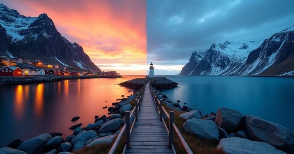
The biggest difference between warm and cool colors is the feeling they give you. Warm colors like red and orange make you feel active and cozy. They remind us of things like fire and the sun. Cool colors like blue and green make you feel calm and relaxed. They remind us of things like water, grass, and the sky.
In design, warm colors tend to stand out and look closer to the viewer. Cool colors usually fade into the background and make a space feel larger. Most people use warm colors to grab attention and cool colors to create a peaceful vibe. Knowing how to use both helps you control the mood of your project. Below is a simple table to help you see the main differences clearly.
| Feature | Warm Color Palette | Cool Color Palette |
| Main Colors | Red, Orange, Yellow, Gold | Blue, Green, Purple, Silver |
| Common Feelings | Excitement, Energy, Comfort | Calm, Peace, Professionalism |
| Nature Links | Fire, Sun, Autumn Leaves | Water, Ice, Forest, Sky |
| Visual Effect | Pops out and looks closer | Recedes and looks farther away |
| Best Used For | Call-to-action buttons, cozy rooms | Backgrounds, relaxation apps |
| Temperature | Feels hot or cozy | Feels cold or refreshing |
| Room Impact | Makes a room feel smaller and snug | Makes a room feel spacious and airy |
Warm Color Palette Tips for Beginners
Starting with warm colors is a fun way to make your work look better. These colors are very friendly and easy to use. The best tip for beginners is to start with small steps. You do not need to use a lot of bright colors all at once. Try adding a little bit of orange or yellow to a simple design to see how it changes the mood.
You should also pay attention to how colors look next to each other. Some warm colors are very strong and might clash if they are too close. Using a soft neutral color like beige can help separate them. This makes your design look clean and professional. Here are some simple tips to help you begin:
- Start Small: Use warm colors for small icons or bold titles first.
- Use Neutrals: Mix your warm colors with white, grey, or cream to keep things balanced.
- Test the Lighting: Remember that warm colors can look different on a phone screen than on paper.
- Look at Nature: Find inspiration in sunsets or flowers to see which colors naturally go together.
- Keep it Simple: Try to use only two or three warm shades in one project so it does not look messy.
Following these tips will help you feel more confident with your choices. It takes a little practice to get the balance just right. Over time, you will learn how to create beautiful designs that feel glowing and full of life.
Conclusion
Using a warm color palette is a simple way to bring life to your projects. These colors make people feel happy, cozy, and excited. Whether you are decorating a room or designing a website, the right shades can make a big difference. It is all about finding a balance that feels good to you and your audience.
Do not be afraid to experiment with different combinations of red, orange, and yellow. You can start with small details and grow from there as you get more comfortable. With these tips and ideas, you can create designs that truly glow. Now it is time to grab your favorite warm tones and start creating something beautiful.
FAQs
1. What are the main colors in a warm palette?
The main warm colors include red, orange, and yellow. These hues are inspired by the sun and fire to create a cozy feel.
2. Can I use warm colors in a small room?
Yes, but it is best to use lighter shades like peach or soft gold. These make the room feel snug without making it look too tiny.
3. How do warm colors affect our mood?
Warm colors usually make people feel happy, energetic, and welcomed. They are great for social spaces like living rooms or kitchens.
4. What is the best way to balance bright warm colors?
You should mix them with neutral tones like white, cream, or light grey. This prevents the design from looking too loud or messy.
5. Are warm colors better than cool colors for branding?
It depends on your goal, but warm colors are excellent for grabbing attention. They help a brand appear friendly, passionate, and very approachable.

Welcome to Digital Pin Media! I’m Usama Ijaz, an AI-Powered SEO, and Content Write with 4 years of experience.
I help websites rank higher, grow traffic, and look amazing. My goal is to make SEO and web design simple and effective for everyone.
Let’s achieve more together!


One Comment