Introduction
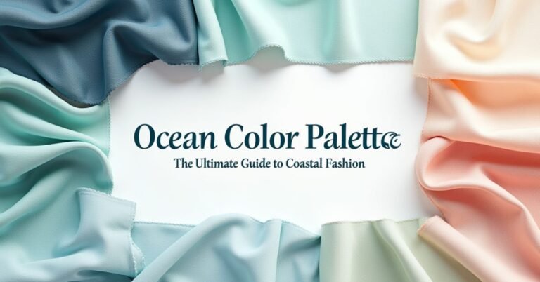
Cool color palette rely on blue, green, and purple undertones. These shades mimic the soothing vibes of water, sky, and lush foliage. Designers use these combinations to create a sense of calm and professional polish in any space.
Think about the last time you walked into a room and felt instant peace. That wasn’t an accident; it was the power of color psychology at work. You can transform a chaotic environment into a sleek sanctuary just by picking the right tones.
This guide explores the best cool-toned pairings for contemporary fashion and interior design. I will show you how to mix icy blues with slate greys and mint greens. You will learn how to balance these chilly hues to achieve a crisp, modern aesthetic.
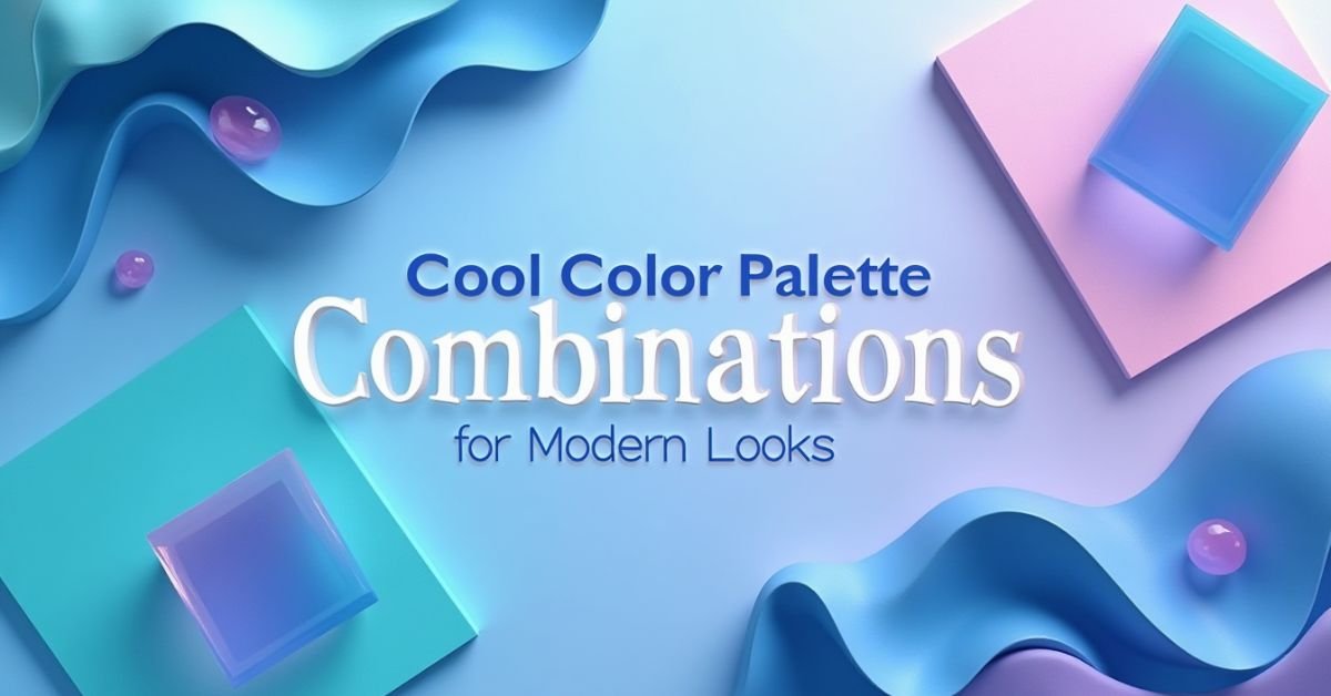
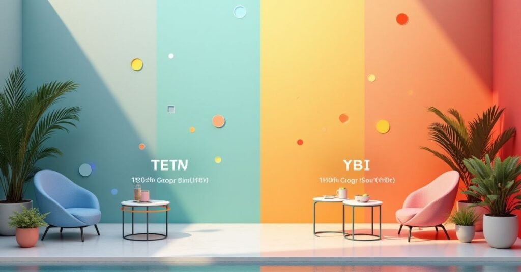
Cool Color Palette Ideas for Stunning Designs
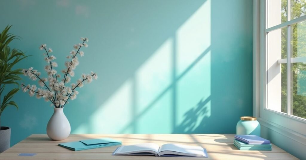
Cool colors bring a fresh and calm feeling to your creative work. These palettes use blues, greens, and soft purples to create a professional look. You can use these shades to make your website or social media posts feel more relaxing. Many people choose cool tones because they look clean and modern.
You can mix different shades to build a unique style. Try combining dark navy with light mint or icy blue with slate grey. These combinations work well for tech brands, home decor, and fashion layouts.
- Ocean Breeze: Mix deep sea blue with soft turquoise and white.
- Forest Mist: Combine dark emerald green with sage and silver.
- Icy Morning: Use pale blue, lavender, and charcoal grey together.
- Midnight Glow: Pair royal purple with dark indigo and a hint of mint.
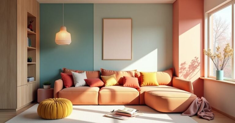
Best Cool Color Palette Combinations
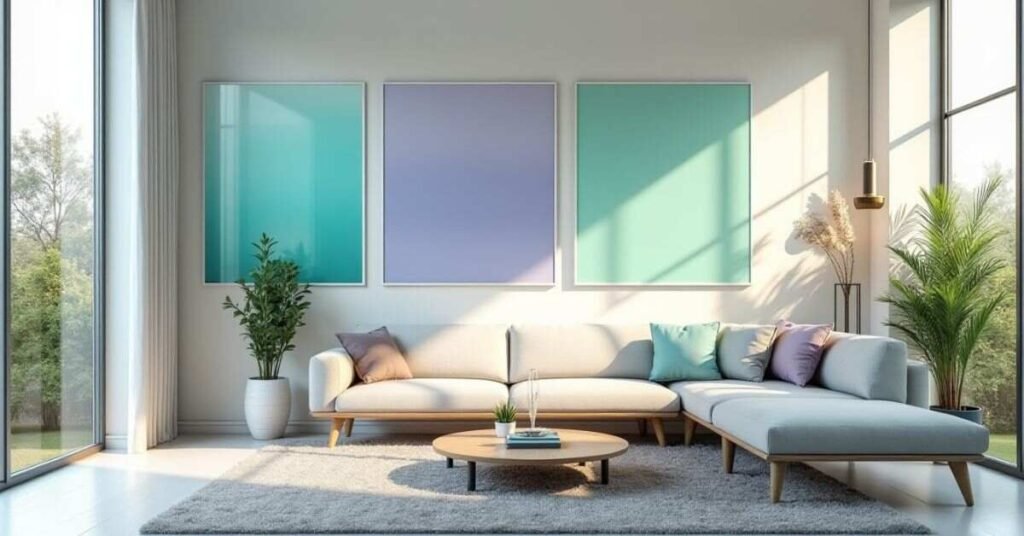
Cool colors transform any project into a calm and inviting space. These shades focus on blues, greens, and purples to give your work a crisp finish. Most people find these tones very easy on the eyes. You can use them to create a professional feel without making things look boring or cold.
Good palettes use a mix of light and dark shades to add depth. You might pair a deep navy with a soft mint green for a striking contrast. Using these combinations helps your design stand out while keeping a peaceful vibe. They work perfectly for modern websites, living rooms, or even personal branding.
- Sky and Stone: Pair light azure with a deep charcoal gray.
- Mountain Stream: Mix teal, slate blue, and a touch of silver.
- Lavender Field: Combine soft purple with sage green and white.
- Winter Night: Use indigo, royal blue, and a very pale gray.
How to Choose the Right Cool Color Palette
Choosing the right colors starts with the mood you want to create. Cool colors like blue and green usually make people feel calm or focused. Think about where your design will live and who will see it. A dark palette feels serious and bold, while light tones feel airy and open.
You should always test how your colors look together before you finish your work. Some cool shades can look too “chilly” if you don’t balance them properly. Try adding a neutral gray or a crisp white to keep the look clean. Following a simple process helps you avoid common mistakes and saves you time.
Step-by-Step Guide
- Pick a Base Color: Start with one cool shade you love, like a deep navy or a soft sage.
- Add a Secondary Tone: Choose a color near your base on the color wheel to create harmony.
- Select a Neutral: Use white, light gray, or cream to give the eyes a place to rest.
- Check the Contrast: Make sure your text is easy to read against your background colors.
- Test the Look: View your palette on different screens or in different lighting to ensure it stays beautiful.
Cool Color Palette Codes with Hex Values
Hex codes help you get the exact color you want every time. These six-digit codes act like a digital fingerprint for each shade. You simply copy and paste them into your design software or website editor. This ensures your greens and blues look consistent across all your different projects.
Using a mix of light, medium, and dark hex codes creates a professional balance. A good table helps you see how these colors sit next to each other. You can pick one primary color and use the others for accents or backgrounds. Check the list below to find the perfect match for your next modern look.
Cool Color Reference Table
| Palette Name | Color Description | Hex Code | Best Use Case |
| Deep Ocean | Navy Blue | #1B263B | Backgrounds / Text |
| Arctic Ice | Very Pale Blue | #E0FBFC | Highlights / Accents |
| Sage Leaf | Muted Green | #839788 | Natural Designs |
| Midnight | Dark Indigo | #2D3142 | Bold Headers |
| Mist | Soft Blue-Gray | #98C1D9 | Secondary Shapes |
| Mint Tea | Fresh Green | #B5E48C | Call-to-Action Buttons |
| Slate | Cool Gray | #4A4E69 | Professional Borders |
| Electric Blue | Bright Cyan | #00B4D8 | Modern Links |
| Lavender | Dusty Purple | #BE95C4 | Creative Accents |
| Teal Dream | Dark Blue-Green | #073B4C | Footers / Sidebars |
| Frost | Pure Ice Blue | #CAF0F8 | Card Backgrounds |
| Forest Shadow | Dark Pine | #2D6A4F | Deep Contrast |
| Stormy Sky | Muted Denim | #3E5C76 | Subtle Icons |
| Soft Grape | Light Violet | #9D8189 | Stylish Borders |
| Aqua Marine | Bright Turquoise | #48CAE4 | Playful Elements |
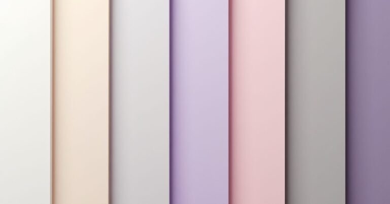
Simple Cool Color Palette for Beginners
Starting with cool colors is a great choice for any new designer. You can easily mix blues and greens without making a mistake. These colors naturally fit together because they appear next to each other in nature. Just pick one favorite shade and pair it with a light gray to keep things simple.
You do not need to be an expert to create a beautiful look. Try using a light blue for your background and a dark blue for your text. This creates a clean style that everyone will find easy to read. Keeping your palette small helps you stay focused and makes your project look professional right away.
Cool Color Palette for Websites & Graphics
Cool colors work wonders for digital spaces and graphic layouts. These shades create a sense of trust and clarity for your visitors. Most modern websites use blue or green tones to help users feel relaxed while browsing. You can use a dark cool shade for your text to make it stand out against a light background.
Graphics also benefit from these calming combinations. They help you organize information without overwhelming the viewer. You can use different shades of the same cool color to highlight important buttons or icons. This strategy keeps your design looking unified and very polished.
- For headers and main text, use Deep Navy (#1B263B).
- For an airy background, use Sky Blue (#98C1D9).
- Mint Green (#B5E48C): Pick this for “Buy Now” buttons or success messages.
- Slate Gray (#4A4E69): Try this for subtle borders and secondary information.
- Maintain a clean look with Ice White (#F8F9FA).
Trending Cool Color Palette from Top Tools
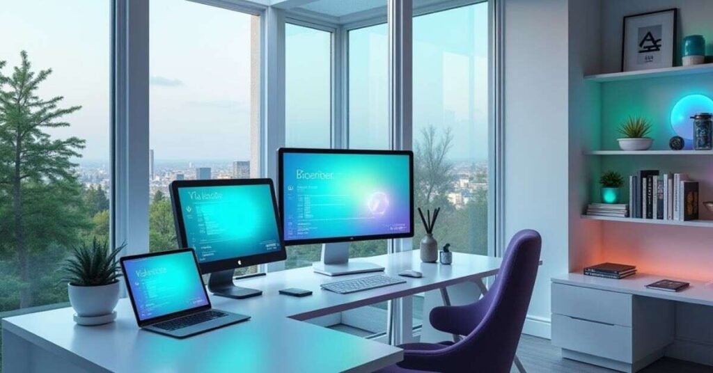
Modern design tools now highlight palettes that mix calm vibes with high-tech energy. These trending colors often take inspiration from nature and digital innovation. Many experts see a shift toward “smoky” and “transformative” tones that look great on both screens and printed materials. You can use these fresh combinations to keep your brand or project looking current in 2026.
Top platforms like Pinterest and Adobe Color suggest using deep purples and watery blues to stand out. These tools help you find the right balance between “quiet luxury” and bold personality. Following these trends ensures your work feels fresh and exciting to your audience. Try these popular combinations to give your designs a modern edge.
- Cool Blue & Jade: Mix a frosty, subzero blue with a serene, earthy green.
- Carbon Mint: Pair a glowing mint green with a deep, dark anthracite gray.
- Mermaidcore: Combine iridescent aquas and soft teals with pearlescent purples.
- Electric Pulse: Use a vibrant cyan alongside a deep, trustworthy “Stripe-blue.”
- Plum Noir: Blend a deep, decadent purple with smoky blue-green accents.
Cool Color Palette Inspiration You’ll Love
Cool color palettes are reaching new levels of popularity this year. Designers now focus on “Transformative Teal” and “Cool Blue” to create spaces that feel both high-tech and grounded. These icy tones provide a perfect escape from the busy digital world. You will love how these colors refresh your home or website with a crisp, subzero mood.
Mixing these trendy shades helps you stay ahead of the curve. Many professionals now pair frosty blues with earthy greens like Jade to balance energy with serenity. This combination creates a “chilled chaos” vibe that looks both bold and sophisticated. Use these ideas to bring a modern, optimistic feel to your next creative project.
- Transformative Teal: This deep blue-green serves as a top pick for stable and stylish designs.
- Frosty Cool Blue: Use this “iced out” shade to add a clean, subzero chill to your brand.
- Jade & Moss: Mix these earthy greens to bring a sense of natural glamour to any room.
- Blue Aura: Pick this soft, soothing light blue to build trust and lightness.
- Marina Blue: Apply this clear ocean hue to achieve a timeless and relaxed summer look.
Cool Color Palette vs Warm Colors Explained
Color choice changes how people feel about your work. Warm colors like red, orange, and yellow bring energy and heat to a design. They pop out and grab attention quickly, which makes them great for calls to action. Use these colors when you want to create a sense of excitement or urgency.
Cool colors like blue, green, and purple do the opposite. They recede into the background and create a sense of calm. These shades mimic nature, like the sky or a quiet forest. You should pick cool tones if you want your audience to feel relaxed and trust your brand.
Comparison Table: Cool vs. Warm Colors
| Feature | Cool Color Palette | Warm Color Palette |
| Primary Colors | Blue, Green, Purple | Red, Orange, Yellow |
| Mood | Calm, Trusting, Relaxed | Energetic, Bold, Happy |
| Visual Effect | Recedes into the background | Pops out toward the viewer |
| Nature Link | Water, Ice, Sky, Night | Fire, Sun, Autumn Leaves |
| Best For | Professionalism and Peace | Urgency and Excitement |
| Room Feel | Makes small rooms feel larger | Makes large rooms feel cozy |
| Common Brands | Tech, Health, Banking | Food, Retail, Entertainment |
| Temperature | Feels chilly or fresh | Feels hot or glowing |
| Text Usage | Great for long-form reading | Best for headlines and alerts |
| Impact | Subtle and soothing | Intense and demanding |
Creative Cool Color Palette Themes for Modern Design
Creative themes give your project a unique personality. You can move beyond basic blue by exploring themes like “Arctic Dusk” or “Neon Jungle.” These themes mix different cool shades to tell a specific story. Using a theme helps you stay consistent across every page of your website or every room in your home.
Modern design often uses these themes to create a “vibe” rather than just a color scheme. You might choose a “Rainy Morning” theme to feel cozy and quiet. Or you could pick a “Cyber Teal” look to feel fast and futuristic. These creative choices make your work look thoughtful and very professional.
- Deep Sea Mystery: Mix midnight blue, seafoam green, and a splash of bright silver.
- Frozen Tundra: Combine icy white, pale violet, and a crisp slate gray.
- Twilight Garden: Pair dark plum with sage green and a muted periwinkle.
- Digital Breeze: Use bright cyan, royal blue, and a very light mint green.
- Evening Fog: Blend charcoal gray with a dusty blue and a soft lavender.
Conclusion
Choosing a cool color palette is an easy way to make your work look professional. These shades bring a sense of peace and clarity to any creative project. You can start with simple blues and greens to build a clean, modern style. Over time, you will find the perfect balance that fits your specific vision.
Remember that great design is all about how it makes people feel. Use these calm tones to tell your story and connect with your audience. Experiment with different hex codes and themes to keep your looks fresh and exciting. You have all the tools now to create something truly stunning and unique.
Frequently Asked Questions
Q1. What defines a cool color palette?
Cool palettes feature colors with blue, green, or purple undertones. These shades mimic natural elements like water, ice, and the sky to create a calm feeling.
Q2. How do cool colors affect a person’s mood?
Cool tones lower stress and help people feel relaxed or focused. Most designers use them to build a sense of professional trust and peace.
Q3. Can I mix cool colors with warm colors?
Yes, adding a tiny splash of a warm color creates a beautiful contrast. A small yellow or orange accent makes a cool design feel more balanced and energetic.
Q4. Are cool colors good for small rooms?
These colors make small spaces feel much larger and more open. Light blues and greens recede visually, which gives the walls an airy, expansive look.
Q5. What are hex codes in a color palette?
Hex codes are six-digit strings that identify exact digital colors. You use these codes in software to ensure your colors look identical on every screen.

Welcome to Digital Pin Media! I’m Usama Ijaz, an AI-Powered SEO, and Content Write with 4 years of experience.
I help websites rank higher, grow traffic, and look amazing. My goal is to make SEO and web design simple and effective for everyone.
Let’s achieve more together!


One Comment