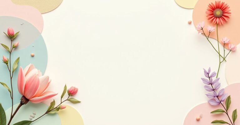
Introduction
Beige Color Palettes You’ll Love for Soft, Modern Styling
Beige Color Palettes is much more than just a simple neutral. It is a versatile blend of light brown, grey, and yellow tones that brings a sense of calm to any space. In the world of design, a beige color palette represents warmth, balance, and “quiet luxury.” It’s the perfect foundation for anyone who wants a look that feels clean but never cold.
Have you ever walked into a room and immediately felt like you could breathe easier? That is the magic of soft, modern styling at work. While bold colors can be fun, they often go out of style as quickly as they arrive. Beige, however, stays relevant year after year because it adapts to your life. It turns a chaotic room into a peaceful sanctuary without trying too hard.
In this guide, we are diving into the best ways to use these sandy tones to elevate your surroundings. We will explore different shade variations, from creamy oats to deep biscuits. You’ll also learn how to mix textures so your palette feels rich and intentional. Whether you are refreshing your home or building a new brand, these combinations will help you master the art of the perfect neutral.
Beige Color Palettes for Cozy Bedrooms
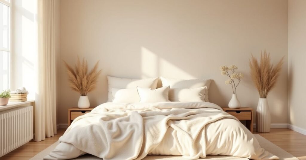
Your bedroom should be the place where you finally unwind after a long day. Using a beige color palette is the easiest way to create that relaxing, “cloud-like” feeling. These soft tones mimic natural sunlight and warm sand, making your space feel bright yet incredibly snug. When you surround yourself with shades like cream, tan, and latte, your brain naturally starts to slow down and prep for sleep.
To get the look right, try layering different tones of beige instead of using just one. Pair a pale vanilla wall with a chunky knit blanket in a deeper toasted almond shade. Adding natural materials like wooden nightstands or linen curtains helps bring the palette to life. This mix of soft colors and textures keeps the room from looking flat. It creates a cozy, modern sanctuary that feels like a warm hug every time you walk in.
Creamy Beige Tones
Creamy Beige Color Palettes tones are the “secret sauce” of a welcoming home. Unlike stark whites that can feel a bit like a doctor’s office, creamy beige has a drop of yellow or gold in it. This tiny bit of warmth makes a room feel like it’s glowing, even on a cloudy day. It’s a soft, buttery color that works perfectly in kitchens, hallways, and living rooms where you want people to feel comfortable right away.
These tones are incredibly easy to work with because they play well with almost everything. Because they are so light and airy, they make small rooms feel much larger than they actually are. To keep things interesting, try mixing different “creamy” textures together. Here are a few ways to use these tones effectively:
- Velvet Pillows: Use cream-colored velvet to add a touch of luxury.
- Woven Baskets: The natural tan fibers look beautiful against creamy walls.
- Warm Lighting: Use “soft white” bulbs to bring out the golden undertones in the paint.
- Light Woods: Oak or pine furniture blends seamlessly with this palette.
Soft Taupe Shades
Soft taupe is the perfect “middle ground” in the world of neutrals. It is a unique mix of brown and grey that feels very high-end and polished. Because it has those cool grey undertones, it doesn’t look too yellow or “muddy” under artificial lights. It is the color of smooth river stones or expensive suede, making it a favorite for modern living rooms and sleek offices.
What makes soft taupe so special is its ability to change with the mood of the room. In the morning light, it can look crisp and clean, while at night, it feels deep and cozy. It is a sophisticated choice for anyone who wants a neutral look that feels a bit more “grown-up” than basic tan. Here are some simple ways to style soft taupe:
- Matte Finishes: Taupe looks stunning on matte walls or kitchen cabinets for a velvet-like appearance.
- Metal Accents: Pair it with brushed gold or matte black hardware to add a modern edge.
- Cool Linens: Use taupe bedding to create a peaceful, hotel-style atmosphere.
- Greenery: Real plants pop beautifully against the muted, earthy background of taupe.
Gray-Toned Beige Color Palettes Shades
Gray-toned beige, often called “greige,” is the ultimate color for a modern home. It takes the coolness of gray and mixes it with the warmth of beige. This creates a balanced look that never feels too chilly or too yellow. It is a very popular choice because it looks great under any kind of light. Whether it is a rainy day or a sunny afternoon, these shades keep your walls looking fresh and clean.
This color is Also like a chameleon for your house. It acts as a quiet background that lets your furniture and art really stand out. It’s perfect for open-concept floor plans because it flows easily from one room to the next. If you want a home that feels updated and calm, gray-toned beige is the way to go. Here are some easy ways to use it:
- Black Accents: Use black picture frames or lamps to give the soft color a sharp, modern look.
- White Trim: Pair these shades with bright white baseboards to make the color “pop.”
- Natural Stone: It looks amazing next to marble countertops or slate floors.
- Stainless Steel: This is the best neutral to use in kitchens with silver appliances.
Beige Color Palettes for Living Rooms
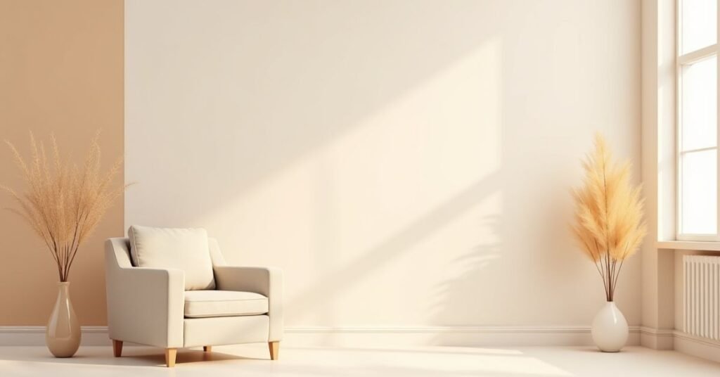
The living room is where everyone gathers, so you want it to feel open and inviting. A beige color palette is perfect for this because it makes the room feel much larger and brighter. It acts as a soft, neutral backdrop that doesn’t overwhelm the senses. By using different shades of sand and biscuit, you can create a space that feels both stylish and lived-in at the same time.
To keep a beige living room from looking too plain, it is all about the “layers.” You can mix a light beige sofa with darker tan pillows and a soft oatmeal rug. Adding natural elements like a wooden coffee table or a large leafy plant makes the colors feel more alive. This approach creates a “quiet luxury” vibe that feels high-end but is still comfortable enough for a movie night with the family.
Rosy Beige Color Palettes Tones
Rosy Beige Color Palettes is a beautiful mix of classic neutral and a tiny hint of pink. It is often called “mushroom” or “blush beige” because it feels soft and romantic. This color is much warmer than a standard tan and brings a healthy, glowing feeling to any room. It is a great choice if you want a neutral space that still feels a bit sweet and cheerful.
This shade works wonders in rooms that don’t get much natural light. The pink undertones help the space feel less “flat” and more vibrant. It is a very sophisticated color that looks great in bathrooms, nurseries, or even chic dressing rooms. Here are a few ways to bring out the best in rosy beige:
- Metallic Accents: Copper and rose gold look incredible next to these tones.
- Soft Fabrics: Use rosy beige in velvet or silk to make the color look even richer.
- Neutral Pairs: It looks very modern when paired with charcoal gray or deep chocolate brown.
- Natural Elements: Dried flowers and light-colored wood help keep the look earthy and grounded.
Forest Green & Warm Beige Color Palettes
Forest green and warm Beige Color Palettes are a match made in nature. This combination Also brings the feeling of a quiet walk in the woods right into your home. The deep, dark green acts as a strong anchor, while the warm beige keeps the space from feeling too heavy or dark. It is a very grounding look that feels sophisticated yet extremely cozy.
This duo is perfect for making a room feel timeless and high-end. The beige softens the intensity of the green, creating a space that is easy on the eyes. It works beautifully in home offices, cozy dens, or living rooms where you want a “moody” but welcoming vibe. Here are some simple ways to style these colors together:
- Dark Accent Walls: Paint one wall forest green and keep the others a warm, sandy beige.
- Natural Materials: Use leather chairs or wooden tables to bridge the gap between these two earthy colors.
- Greenery: Real indoor plants naturally enhance the forest green tones in your decor.
- Textiles: Try a beige linen sofa with forest green velvet throw pillows for a touch of luxury.
Dusky Pink & Earthy Beige Color Palettes
Dusky pink and earthy beige create a look that is both soft and very modern. This pair is often called “desert chic” because it looks like a sunset over the sand. The pink isn’t too bright or “girly” because it has a bit of brown mixed in. When you put it next to earthy beige, the whole room feels warm and peaceful. It is a great choice for a bedroom or a cozy reading nook.
This combination is all about balance. The beige keeps the pink from feeling too sweet, while the pink adds a pop of personality to the neutral beige. It’s a very welcoming mix that makes people want to sit down and stay a while. To make this look work in your home, try these simple tips:
- Layered Bedding: Mix dusky pink sheets with an earthy beige duvet for a high-end hotel look.
- Terracotta Pots: Add some clay planters to bring out the warm, orange tones in the beige.
- Gold Hardware: Use gold or brass lamps to make the pink tones feel more expensive and polished.
- Matte Textures: Use flat paint or linen fabrics to keep the colors looking natural and soft.
Beige Color Palettes for Kitchens
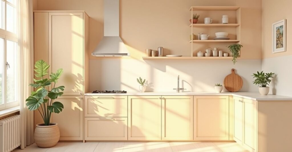
The kitchen is often the heart of the home, and Beige Color Palettes makes it feel incredibly warm. Using a beige color palette in your kitchen creates a clean look that feels much softer than plain white. It is a smart choice because it hides small messes better than bright surfaces do. Whether you have a tiny galley or a big open space, these sandy tones make the room feel bright and airy.
To make your beige kitchen look modern, try mixing different finishes. You can pair creamy beige cabinets with a white marble countertop or a light wood island. Adding hardware in matte black or polished brass can give the neutral colors a real “wow” factor. It’s a timeless style that feels fresh in the morning and cozy when you’re cooking dinner at night.
Caramel Beige Color Palettes Tones
Caramel Beige Color Palettes is like a warm cup of coffee on a cold morning. It is a rich, golden version of neutral that feels much deeper than standard cream. This shade has a lot of brown and orange hidden inside it, which makes any room feel instantly more expensive. It is the perfect color for creating a “moody” but comfortable vibe in your favorite living spaces.
Because this color is so warm, it makes a house feel like a home. It doesn’t feel cold or empty like some lighter colors can. Caramel beige works beautifully on leather sofas, wooden floors, or even as a bold paint color for an entryway. If you want a neutral that feels bold and confident, this is the one for you. Here are some easy ways to use it:
- Leather Furniture: A caramel-colored chair is a classic piece that never goes out of style.
- Warm Wood: Pair these tones with walnut or oak furniture for a seamless, natural look.
- For a lighter caramel color, use white pillows or rugs.
- Cozy Knits: Add a chunky caramel throw blanket to a beige sofa for instant warmth.
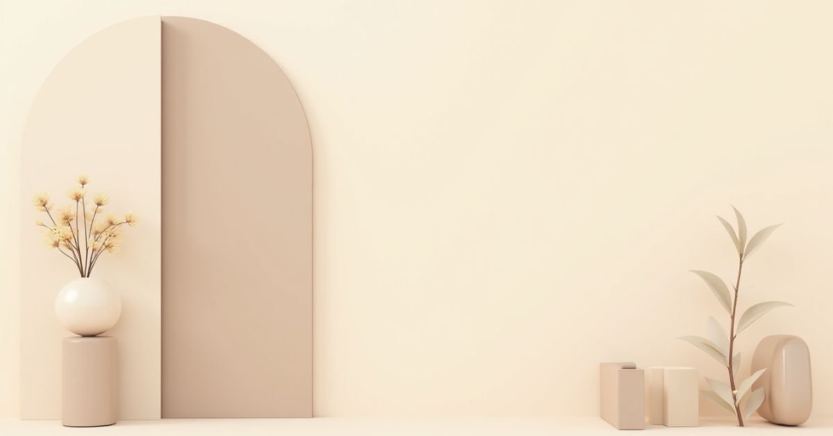
Bone Beige Color Palettes Shades
Bone Beige Color Palettes is a very light and crisp version of neutral. It is slightly darker than white but much softer than a true grey. Think of it as the color of sun-bleached stones or vintage paper. It is a favorite for people who love the “minimalist” look because it makes everything feel organized and calm. It’s the perfect choice if you want your home to look bright and fresh without feeling cold like a gallery.
This shade is a “safe” color that works in every single room of the house. Because it is so pale, it reflects light beautifully and can make even a tiny apartment feel much bigger. It creates a clean canvas that lets your favorite furniture pieces be the stars of the show. Here are a few ways to style bone beige:
- Monochrome Look: Use different shades of bone and off-white for a very expensive, layered feel.
- Natural Textures: Pair it with light jute rugs or wicker baskets to keep it looking earthy.
- Black Contrast: Use thin black metal frames or curtain rods to add a sharp, modern touch.
- Soft Lighting: Use warm bulbs to prevent the color from looking too “flat” at night.
Desert Beige Shades
Desert beige shades are inspired by the warm sand found in nature. This color is a bit deeper than a standard cream and has a tiny hint of golden yellow. It makes any room feel grounded and very cozy. Using this shade is like bringing the peace of a sunny landscape right into your living room.
This color is perfect if you like a natural or Mediterranean style. Looks best when you mix it with earthy materials like wood, clay, or stone. It makes your space feel sun-kissed and welcoming all year round. It is a great way to add character to your home while keeping things simple and relaxing.
Peachy Beige Tones
Peachy beige is a soft and cheerful color that feels like a warm summer morning. It is a lovely mix of classic tan with a tiny drop of orange or apricot. This color is much friendlier than a plain neutral because it adds a healthy glow to your walls. It is a popular choice for bathrooms and bedrooms because it makes the skin look great in the mirror.
This shade works perfectly if you want a room to feel bright and happy but still very calm. It isn’t as bold as a bright pink, so it stays looking sophisticated and modern. You can use it as a main wall color or just in small spots like pillows and blankets. Here are a few ways to use peachy beige in your home:
- White Furniture: Use bright white chairs or tables to make the peach tones look fresh.
- Gold Accents: Picture frames or lamps in gold add a touch of luxury to this soft color.
- Light Greenery: Real plants look amazing next to the warmth of peach.
- Layered Rugs: Try a peachy beige rug over a darker wood floor for a cozy contrast.
Beige Color Palettes for Outfits
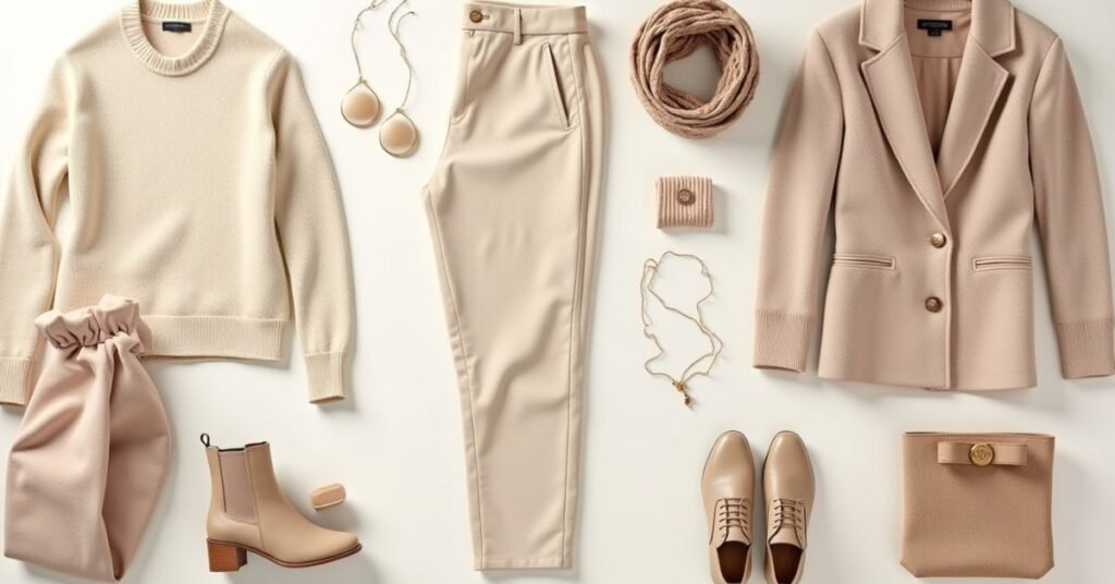
Beige is a superstar in the world of fashion. It is the main color for the “quiet luxury” style that everyone loves right now. Wearing a beige color palette makes you look polished and expensive without trying too hard. It is a very smart choice because every piece in this color will match almost everything else in your closet. You can easily dress it up for a fancy dinner or keep it casual for a coffee date.
To make a beige outfit look great, try mixing different fabrics instead of just one flat color. You can wear a chunky beige sweater with a silky tan skirt or crisp linen trousers. This mix of textures keeps your look from feeling boring. Adding a few accessories like a brown leather belt or a gold watch can pull the whole outfit together. It is a timeless look that always feels fresh and sophisticated.
Clay Beige Shades
Clay beige is a deep, earthy neutral that feels very solid and natural. It is inspired by the colors of red earth and sun-dried pottery. This shade is much warmer than a standard beige because it has a subtle hint of terracotta or orange. It is the perfect choice if you want a room to feel grounded, rustic, and very cozy.
This color is a favorite for creating a “Mediterranean” or “Southwestern” look in a home. It doesn’t feel cold or empty; instead, it wraps the room in a warm, clay-like hug. It looks particularly beautiful in kitchens or entryways where you want a sense of strength and character. Here are some simple ways to use clay beige:
- Matte Walls: Use a flat paint finish to make the color look like real, hand-crafted plaster.
- Handmade Pottery: Decorate with clay vases and bowls to match the wall tones.
- Woven Textures: Add jute rugs or seagrass baskets to bring out the earthy vibe.
- Dark Wood: Pair this shade with deep mahogany or walnut furniture for a rich, high-end look.
Cashmere Beige Tones
Cashmere beige is one of the most elegant colors you can choose. It is a very soft, silky neutral that feels like a luxury sweater. This shade is slightly warmer than gray but cooler than a deep tan. It is the perfect choice for creating a space that feels expensive, quiet, and very peaceful.
This color works best in rooms where you want to relax, like a bedroom or a cozy reading corner. It reflects light in a gentle way, so it never feels too bright or harsh. Because it is so subtle, it makes your furniture look high-end and intentional. Here are some easy ways to style cashmere beige:
- Soft Textures: Use velvet or wool fabrics to match the “expensive” feel of the color.
- Silver or Chrome: These cool metals look very modern against the soft beige background.
- White Bedding: Pair it with crisp white linens for a high-end hotel look.
- Sheer Curtains: Use light, breezy curtains to let the sunlight dance with the cashmere tones.
Beige Color Palettes for Weddings
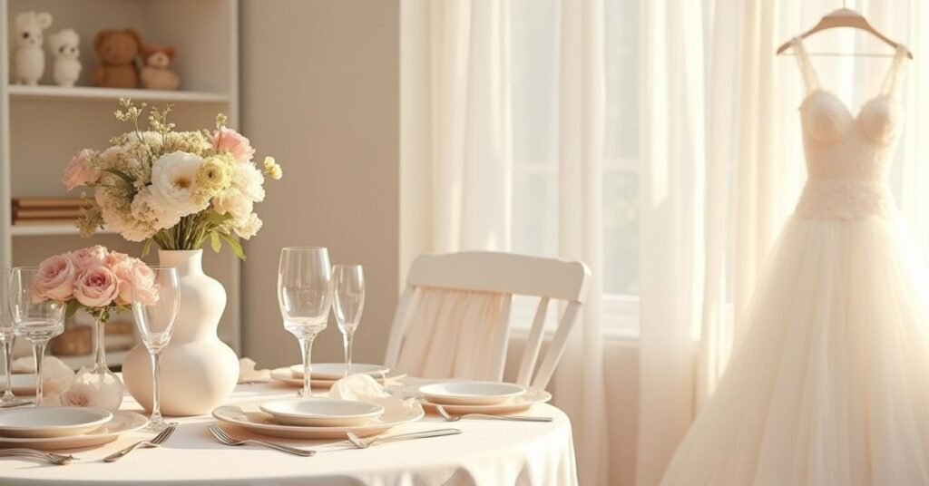
Beige is a top choice for weddings because it is so timeless and classy. It creates a soft and romantic feeling that never goes out of style. Many couples love it because it looks beautiful in outdoor gardens or grand indoor halls. This palette makes the whole event feel calm, elegant, and very high-end.
A beige wedding looks best when you play with different shades like cream, sand, and champagne. You can use beige for the bridesmaid dresses or the table linens to keep things looking clean. Adding small touches of gold or green leaves makes the neutral tones pop beautifully. It is a perfect way to ensure your wedding photos look stunning for years to come.
Stone Beige Neutrals
Stone beige is a cool and sturdy color. It looks like the smooth pebbles you find at the beach. This shade is a mix of light tan and soft gray. It feels very solid and modern. Many people use it to make a room feel quiet and strong. It is a great choice if you want a neutral that is not too yellow.
This color works well in bathrooms and entryways. It looks very clean and high-end. Stone beige helps small spaces feel bigger and more open. It stays looking fresh even as the sun moves across the room. You can use it to create a peaceful home that feels like a spa. Here are some great ways to use stone beige:
- Natural Stone: Use it near marble or granite to match the colors.
- Black Frames: Add black metal mirrors for a sharp, modern style.
- Light Wood: Pair it with ash or pine furniture to keep the look breezy.
- Textured Rugs: A wool rug in this shade adds a cozy feel to a hard floor.
Ocean-Inspired Beige
Ocean-inspired beige is the color of warm sand right where the water hits the shore. It is a light and breezy shade that feels like a summer vacation. This color is very relaxing because it reminds people of the beach and the fresh sea air. It is a great choice for a bathroom or a bedroom where you want to feel calm.
This shade works best when the room has lots of natural light. It makes the walls look like they are glowing under the sun. You can pair it with watery colors to create a peaceful coastal home. It is a simple way to make your house feel more open and bright. Here are some easy ways to use ocean-inspired beige:
- Soft Blues: Use sea-foam green or light blue pillows to match the ocean vibe.
- Natural Wood: Add some driftwood or light oak furniture for a beachy look.
- White Linens: Use white cotton curtains to keep the space feeling airy.
- Shell Decor: Place a few seashells or glass jars on a table to finish the style.
Iced Coffee Beige
Iced coffee beige is a cool and tasty-looking color. It looks like milk swirling into a cold glass of coffee. This shade is a perfect mix of soft brown and creamy white. It feels very modern and fresh in any room. Many people love it because it is not too dark and not too light.
This color makes a room feel very smooth and organized. It is a great choice for kitchens or home offices. Long-lasting style. You can use this shade to create a space that feels both smart and cozy. Here are a few ways to use iced coffee beige:
- Dark Wood: Use dark tables to make the light coffee color stand out.
- White Trim: Paint your doors white to keep the room looking crisp.
- Metal Details: Silver or black handles look great with this cool tone.
- Green Plants: A few leafy plants make the coffee shades feel more alive.
How to Choose the Perfect Beige Color Palettes
Choosing the right beige starts with looking at your light. Some beige paints look yellow in the sun but turn grey in the shade. Always paint a small patch on your wall before you decide. Watch how the color changes from the bright morning to the cozy evening. This helps you avoid a color that looks too muddy or too bright.
Next, think about the mood you want to create. Pick a pink-based beige if you want the room to feel very warm. Choose a stone-based beige if you want a clean and modern look. Mix your favorite shade with different textures like wood or linen to add depth. A good palette should feel comfortable and match the furniture you already own.
Conclusion
Beige is far from boring when you find the right shade. It is a flexible color that brings peace and warmth to any space. Whether you love the coolness of stone or the warmth of caramel, there is a perfect match for you. Using these tones makes your home feel timeless and very welcoming.
Start small by adding beige pillows or a new rug to your room. You will quickly see how much brighter and calmer your home feels. Don’t be afraid to mix different shades together for a rich look. With a little bit of planning, you can create a beautiful home that never goes out of style.
FAQs
1. Is beige a boring color for a home?
Not at all! It is a classic choice that creates a calm, high-end look and acts as a perfect base for your favorite decor.
2. Which beige shade makes a small room look bigger?
Lighter shades like bone beige or cashmere beige reflect more light, which helps a tiny space feel more open and airy.
3. Does beige go well with grey furniture?
Yes, you can pair them by choosing a “greige” or stone beige that shares both warm and cool tones for a balanced look.
4. How do I stop a beige room from looking too flat?
The secret is to mix different textures, such as a chunky knit throw, a wooden coffee table, and soft linen curtains.
5. Can I use beige in a kitchen with white cabinets?
Definitely! Beige walls or backsplashes add a lovely warmth that keeps an all-white kitchen from feeling too cold or clinical.

Welcome to Digital Pin Media! I’m Usama Ijaz, an AI-Powered SEO, and Content Write with 4 years of experience.
I help websites rank higher, grow traffic, and look amazing. My goal is to make SEO and web design simple and effective for everyone.
Let’s achieve more together!