Introduction
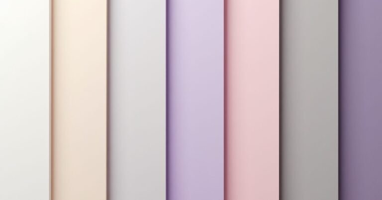
Choosing the right complementary color palette transforms a basic layout into a professional masterpiece. Complementary colors sit opposite each other on the color wheel. This high-contrast pairing creates a vibrant look that naturally draws the eye.
Struggling to make your designs pop? Most people pick colors that blend in too much. You want your audience to stop scrolling immediately. Bold color choices give your brand the energy it needs to stand out from the crowd.
“Complementary Color Palette Inspiration for Modern Designs” explores how to use these dynamic duos effectively. This guide offers fresh ideas for digital branding and sleek interiors. You will learn to balance intense tones for a clean, sophisticated finish.
What Is Complementary Color Palette
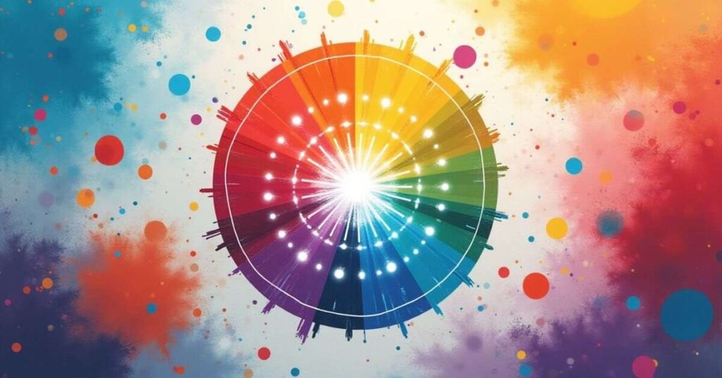
Colors that are complementary are located across from each other on the color wheel. Red and green or blue and orange represent classic examples of these pairings. This setup creates the strongest possible contrast between two different hues. When you place them side by side, each color appears brighter and more intense.
Artists and designers use this palette to make specific elements stand out. One color usually acts as the dominant base while the other provides a sharp accent. This balance prevents the design from looking overwhelming or messy. You get a look that feels both bold and purposeful at the same time.
Complementary Color Palette Basics
Every great design starts with an understanding of how colors interact. Complementary colors represent pairs that live on opposite sides of the color wheel. These sets create a natural “tug-of-war” that catches the human eye instantly. You use one color to anchor the space and the other to add a burst of energy.
This method works because the colors share no common traits. Because they are total opposites, they make each other look more saturated and crisp. Designers often use this trick to guide your attention to important buttons or headlines. Keeping things simple ensures the contrast remains pleasing rather than distracting.
- Blue and Orange: This pair offers a reliable, professional, and energetic feel.
- Red and Green: These colors provide a classic, high-impact look often found in nature.
- Yellow and Purple: This combination feels playful, creative, and luxurious.
- The 70/30 Rule: Use the main color for 70% of the design and the opposite for 30%.
How Complementary Color Palette Works
Complementary colors work by stimulating different parts of your eyes at the same time. Since these colors sit on opposite sides of the color wheel, they possess no shared pigments. Your brain perceives this lack of overlap as a visual “pop.” This high contrast makes the colors appear more vivid than they would on their own.
When you mix these two colors together, they actually cancel each other out. They create a neutral gray or brown tone because they represent the full spectrum of light. In design, photographers and artists use this relationship to create depth. Placing a small amount of a color’s complement nearby makes the main subject look sharp and three-dimensional.
Complementary Color Palette Color Wheel Guide
The color wheel serves as your primary map for finding perfect pairs. You simply pick a color and look directly across the circle to find its partner. This straight line connects two hues that provide the maximum amount of visual contrast. Using this tool takes the guesswork out of choosing colors that naturally demand attention.
Most wheels categorize these pairs into primary, secondary, and tertiary groups. A primary color like yellow always pairs with a secondary color like purple. This relationship creates a sense of balance because the two colors complete each other. Referencing the wheel ensures your modern designs stay grounded in proven color science.
Best Complementary Color Palette Combinations
Certain color pairs stand out because they appear everywhere in nature and modern branding. These classic duos offer a foolproof way to create balance in your projects. You often see blue and orange in movie posters because they create a sense of action and warmth. Sticking to these well-known sets ensures your design feels professional and familiar to your audience.
Experimenting with different shades of these pairs can change the entire mood. You don’t have to use bright, neon versions of these colors to get the effect. A dusty navy blue paired with a soft peach still provides that satisfying complementary contrast. Using varied tones helps you maintain a modern and sophisticated look while keeping the high-energy benefits of the color wheel.
| Color Pair | Mood & Feeling | Common Uses |
| Electric Blue & Bright Orange | Energetic, Bold, Technical | Tech startups, sports branding, action movies. |
| Forest Green & Deep Red | Organic, Traditional, Stable | Luxury packaging, outdoor brands, holiday themes. |
| Royal Purple & Lemon Yellow | Playful, Creative, Luxurious | Children’s brands, high-end candy, creative agencies. |
| Teal & Coral | Fresh, Tropical, Friendly | Travel websites, summer fashion, lifestyle blogs. |
| Navy & Peach | Sophisticated, Calm, Modern | Interior design, wedding invites, professional services. |
| Sage Green & Rose | Soft, Natural, Romantic | Skincare products, floral shops, home decor. |
| Deep Plum & Gold | Elegant, Regal, Rich | Jewelry branding, evening wear, formal event decor. |
Complementary Color Palette Examples
Real-world examples show how these colors create balance in everyday life. You see these pairings in famous logos, famous paintings, and even in your own home. Nature uses complementary colors to make flowers stand out against green leaves. Seeing these pairs in action helps you understand why they feel so satisfying to the eye.
Modern brands use these combinations to grab your attention quickly. A bright orange button on a blue website background practically begs for a click. These choices aren’t accidents; they are strategic moves to guide your focus. Using these established examples can inspire your own creative projects.
- Sports Teams: Many teams use blue and orange or purple and yellow to create a high-energy look on the field.
- Movie Posters: Action movies often use “Teal and Orange” to make actors stand out against dramatic backgrounds.
- Classic Art: Vincent van Gogh used yellow and purple in his famous paintings to create a glowing, emotional effect.
- Holiday Decor: Red and green remain the most famous example of high-contrast colors used for festive themes.
- App Icons: Popular social media and shopping apps use these pairs to ensure their icons pop on your phone screen.
How to Create Complementary Color Palette
Creating your own palette starts with picking one color you truly love. This “base color” sets the mood for your entire design. Once you have your base, find its opposite on the color wheel to get your accent. This simple step ensures your two main colors will always look great together.
You should avoid using both colors in equal amounts. Most designers pick a dominant shade and use the second one for small, important details. This approach creates a clean look that directs the eye without causing strain. Follow these steps to build a professional-looking palette for your next project.
- Pick a Base Color: Start with a color that fits your brand or room.
- Find the Opposite: Look directly across the color wheel to find the perfect partner.
- Adjust the Shades: Mix light and dark versions of these colors to add variety.
- Choose a Dominant Hue: Use your base color for most of the design.
- Apply the Accent: Save the opposite color for buttons, headlines, or decor pieces.
- Add Neutrals: Use white, gray, or black to give the eyes a place to rest.
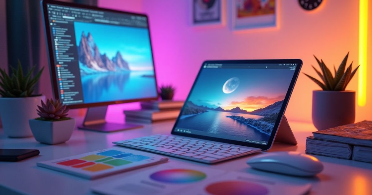
Complementary Colors Tools Online

Finding the perfect pair is easy with the right digital tools. Many free websites allow you to click a single color and instantly see its perfect opposite. These tools often provide the exact codes you need for your website or graphic design software. Using these online resources saves time and ensures your colors match perfectly every time.
New AI-powered tools can even suggest palettes based on the “vibe” of your project. You can upload a photo and let the software extract the best complementary tones for you. This technology helps you discover unique shades that you might not find on a standard color wheel. These tools make professional color theory accessible to everyone, regardless of their design experience.
- Adobe Color: This professional tool offers a specific “Complementary” rule to generate balanced themes.
- Coolors.co: You can press your spacebar to generate random palettes or lock a color to find its complement.
- Canva Color Wheel: This beginner-friendly tool explains the science while you pick your favorite combinations.
- Khroma: An AI tool that learns your personal style to create limitless color pairings just for you.
- Paletton: This site allows you to preview how your chosen colors look on a live website layout.
Complementary Color Palette Design Tips
Using two opposite colors requires a careful touch to avoid visual clutter. You should never let both colors compete for the same amount of space. Instead, treat one color as the star and the other as a supporting actor. This balance keeps your design clean while still providing that famous “pop” of energy.
Testing your colors in different lighting or on various screens is also a smart move. Bright opposites can sometimes vibrate or look blurry if they are too intense. Adding a neutral color like white or soft gray helps separate the bold tones. These small adjustments make your final product look professional and easy on the eyes.
- Use the 60-30-10 Rule: Fill 60% of the space with a neutral, 30% with your base color, and 10% with the complement.
- Avoid Thin Text: Never put small, thin text in a color directly on top of its complement.
- Tame the Vibrancy: Lower the saturation of one color to make the pair feel more sophisticated.
- Watch Your Backgrounds: Stick to a neutral background if your two main colors are very bright.
- Focus on the Call to Action: Use your accent color for the most important button or piece of information.
Complementary vs Split Complementary Palette
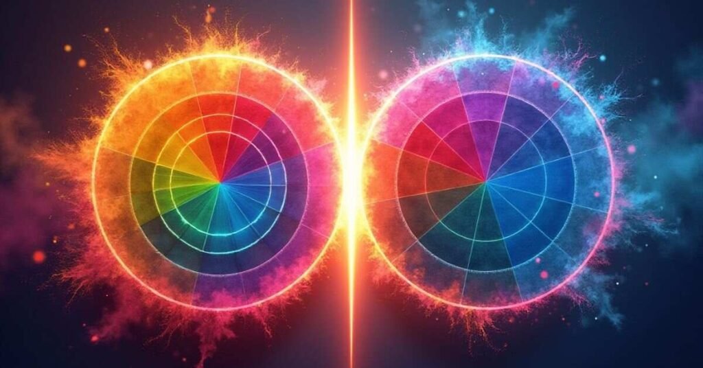
A standard complementary palette uses only two colors from opposite sides of the wheel. This creates a high-contrast look that feels very bold and energetic. In contrast, a split complementary palette uses a base color and the two colors next to its opposite. This choice softens the tension while still giving you a vibrant and colorful result.
Many designers prefer the split version because it offers more variety. You get three colors to work with instead of just two. This makes it much easier to balance your design without making it look too intense or overwhelming. Choosing between them depends on whether you want a sharp, two-tone impact or a more layered, harmonious feel.
| Feature | Complementary Palette | Split Complementary Palette |
| Number of Colors | Two colors. | Three colors. |
| Visual Tension | Very high and vibrant. | Medium; feels more relaxed. |
| Ease of Use | Harder to balance; can be harsh. | Easier for beginners to manage. |
| Contrast Level | Maximum contrast. | High contrast but softer. |
| Best For | Call-to-action buttons and logos. | Main website themes and room decor. |
| Example Pair 1 | Blue and Orange. | Blue with Yellow-Orange and Red-Orange. |
| Example Pair 2 | Red and Green. | Red with Yellow-Green and Blue-Green. |
| Example Pair 3 | Yellow and Purple. | Yellow with Blue-Purple and Red-Purple. |
| Visual Variety | Limited to two hues. | Offers more flexible color choices. |
Common Mistakes in Complementary Color Palette
Many people use two bright colors in equal amounts. This creates a “vibrating” effect that hurts the eyes and looks messy. When both colors compete for attention, the viewer does not know where to look first. You should always let one color lead while the other stays in a supporting role.
Another common error involves placing small text directly over a complementary background. For example, thin red text on a green background is very hard to read for most people. This happens because the high contrast confuses the brain’s ability to see sharp edges. Adding a neutral border or picking a different shade solves this problem instantly.
- Using 50/50 Proportions: Avoid splitting the space equally between your two main colors.
- Ignoring Saturation: Bright neon opposites can be overwhelming; try using a muted version of one color.
- Forgetting Neutrals: Not using white, black, or gray makes the design feel crowded and loud.
- Bad Accessibility: High-contrast pairs can be difficult for people with color blindness to distinguish.
- Too Many Pairs: Stick to one set of opposites rather than mixing multiple complementary pairs in one project.
When to Use Complementary Color Palette
Use a complementary palette when you want to grab someone’s attention immediately. This color scheme works best for call-to-action buttons like “Buy Now” or “Sign Up.” The high contrast ensures that your most important message jumps off the page. It creates an energetic feel that keeps the audience engaged with your content.
This palette also helps when you need to separate two different ideas or areas. You can use it in a large room to define a specific corner or in a chart to show opposing data. Nature uses this trick to make bright berries visible against green leaves. Choose these pairs whenever you want to create a bold, memorable, and high-impact look.
Conclusion
Mastering complementary colors gives you a powerful tool for any creative project. You now understand how opposite hues create balance and excitement in your designs. Start with one favorite color and find its partner to see the magic happen. Small changes in contrast and balance make a huge difference in your final result.
Keep experimenting with different shades to find a look that fits your unique style. Use these tips to guide your readers’ eyes and make your brand stand out. Trust your instincts as you mix and match these dynamic duos. Your next design will surely capture attention and look more professional than ever.
FAQs
Q1. What is a complementary color palette?
A complementary color palette uses two colors that sit directly opposite each other on the color wheel. This combination creates the highest possible contrast and visual energy.
Q2. Can I use more than two colors in this scheme?
You should stick to two main opposite colors to keep the effect strong. However, you can add neutral tones like white, black, or gray to balance the look.
Q3. Why do complementary colors sometimes look like they are vibrating?
Vibration happens when two very bright opposites touch each other. You can fix this by using a muted shade for one of the colors or adding a neutral border.
Q4. What is the best way to balance these colors?
Follow the 70/30 rule by letting one color dominate most of the space. Use the second color sparingly for small accents and important details.
Q5. Are complementary colors good for text?
They work well for large headings, but you should avoid using them for long paragraphs. High contrast between the text and background can strain the reader’s eyes over time.

Welcome to Digital Pin Media! I’m Usama Ijaz, an AI-Powered SEO, and Content Write with 4 years of experience.
I help websites rank higher, grow traffic, and look amazing. My goal is to make SEO and web design simple and effective for everyone.
Let’s achieve more together!