Introduction
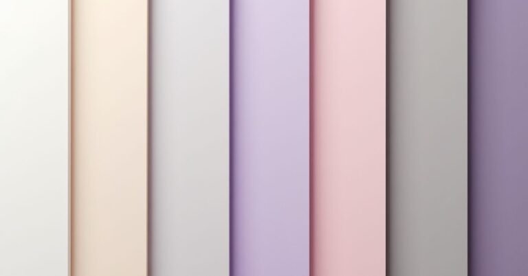
Pastel Color Palette are soft, muted shades that have high lightness and low saturation. They are created by adding a significant amount of white to primary or secondary colors. Think of gentle pinks, pale blues, and creamy mint greens. These tones are known for being soothing and easy on the eyes.
Walking into a room filled with heavy, dark colors can sometimes feel a bit overwhelming. But imagine coming home to a space that feels like a warm hug or a soft summer cloud. Pastels have the magic power to turn a chaotic house into a peaceful sanctuary. They instantly brighten your mood and make even the smallest rooms feel airy and open.
In this guide, we will explore how to mix and match these delicate hues to refresh your living space. From subtle accents to bold wall colors, you will find plenty of inspiration to get started. These ideas will help you create a modern, stylish look that never feels outdated or childish.
Trending Pastel Palettes 2026
The biggest trend this year is a move toward “Sophisticated Pastels” that feel more grown-up and grounded. Instead of the sugary sweet colors of the past, we are seeing deeper shades like Cloud Lavender and Iced Mint. These colors have a touch of gray or earthy undertone, making them look elegant rather than childish. Designers are also embracing Cloud Dancer, a soft, airy off-white that acts as the perfect calm base for any room.
Another favorite for 2026 is the rise of nature-inspired tones like Sage Green and Butter Yellow. These hues bring a sense of the outdoors inside, creating a peaceful and optimistic vibe. Many homeowners are pairing these light tints with natural wood and stone to keep the look modern. Whether you choose a “Cool Blue” for a refreshing feel or a “Dusky Rose” for warmth, these palettes are all about making your home a quiet escape from the busy world.
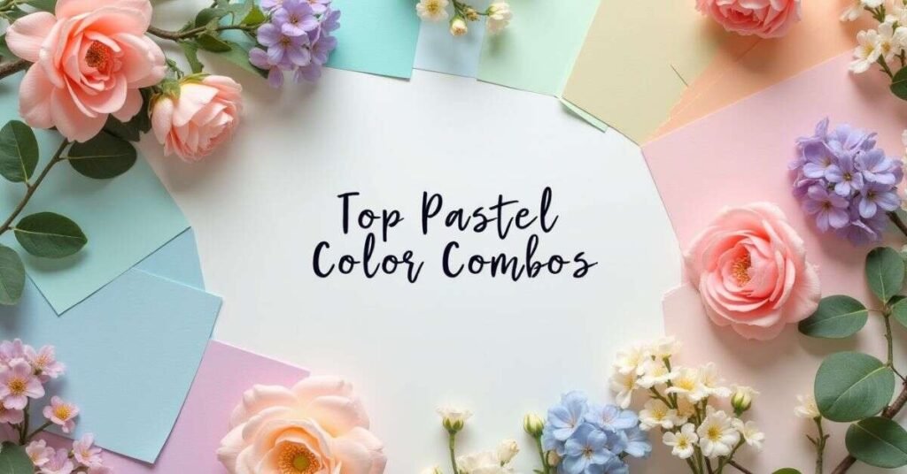
Top Pastel Color Palette Combos
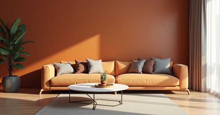
Mixing the right Pastel Color Palette can completely change how a room feels. One of the most popular pairings is mint green combined with soft lavender. This duo creates a refreshing and balanced look that feels very modern. Another classic choice is peach paired with light cream. This combination adds a subtle warmth and a cozy glow to your living space without being too bright or loud.
If you want a more sophisticated vibe, try mixing dusty blue with sage green. These colors look beautiful together because they mimic the natural tones of the sky and the trees. For a bit of personality, you can also add a few pops of soft yellow to brighten things up. Here are a few more popular combinations to consider:
- Seafoam and Sand: Great for a coastal, breezy atmosphere.
- Blush Pink and Slate Grey: A perfect mix of feminine and grounded tones.
- Lemon Chiffon and Sky Blue: Ideal for a cheerful and sunny kitchen.
- Lilac and Warm White: Creates a clean, dreamy, and airy aesthetic.
Pastel Color Palette Ideas for Designers
Designers often use pastels to create a brand identity that feels approachable and trustworthy. These light shades work well because they don’t compete with the content on the screen. For a tech-focused project, a mix of “Electric Blue” and soft “Glacier Mint” can feel both innovative and calm. If the design is for a lifestyle or wellness brand, using “Warm Terracotta” alongside “Powder Pink” creates a sense of comfort and human connection.
When building a layout, consider using a single pastel color with different levels of transparency. This creates a monochromatic look that is very easy on the eyes and looks professional. You can also pair a light pastel background with dark, high-contrast text to ensure your work is easy to read. Adding a “Honey Gold” or “Soft Coral” accent can help highlight important buttons or links without breaking the gentle aesthetic of your project.
Create Your Pastel Color Palette Online
Building a custom Pastel Color Palette is easier than ever with the help of free online tools. Websites like Coolors and Adobe Color allow you to generate soft color schemes with just a click of a button. You can start with a single color you love and let the AI suggest matching tones that stay in the same gentle family. Many of these platforms even let you upload a favorite photo to pull out its most beautiful, muted shades automatically.
These digital tools are perfect for testing how colors look together before you commit to buying paint or decor. You can save your favorite palettes, copy the specific color codes, and share them with friends or designers. Using a generator ensures that your chosen tints have the right balance of lightness and soft saturation. This takes all the guesswork out of the process and helps you build a professional-looking palette in minutes.
Pastel Color Palette Codes Table
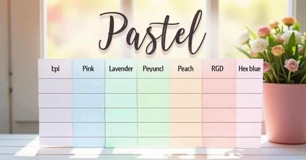
Finding the exact Pastel Color Palette you want is much easier when you have the right digital codes. Each pastel color has a specific HEX code that tells your computer or printer exactly which tint to use. These codes ensure that your “Soft Peach” or “Mint Green” looks the same on your screen as it does in your final project. Using a table is the best way to keep these numbers organized so you can quickly copy and paste them into your favorite design tools.
This table includes a variety of popular shades ranging from cool blues to warm pinks. You can use these values for your website, social media graphics, or even when ordering custom home decor online. Having these codes at your fingertips helps you maintain a consistent and professional look across all your dreamy designs.
| Color Name | HEX Code | Mood & Feeling |
| Cloud Lavender | #E6E6FA | Calm and dreamy |
| Iced Mint | #F5FFFA | Fresh and clean |
| Sage Green | #B2AC88 | Natural and grounded |
| Butter Yellow | #FFF6D5 | Cheerful and sunny |
| Dusty Rose | #DCAE96 | Warm and elegant |
| Sky Blue | #87CEEB | Open and airy |
| Peach Puff | #FFDAB9 | Soft and cozy |
| Lemon Chiffon | #FFFACD | Bright and happy |
| Seafoam Green | #93E9BE | Relaxing and coastal |
| Powder Pink | #FFB2D1 | Gentle and sweet |
| Cloud Dancer | #F0EEE9 | Neutral and light |
| Slate Grey | #708090 | Balanced and modern |
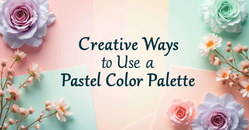
Creative Ways to Use a Pastel Color Palette
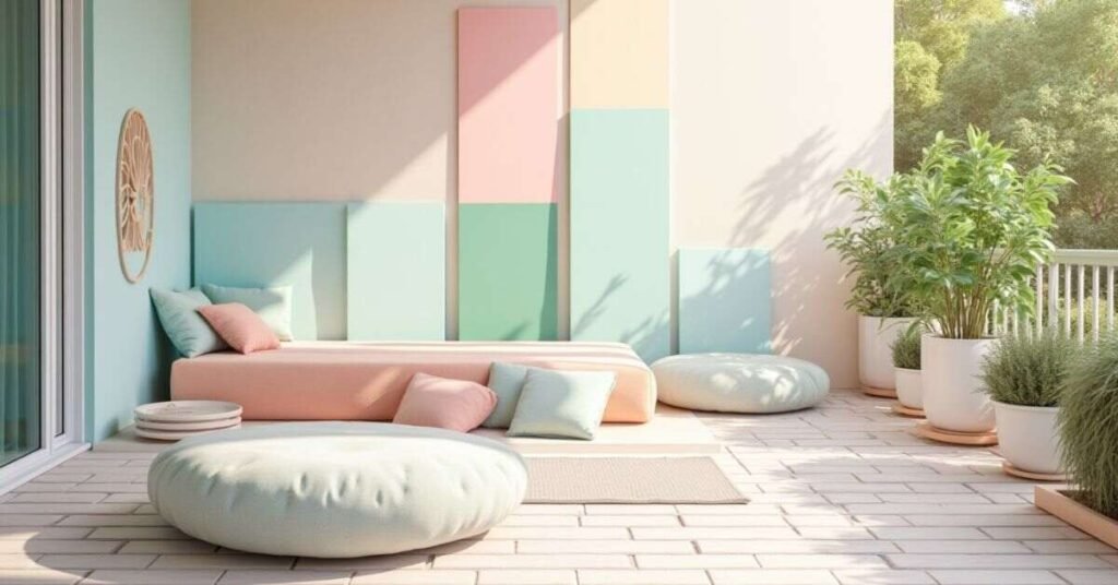
You do not have to paint every wall to enjoy the beauty of Pastel Color Palette. A great way to start is by adding small pops of color through your accessories. You can place soft mint cushions on a grey sofa or hang a pale lavender frame on a white wall. These tiny changes add a sense of freshness without making the room feel too colorful. It is a simple trick to make any space look professionally designed with very little effort.
Another creative idea is to use Pastel Color Palette in unexpected places like your kitchen or hallway. You could try painting a wooden chair in a soft butter yellow or using peach-colored towels in a white bathroom. Even adding a collection of pastel-toned ceramic pots for your indoor plants can make a huge difference. These light shades work perfectly for DIY projects because they are very forgiving and easy to blend. Here are a few more fun ways to use them:
- Layering Textiles: Mix different pastel blankets and rugs to add depth and texture.
- Accent Furniture: Paint a single nightstand or shelf in a soft seafoam green.
- Gallery Walls: Use art prints that feature muted tones to create a calming focal point.
- Natural Elements: Combine your pastel decor with light wood or wicker for a natural look.
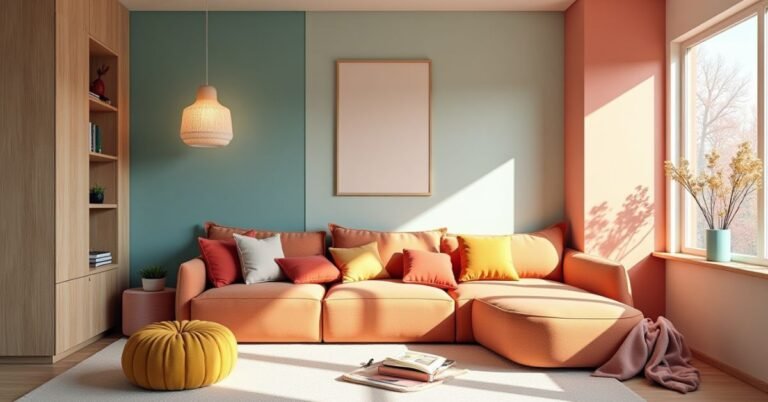
Beautiful Pastel Color Palette Photos & Examples
Looking at real-life examples is the best way to see how pastels can transform a home. Many modern living rooms now feature soft blush sofas paired with sage green accents to create a space that feels both calm and stylish. You might see photos of a “Sunlit Pastel Lounge” where pale blue walls catch the natural morning light, making the entire room glow. These examples show that using muted tones does not mean your home has to look like a nursery. Instead, it creates a sophisticated and airy environment that feels like a peaceful retreat.
Photography also highlights how well pastels work with different textures and materials. You can find beautiful images of “Iced Mint” kitchen cabinets matched with warm wood floors or “Cloud Lavender” bedrooms with soft, layered blankets. Some of the most popular photos for 2026 show “Sunset Pastels” like butter yellow and dusty rose used in sunny reading nooks. These visual ideas prove that even a small pop of color, like a single pastel chair or a few colorful pillows, can make a huge impact. Seeing these designs in action helps you visualize exactly how to bring that dreamy, coordinated look into your own house.
Trending Pastel Color Palette
The most popular Pastel Color Palette this year are moving away from bright, sugary tones toward more grounded and “muddy” shades. These colors feel more sophisticated and adult because they often have a tiny hint of gray or brown mixed in. For example, a soft mineral green or a dusty lavender can make a room feel calm and fresh without looking like a nursery. Many designers are using these “Sunwashed” tones to create spaces that feel like a quiet escape from the busy digital world.
Nature is the biggest inspiration for these new color trends. You will see a lot of earthy pastels like sage green, sandy beige, and soft terracotta that bring the feeling of the outdoors inside. These palettes work beautifully because they are easy on the eyes and help you feel more connected to the natural environment. To keep your home looking modern and stylish, try focusing on these top combinations:
- Sunwashed Sage: A soft, silvery green that looks great with light wood furniture.
- Mellow Blue: A clear, sky-like blue that makes small rooms feel open and airy.
- Dusty Rose: A muted, sophisticated pink that adds warmth to a living room or bedroom.
- Butter Yellow: A gentle, creamy yellow that brings a touch of sunshine to kitchens.
- Cloud Lavender: A pale purple with a gray undertone for a very peaceful atmosphere.
Popular Combinations
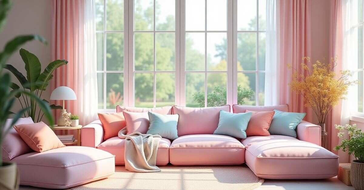
Mixing the right Pastel Color Palette can make your home feel both balanced and professionally styled. One of the most loved combinations for 2026 is “Sage and Sand,” which pairs a soft mineral green with a warm, creamy beige. This duo works perfectly because it brings the calming colors of nature right into your living room. Another popular choice is “Lavender and Slate,” where a pale purple meets a gentle gray. This mix is excellent for bedrooms because it feels very quiet and sophisticated without being too bright.
If you want a look that feels a bit more cheerful, try combining “Peach and Sky Blue.” These two shades mimic the colors of a soft morning sunrise and instantly make a kitchen or sunroom feel more inviting. Many designers are also loving “Mint and Soft Ivory” for a clean and crisp aesthetic that never goes out of style. No matter which pair you choose, the key is to balance a cool tone with a warm one to keep the space feeling cozy. These simple combinations are a great way to add personality to your home while keeping the overall vibe peaceful and light.
Design & Fashion Ideas
Pastel Color Palette are not just for home decor; they are also taking over the world of design and fashion. Many brands are moving away from dark colors to use soft mint and pale peach for their logos and websites. This choice makes a company look friendly, modern, and very easy to trust. In fashion, wearing an entire outfit in one pastel shade, like a soft lavender suit or a sage green dress, is a huge trend for 2026. These light colors look great on everyone and bring a sense of calm energy to your everyday style.
You can also use these dreamy tones to highlight your own creative projects. Using pastel accents in your digital art or social media posts helps your content stand out while remaining gentle on the eyes. In your wardrobe, you can start by adding small accessories like a butter yellow bag or a sky blue scarf to brighten up a neutral outfit. These colors are very versatile and work well for both casual weekend looks and professional office wear. Here are a few creative ways to bring these tones into your life:
- Monochrome Outfits: Wear different shades of the same pastel color for a high-fashion look.
- Minimalist Branding: Use a soft “Cloud Dancer” white with one pastel accent for a clean brand identity.
- Pastel Accessories: Add a pop of color with soft-toned sneakers or light-framed glasses.
- Nature-Inspired Prints: Choose floral or leaf patterns that feature muted greens and pinks.
Conclusion
Choosing a Pastel Color Palette is a wonderful way to make your home feel like a calm sanctuary. These soft colors do more than just look pretty on your walls. They actually help you feel more relaxed and happy every time you walk through the door. You don’t need to be an expert to make these shades work for you. Just pick a few colors that make you feel peaceful and start adding them to your favorite rooms.
The best part is that you can start small with just a few pillows or a simple piece of art. As you get more comfortable, you can mix and match different tones to find your own unique style. There are no wrong answers when it comes to creating a space that makes you feel good. With these dreamy colors, you can easily turn any house into a bright and airy home that you truly love.
FAQs
Q1. What are the best pastel colors for a small room?
Light shades like sky blue and mint green are perfect because they reflect light. These colors make a small space feel much larger and more open.
Q2. Can I use pastel colors in a modern living room?
Yes, you can pair muted pastels like sage green with black or gold accents. This creates a sophisticated look that feels both trendy and mature.
Q3. Do pastel colors go well with dark furniture?
Absolutely, as pastels provide a beautiful contrast to dark wood or metal. A soft lavender or peach wall can make dark furniture stand out without feeling heavy.
Q4. How do I stop a pastel room from looking like a nursery?
Try using “muddy” pastels that have gray or earthy undertones instead of bright candy colors. Adding natural textures like wood and stone also adds a grown-up feel.
Q5. Which pastel color is best for a relaxing bedroom?
Soft lavender and dusty blue are the best choices for a peaceful sleep environment. These cool tones are known for their calming effect on the mind and body.

Welcome to Digital Pin Media! I’m Usama Ijaz, an AI-Powered SEO, and Content Write with 4 years of experience.
I help websites rank higher, grow traffic, and look amazing. My goal is to make SEO and web design simple and effective for everyone.
Let’s achieve more together!