Introduction
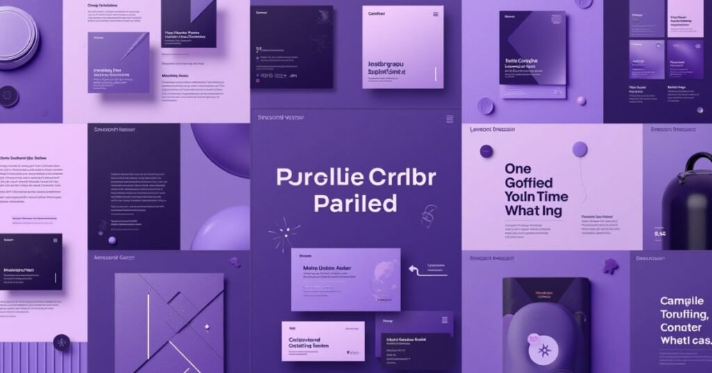
Purple Color Palette is a special color that combines the calm of blue with the passion of red. In design, it is the ultimate symbol of luxury, creativity, and mystery. It comes in many forms, from soft, pale lavenders to dark, royal grapes. This makes it a very flexible tool for anyone looking to create something beautiful and unique.
Have you ever wondered why some designs feel more “magical” or high-end than others? Most of the time, the secret is in the colors. While many people play it safe with grey or blue, choosing purple shows you are bold and imaginative. It is a color that grabs attention and makes your work stand out from the crowd immediately.
This guide provides fresh ideas for using a purple color palette in modern projects. We will look at different shades and see how they work in branding, home decor, and fashion. You will learn which colors pair best with purple to create a look that is both professional and creative.
Purple Color Palette Color Scheme Ideas
Choosing the right shade of purple can completely change the mood of your project. Light purples like lilac feel soft and friendly, making them great for wellness brands. On the other hand, dark purples like eggplant feel serious and expensive. When you mix purple with other colors, you create a specific “vibe” that speaks to your audience without using words.
Modern designs often use purple to look tech-forward or artistic. You can pair it with bright yellow for high energy or with soft grey for a professional look. The key is to balance the strength of the purple so it doesn’t overwhelm the eyes. Use the table below to find a combination that fits your specific creative needs.
| Style | Color 1 | Color 2 | Color 3 | Best Use Case |
| Royal Luxury | Deep Plum | Gold | Cream | Jewelry or High-end Branding |
| Cyberpunk | Electric Purple | Neon Blue | Hot Pink | Gaming & Tech Websites |
| Soft & Airy | Lavender | Mint Green | Soft White | Wedding Invites or Skincare |
| Modern Corporate | Indigo | Slate Grey | Sky Blue | App Interfaces & Dashboards |
| Earth Lavendar | Muted Purple | Sage Green | Sand | Interior Design & Eco-brands |
| Bold Contrast | Royal Purple | Lemon Yellow | Dark Charcoal | Sports Teams & Posters |
Deep Purple Color Palette Inspiration
Deep purple is a powerful color that feels heavy and grounded. It reminds people of expensive velvet, midnight skies, and vintage wine. Using these darker shades adds a sense of authority and depth to any design. It is the perfect choice if you want your project to feel serious but still very creative.
To make deep purple work, you should pair it with the right accents. It looks amazing when sitting next to metallic copper or bright white to create a sharp contrast. Because it is so dark, it works beautifully as a background color for websites or high-end packaging. It gives your work a polished, finished look that feels both classic and trendy.
Royal Purple Color Palette Shades
Royal purple is the color of kings and queens. It is a very rich and saturated shade. For a long time, this color was hard to make, so it became a symbol of wealth and high status. Using it today makes your design feel prestigious and very special. It commands attention the moment someone sees it.
This palette works best when you want to show power and elegance. You don’t need to use a lot of it to make a big impact. Even small touches of royal purple can make a simple layout look much more expensive. It is a bold choice that stays timeless and classy.
Popular Shades of Royal Purple
- Imperial Purple: A very deep, traditional shade that looks great with gold.
- Tyrian Purple: A reddish-purple that feels ancient and historic.
- Majestic Violet: A bright, vivid purple that pops on digital screens.
- Royal Plum: A slightly darker, warmer tone that feels cozy yet fancy.
- Electric Amethyst: A modern, glowing purple used for creative tech brands.
Lavender Purple Color Palette for Soft Aesthetic Designs
Lavender is a gentle shade that brings a sense of peace and calm. It is much lighter than royal purple and feels very approachable. Many people use it to create a “soft aesthetic” that feels dreamy and clean. It is a favorite choice for beauty products, flower shops, and relaxing apps because it helps the viewer feel at ease.
This color works perfectly when you pair it with other pastels or neutrals. Think of lavender sitting next to soft whites, baby blues, or pale pinks. It creates a look that is modern but not aggressive. Whether you are decorating a bedroom or designing a social media page, lavender adds a touch of sweetness without being too loud.
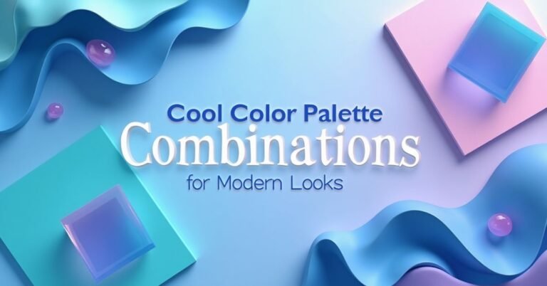
Purple Color Palette Combination Ideas
Mixing purple with other colors is like a fun science experiment. Some colors make the purple look bright and energetic, while others make it feel calm and quiet. The trick is to think about the “temperature” of the colors. If you want a bold look, go for a high-contrast pair. If you want a professional look, stay within the same color family.
A great combination can help tell a story. For example, purple and orange can feel very creative and experimental. Purple and teal often look futuristic or like a deep ocean. By picking the right partners for purple, you can control exactly how people feel when they see your design. Use the table below to see which colors play well together.
| Mood | Primary Purple | Accent Color 1 | Accent Color 2 | Common Usage |
| High Energy | Vivid Violet | Bright Orange | Charcoal | Event posters or sports |
| Ocean Mist | Deep Indigo | Teal | Seafoam Green | Bath products or spas |
| Sunset Glow | Plum | Rose Gold | Soft Peach | Photography or weddings |
| Futuristic | Neon Purple | Cyan | Matte Black | Gaming or app icons |
| Vintage Charm | Dusty Mauve | Sage Green | Cream | Home decor or stationery |
| Professional | Dark Grape | Navy Blue | Silver | Business reports or logos |
| Sweet & Playful | Orchid | Lemon | White | Candy or children’s brands |
Deep Eggplant Purple Color Palette: Bold & Beautiful
Deep eggplant is a very dark, earthy shade of purple. It is much warmer than a standard violet. This color feels sophisticated and grounded at the same time. Because it is so close to black, it works as a great neutral color but with a lot more personality. It is a bold choice for anyone who wants to create a space or a brand that feels solid and high-quality.
This palette looks amazing in modern homes and fashion. It creates a “bold and beautiful” look when you mix it with bright metals or light wood. If you use it on a wall or a website background, it makes everything else on top of it pop. It is the perfect shade for a design that needs to feel cozy, mysterious, and very expensive all at once.
Electric Purple Color Palette: Make a Bold Statement
Electric purple is a high-energy color that grabs attention instantly. It is bright, vivid, and full of life. This shade is much more intense than a soft lavender or a dark plum. It works perfectly for projects that need to feel young, modern, and exciting. When you use electric purple, you are telling the world that your brand is not afraid to be loud and different.
This color is a favorite in the worlds of technology and nightlife. It looks incredible when paired with neon greens or bright cyans for a digital, futuristic look. Because it glows with energy, it is great for buttons, logos, or posters that need to stand out from a distance. If you want to make a bold statement that people won’t forget, electric purple is the way to go.
Romantic Purple Color Palette for a Serene Mood
A romantic purple palette is all about softness and emotion. It uses colors like dusty rose, muted plum, and light mauve to create a peaceful feeling. These shades are not too bright or overwhelming. Instead, they feel like a quiet sunset or a field of flowers. This color scheme is perfect for making people feel relaxed and loved the moment they see your work.
You can use these colors to set a very serene mood in your designs. They work beautifully for wedding invitations, spa branding, or cozy home decor. When you mix these purples with soft creams or warm greys, the whole look becomes very elegant. It is a simple way to bring a sense of grace and calm to any creative project.
Purple Wedding Color Palette Ideas
Purple is a top choice for weddings because it looks beautiful in every season. It can feel very romantic and soft for a spring garden wedding. It can also feel deep and moody for a cozy winter ceremony. Because there are so many shades, you can easily find a purple that matches the exact “feeling” of your big day.
Most couples love purple because it pairs so well with other wedding colors. You can mix it with greens for a natural look or with metallic gold for a royal celebration. It works perfectly for everything from the bridesmaid dresses to the flowers on the tables. It is a classic color that always looks elegant in photos.
Popular Purple Wedding Combinations
- Lavender & Sage Green: Perfect for an outdoor, rustic, or garden wedding.
- The combination of Plum: Antique Gold creates a rich, vintage, and very formal atmosphere.
- Lilac & Silver: A cool and airy mix that feels modern and clean.
- Deep Grape & Dusty Rose: A beautiful, moody palette for fall or winter weddings.
- Amethyst & Bright White: A crisp, high-contrast look that feels very fresh.
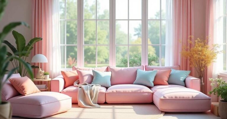
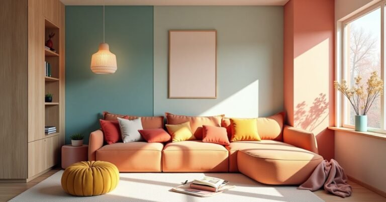
Purple Color Palette Ideas for Bedroom Designs
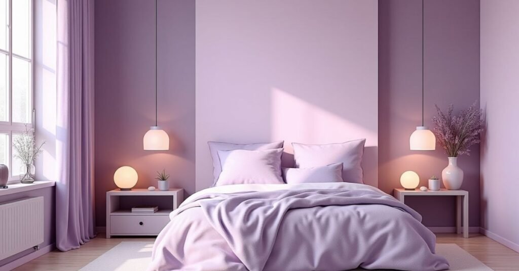
Using purple in a bedroom can turn a simple room into a peaceful retreat. Lighter shades like lilac or thistle help you relax and fall asleep faster. These colors make a small room feel bigger and much more open. It is a great choice if you want your sleeping space to feel like a calm sanctuary away from the busy world.
If you prefer a more dramatic look, dark purples work perfectly for a master suite. Shades like mulberry or raisin add a sense of warmth and luxury. When you use these deeper tones on an accent wall or in your bedding, the room feels cozy and expensive. Color is very flexible, so it can fit any style from modern to vintage.
| Bedroom Style | Main Purple Shade | Accent Color 1 | Accent Color 2 | Atmosphere |
| Modern Minimalist | Soft Lavender | Cool Grey | Crisp White | Clean & Airy |
| Bohemian Retreat | Muted Plum | Terracotta | Mustard Yellow | Creative & Warm |
| Luxury Suite | Deep Eggplant | Champagne Gold | Charcoal | Sophisticated |
| Coastal Zen | Periwinkle | Sand Beige | Soft Teal | Refreshing |
| Vintage Glam | Mauve | Dusty Rose | Antique Brass | Romantic |
| Youthful & Fun | Bright Grape | Mint Green | Pure White | Energetic |
| Dark Moody | Midnight Purple | Slate | Forest Green | Intimate |
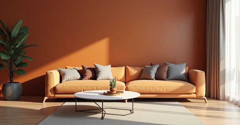
Purple Color Palette Ideas for Outfits & Fashion
Purple is a fantastic color for your wardrobe because it works for every season. In the summer, light purples look fresh and cool under the sun. During the winter, deep purples feel warm and very stylish. Wearing purple is an easy way to show off your creative side while still looking put-together and confident.
You don’t have to wear purple from head to toe to make an impact. You can use it as a bold accent piece, like a scarf or a pair of shoes. It is a very flattering color that works well with many different skin tones. Whether you are dressing up for a party or keeping it casual, purple adds a touch of magic to any outfit.
Stylish Ways to Wear Purple
- Casual Chic: Pair a lavender t-shirt with light blue jeans for a relaxed, everyday look.
- Power Dressing: Use a deep plum blazer with black trousers to look professional and bold.
- Night Out: Match a royal purple dress with gold jewelry for a high-end, glamorous vibe.
- Sporty Style: Mix electric purple leggings with grey sneakers for a modern, high-energy outfit.
- Soft Layers: Combine a mauve sweater with a cream skirt for a gentle and romantic aesthetic.
Purple Color Palette Ideas for Branding
Purple is a “secret weapon” in branding because it combines the trust of blue with the passion of red. Many companies use it to show that they are innovative and imaginative. It often represents high quality and wisdom. When people see a purple logo, they usually think of a brand that is unique and not afraid to lead the way.
Choosing the right shade of purple helps define your brand’s voice. A bright, neon purple works great for a tech startup that wants to look futuristic. A deep, dark purple is better for a luxury brand that wants to feel established and expensive. By picking a purple palette, you tell your customers that your business offers something truly special.
| Industry | Primary Purple | Secondary Color | Accent Color | Brand Personality |
| Technology | Electric Violet | Jet Black | Cyan | Cutting-edge & Bold |
| Beauty & Spa | Soft Lilac | Warm Stone | Pearl White | Relaxing & Clean |
| Finance | Deep Indigo | Silver | Navy | Trustworthy & Wise |
| Creative Agency | Bright Orchid | Sunshine Yellow | Slate | Playful & Original |
| Luxury Goods | Dark Plum | Rose Gold | Cream | Elite & Sophisticated |
| Education | Royal Purple | Forest Green | White | Traditional & Smart |
| App Design | Neon Purple | Hot Pink | Dark Grey | Vibrant & Social |
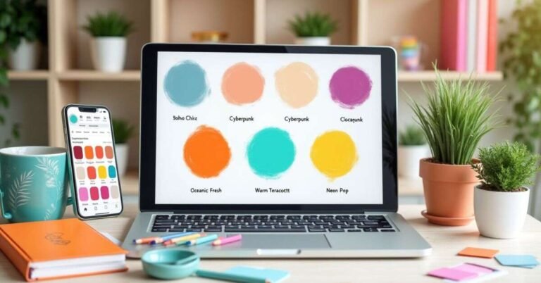
How to Choose and Stay Ahead of Purple Color Palette Trends
To stay ahead of trends, you should look for purples that reflect what is happening in the world. For 2026, designers are moving away from simple shades and toward “Mermaidcore” and “Plum Noir.” These are iridescent, shimmery purples or very dark, moody plums that feel both futuristic and grounded. Keeping an eye on tech, fashion, and nature will help you pick a purple that feels fresh and modern.
Choosing the right palette also means thinking about the emotional message you want to send. If you want to look innovative, try mixing purple with “hyper-gradients” that melt into other colors like orange or blue. To stay relevant, follow design leaders on platforms like Pinterest or Adobe Color. By watching how purple is used in new apps and luxury branding, you can ensure your designs always look one step ahead of the curve.
Conclusion
Purple is a truly amazing color that can fit almost any project. Whether you want something soft and calm or bold and powerful, there is a shade of purple that works for you. It is a great way to show off your creativity and make your designs feel more premium. By experimenting with different combinations, you can find the perfect look for your home, brand, or outfit.
The most important thing is to have fun and be confident with your color choices. Trends will always change, but a well-chosen purple palette stays stylish for a long time. Don’t be afraid to mix things up and try something new. With so many beautiful shades to choose from, you have everything you need to create something truly special and modern.
FAQs
1. What colors pair best with purple for a professional look?
Purple looks very professional when paired with neutral tones like charcoal grey, navy blue, or silver. These combinations feel sophisticated and trustworthy rather than overly playful.
2. Is purple a good color for small rooms?
Yes, lighter shades like lavender or lilac are excellent for small rooms because they reflect light. A tiny space feels more open, airy, and relaxing with these soft tones.
3. Why is purple often associated with luxury and royalty?
Historically, purple dye was very rare and expensive to produce, so only the wealthy could afford it. Today, that connection remains, making it a go-to choice for high-end branding.
4. Can I use purple for a tech or software brand?
Absolutely, especially vibrant “Electric Purple” or neon shades. These colors are popular in tech because they feel futuristic, energetic, and highly innovative.
5. How do I choose between a “warm” and “cool” purple?
Look at the base: reddish-purples like plum are warm and cozy, while bluish-purples like violet are cool and calm. Choose the one that matches the mood you want to create.

Welcome to Digital Pin Media! I’m Usama Ijaz, an AI-Powered SEO, and Content Write with 4 years of experience.
I help websites rank higher, grow traffic, and look amazing. My goal is to make SEO and web design simple and effective for everyone.
Let’s achieve more together!
One Comment