Introduction
A color palette is a curated set of colors used to design a space. In modern homes, it acts as the foundation for your entire aesthetic. It isn’t just about picking a single wall paint, but rather choosing a group of tones that work together across furniture, floors, and decor to create a unified look.
Have you ever walked into a room and immediately felt a sense of calm or a surge of energy? That isn’t an accident; it’s the power of intentional color. The right palette can turn a cluttered-feeling room into a sleek sanctuary or make a small apartment feel like a sprawling loft.
This guide explores how to balance neutral bases with bold accents to achieve a professional look. We will dive into the most popular combinations for 2026, including earthy terracottas, muted “greige,” and deep forest greens. You’ll learn how to pick shades that reflect your personality while keeping your home feeling fresh and timeless.
Best Color Palette Tools for Designers
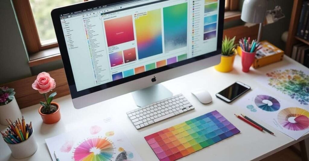
Finding the perfect colors for a project is much easier with the right digital tools. Many designers use online generators to experiment with different shades and contrast levels. These platforms help you see how colors sit next to each other before you apply them to a room or a website. They often provide hex codes or specific paint names so you can stay consistent across your entire design.
Using these tools saves time and prevents expensive mistakes in interior design. Most of them allow you to upload an image of a room and pull colors directly from the furniture or natural lighting. This ensures your new palette matches the existing vibe of the space. Here are some of the most popular tools used by professionals today:
- Coolors: A fast generator that lets you lock specific colors and flip through endless combinations.
- Adobe Color: Great for advanced users who want to explore color theory rules like monochromatic or complementary schemes.
- Canva Color Palette Generator: This is perfect for beginners who want to extract a palette from a favorite inspiration photo.
- Paletton: A technical tool that helps you visualize how colors will look on different layouts and backgrounds.
Best Color Palette Ideas from Top Websites
Leading design websites are shifting away from cold, sterile grays and moving toward “lived-in” warmth for 2026. Top trendsetters like Benjamin Moore and Pantone suggest that a home should feel like a sanctuary, using colors that reduce stress and feel more natural. By following these expert picks, you can create a space that looks modern but feels incredibly cozy and personal.
Current trends from major design hubs emphasize “muddy” tones—shades that have a bit of gray or brown mixed in to make them feel more grounded. These websites recommend starting with a soft, warm neutral and layering in deeper colors to add character. If you are looking for inspiration, here are some of the top-rated ideas currently dominating the best design blogs:
- Warm “Cremèle” Neutrals: These off-whites and creamy beiges are replacing bright white to make rooms feel softer and more inviting.
- Restorative Greens: From misty mint to deep olive, these shades are used to bring the calming feeling of nature indoors.
- Moody Blues & Teals: Experts are using these “introspective” colors in bedrooms and offices to help with focus and mental balance.
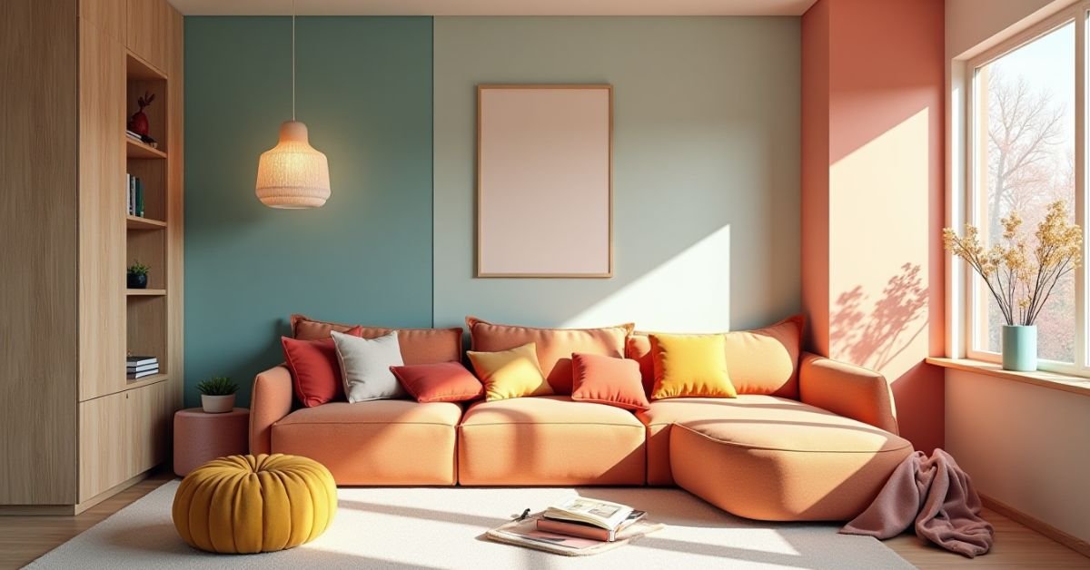
- Sunset & Earth Tones: Terracotta, burnt orange, and “dusty rose” are trending as perfect accent colors to add energy without being too loud.
How to Create the Best Color Palette Easily
Creating a beautiful color scheme doesn’t have to be complicated or stressful. You can start by picking one “hero” color that you absolutely love for your space. Once you have that main shade, look for two or three supporting colors that make it stand out without clashing. Using a simple 60-30-10 rule helps keep everything balanced so the room feels professional and intentional.
The secret to a great palette is testing your colors in different lighting throughout the day. Natural sunlight can change how a paint or fabric looks, making it appear warmer or cooler than expected. If you are feeling stuck, try pulling inspiration from a favorite piece of art or even a photo of a garden. Here are a few easy steps to build your own palette from scratch:
- Start with a Neutral: Choose a soft white, beige, or light gray to act as the primary backdrop for your room.
- Pick a Dominant Color: This is your favorite hue that will appear in larger items like rugs or accent walls.
- Add a High-Contrast Accent: Use a small amount of a bold or dark color to create visual interest and depth.
- Check the Texture: Remember that the same color can look different on a velvet pillow versus a wooden table.
Palette Generators You Should Try
Modern designers and homeowners are lucky to have powerful digital tools that make choosing colors a breeze. These generators use smart technology to suggest shades that naturally look good together, saving you from the stress of trial and error. Whether you are starting with a blank slate or trying to match a specific piece of furniture, these platforms provide instant inspiration and professional-grade results.
Many of these tools now include features that show how your chosen colors will look in a real room or on a digital layout. This “live preview” helps you catch any clashing tones before you ever pick up a paintbrush or buy new decor. If you are looking for the best places to start your color journey, here are some top-rated generators to explore:
- Coolors: This is a fan favorite for its speed; you simply hit the spacebar to generate thousands of unique palettes instantly.
- Khroma: An AI-powered tool that learns your personal style and creates limitless combinations based on the colors you already love.
- Adobe Color: The go-to choice for professionals who want to use advanced color theory and sync their palettes with design software.
- Huemint: A revolutionary generator that shows your palette applied to actual mockups of websites or room graphics so you can see the final vibe.
- Color Hunt: A beautifully curated collection of hand-picked palettes where you can browse the most popular and trending themes of the year.
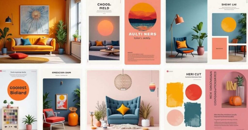
Best Color Palette Trends for Modern Design
The world of modern design is moving toward a mix of bold expression and deep comfort. For 2026, the trend is shifting away from flat, cold grays to more “human” and layered tones. Designers are focusing on colors that not only look good on a screen but also make a physical room feel more welcoming and lived-in. This means we are seeing a blend of futuristic, tech-inspired hues alongside very traditional, earthy shades.
One major trend this year is the rise of “Nature-Fusion” palettes, which combine organic greens with warm, sandy neutrals. People are also embracing “Moody Sophistication” by using deep burgundies and charcoals to create cozy, private nooks. Whether you prefer a bright, energetic space or a quiet sanctuary, these trending combinations are dominating the design world right now:
- Warm Sand & Khaki: Replacing cool whites to provide a softer, more grounded foundation for living rooms.
- Sage & Olive Greens: These remain a top choice for kitchens and bedrooms to bring an outdoor feel inside.
- Dark espresso & charcoal: Used as “new neutrals” to add drama to accent walls or furniture.
- Persimmon & Terracotta: These spicy, sun-baked oranges are perfect for adding a pop of energy and warmth.
- Plum & Dusty Rose: A sophisticated take on pastels that feels mature and elegant rather than sugary.
Best Color Palette for Websites and Branding
Choosing the right colors for a website is a vital step in building a strong brand identity. Your palette tells a story before a visitor even reads a single word on your page. Most successful brands use a primary color to show their personality and a few neutral tones to keep the layout clean. High-contrast colors are also important because they help buttons and links stand out so people know where to click.
A great branding palette should feel consistent across your site, social media, and even your logo. Using too many bright colors can overwhelm a reader and make your content hard to follow. It is often best to stick to two or three main shades that reflect the mood of your business. Whether you want to look professional and trustworthy or fun and creative, your color choices will guide how people feel about your work.
Best Color Palette Combinations That Always Work
Some color pairings are classic because they naturally balance each other out. These “fail-safe” combinations work in almost any setting, from a cozy bedroom to a professional website. They rely on basic color theory, like placing a warm tone next to a cool one to create a pleasing contrast. When you use these tried-and-true matches, you don’t have to worry about your design feeling messy or outdated.
The key to a successful combination is making sure one color is clearly the “star” while the others provide support. Most professionals suggest using a neutral base and then adding one or two pops of color to keep things interesting. This approach makes a space or a brand feel cohesive and easy on the eyes. Here are a few iconic pairings that designers turn to time and time again:
- Navy Blue and Crisp White: This is a timeless look that feels clean, professional, and very sophisticated.
- Sage Green and Warm Beige: A perfect choice for a natural, earthy vibe that makes any room feel like a garden.
- Charcoal Gray and Mustard Yellow: A modern favorite that balances a moody dark tone with a bright, happy energy.
- Terracotta and Cream: These sun-baked tones bring a sense of warmth and comfort to a home or a blog.
- Soft Black and Wood Tones: This combination adds a high-end, organic feel that never goes out of style.
Best Color Palette Tips for Beginners
Picking colors for the first time can feel a bit overwhelming, but starting small is the best way to learn. You don’t need to be a professional artist to create a look that feels balanced and intentional. A great trick is to look at the world around you for inspiration, like the colors in a sunset or a favorite piece of clothing. If you stick to a few simple rules, you can avoid common mistakes and make your design look polished.
One of the most helpful tips is to limit your palette to just three or four colors at first. Using too many different shades can make a room or a website feel messy and confusing. It is also important to think about the “mood” you want to create before you start picking out paints or digital hex codes. Here are a few easy-to-follow tips that every beginner should keep in mind:
- The 60-30-10 Rule: Use your main color for 60% of the space, a secondary color for 30%, and a bold accent for the final 10%.
- Use Neutral Bases: Start with a calm background like white, beige, or light gray to let your brighter colors shine.
- Check the Lighting: Always look at your color samples in both morning and evening light to see how they change.
- Test Before Committing: Paint a small patch on the wall or create a digital mood board to see the colors side-by-side.
Best Color Palette Examples from Real Designers
Professional designers often look to the natural world to find balance in their work. In 2026, many experts are moving away from cold, flat colors in favor of “muddy” and grounded tones that feel more authentic. They use these palettes to create rooms that tell a story and feel cozy the moment you walk in. By looking at real-world examples, you can see how a simple change in shade can completely transform the energy of a home.
Top designers are currently favoring combinations that mix soft neutrals with deep, rich accents. They often recommend using a warm, off-white or “sandy” base to keep the room feeling light and airy. Then, they layer in darker colors like olive green or charcoal to add a sense of luxury and depth. Here are some of the most popular designer-approved palettes trending this year:
- The Nature Retreat: A mix of Sage Green, Warm Beige, and Dark Oak. This is a favorite for living rooms to create a calming, organic vibe.
- The Modern Luxe: Using Charcoal Gray, Soft Gold, and Creamy White. Designers use this for high-end offices or master bedrooms to feel sophisticated.
- The Sunbaked Sanctuary: A combination of Terracotta, Dusty Rose, and Sand. This is perfect for kitchens or entryways to feel welcoming and warm.
- The Deep Contrast: Pairing Navy Blue with Tan and Brass accents. This classic look is often used in dining rooms for a timeless, professional finish.
Best Color Palette Mistakes to Avoid
Even with the best intentions, it is easy to make choices that make a room feel “off” or cluttered. One of the biggest mistakes is picking too many bold colors that compete for your attention. This can make a space feel smaller and much more stressful than it needs to be. Another common slip-up is choosing your paint color in the store without seeing how it looks in your own home’s lighting.
Another error people often make is forgetting about the “visual weight” of a room. If all your dark colors are on one side, the space will feel tilted and unbalanced. It is also important to remember that colors look different on a small swatch than they do on a giant wall. To keep your design looking professional and clean, try to avoid these frequent pitfalls:
- Ignoring Natural Light: A color that looks bright in a sunny shop might look very dark and moody in a small hallway.
- Matching Everything Perfectly: Using the exact same shade for your walls, pillows, and rug can make a room feel flat and boring.
- Forgetting the 60-30-10 Rule: Using too much of a bright accent color can quickly overwhelm the senses.
- Choosing Paint First: It is much easier to match paint to your favorite rug or sofa than it is to find furniture that matches a specific wall color.
- Neglecting the “Flow”: Using completely different palettes in every room can make a home feel disjointed and choppy.
Conclusion
Choosing the right color palette is all about finding a balance that makes you feel at home. It might take a little bit of experimenting, but the process should be fun and creative. Remember that there are no strict rules, only helpful guides to keep your space feeling cohesive. As long as you pick colors that reflect your own personality, your home or project will look amazing.
Start with a few basic tones and slowly add in the accents that catch your eye. You can always change a paint color or a cushion later if your style begins to evolve. The most important thing is to create an environment that feels comfortable and welcoming to you. With these tips and tools in mind, you are ready to design a space that is both modern and timeless.
Frequently Asked Questions
1. What is the easiest way to start a color palette? Pick one “hero” color you love from a rug or a favorite photo. Then, add two neutral shades like beige or light gray to balance it out.
2. How many colors should I use in one room? It is best to stick to three or four colors to keep the space from looking messy. Use the 60-30-10 rule to distribute them perfectly.
3. Does light change how paint looks on my walls? Yes, natural sunlight makes colors look warmer, while artificial bulbs can make them look cooler. Always test a small patch at different times of the day.
4. Can I use dark colors in a small room? You definitely can, as long as you have good lighting and light-colored furniture. Dark colors like navy or charcoal can make a small room feel cozy and expensive.5. What are the most popular colors for modern homes right now? Earthy tones like sage green, terracotta, and warm “cremèle” whites are very trendy. These colors help create a natural and relaxing sanctuary.

Welcome to Digital Pin Media! I’m Usama Ijaz, an AI-Powered SEO, and Content Write with 4 years of experience.
I help websites rank higher, grow traffic, and look amazing. My goal is to make SEO and web design simple and effective for everyone.
Let’s achieve more together!