Introduction
Choosing the right Color Palette Ideas for your social media posts is more than just a design choice. A color palette is a specific set of colors that work together to create a certain look and feel for your brand. When you use the same colors consistently, it helps people recognize your content instantly as they scroll through their busy feeds.
Think about the last time a post really caught your eye and made you stop scrolling. It likely used a “Color Palette Ideas for Social Media Graphics” strategy that felt fresh, bold, or perfectly balanced. Using the right shades can actually make people feel happy, calm, or excited about what you have to say.
In this guide, we are going to look at some of the best color combinations you can use right now. We will explore how different colors change the mood of your page and help your message stand out. These simple ideas will help you create beautiful graphics that look professional and keep your followers engaged.
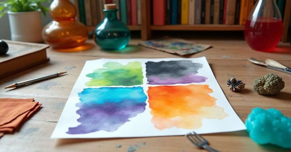
Best Color Palette Ideas 2026
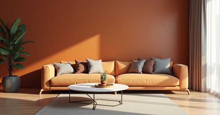
The year 2026 is all about a mix of calm nature and bright digital energy. One of the top trends is called “Transformative Teal,” which is a deep blue-green that feels both stable and modern. Many designers are also using “Cloud Dancer,” a soft off-white that makes any graphic look clean and fresh. These colors help your social media page feel professional while keeping your audience relaxed.
If you want your posts to pop, try adding a splash of “Electric Fuchsia” or “Wasabi” green. These high-energy colors work great against dark backgrounds to create a glowing effect. You can also stick to earthy tones like rich browns and warm terracottas for a more grounded look. Mixing these bold accents with soft neutrals is the secret to making your graphics stand out this year.
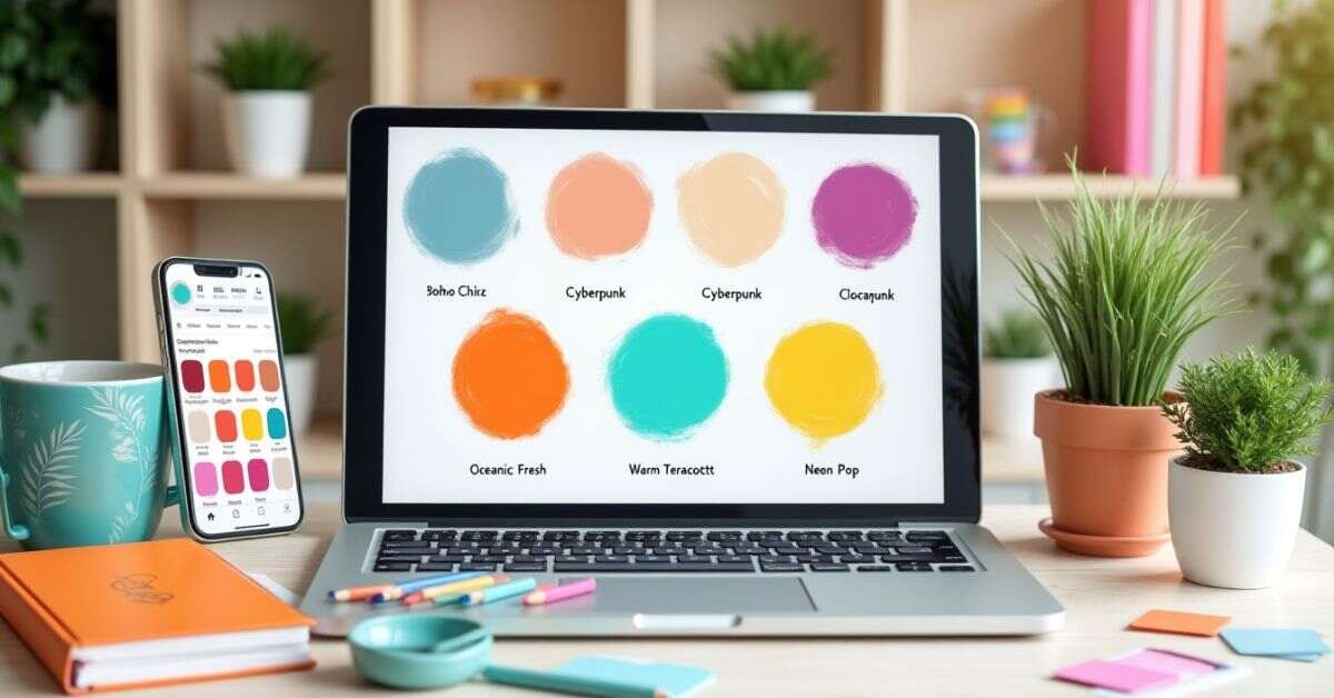
Trending Color Palette Ideas
Modern trends are moving toward a mix of natural vibes and bright digital pops. Many creators are choosing soft, “earthy” tones like sage green and warm sandy beige to make their pages feel calm. These colors help people feel relaxed while they scroll through their busy feeds. Adding a deep charcoal or a soft off-white can make your text easy to read and very professional.
If you want to grab attention quickly, you can try mixing these calm colors with one or two “neon” accents. Using a bright electric blue or a soft sunset orange can make your graphics look fresh and modern. These trending combinations work well for almost any brand because they feel both grounded and exciting. Here are a few popular ideas to try for your next design:
- Soft Sage and Warm Sand: Perfect for a clean, natural look.
- Deep Navy and Bright Gold: Great for feeling bold and high-end.
- Pastel Pink and Cool Teal: A fun, friendly mix that pops on screen.
- Terracotta and Cream: Gives a cozy, handcrafted feel to your posts.
Simple Color Palette Ideas
Creating a great look does not have to be complicated. You can start with just two or three colors that look good together. Using simple combinations makes your brand feel clean and organized. It also helps your followers recognize your posts quickly. Many successful creators stick to one main color and a neutral shade like white or light gray.
Using a simple palette keeps your graphics from looking cluttered or messy. You can choose a “monochrome” style, which means using different shades of the same color. This creates a very smooth and professional appearance. If you want something more energetic, try a bright color paired with a very dark one. Getting started is easy with these ideas:
- Classic Blue and Crisp White: This is a timeless choice that feels very trustworthy.
- Forest Green and Soft Tan: A great way to give your page a natural, organic vibe.
- Sunny Yellow and Charcoal Gray: This mix feels happy but still looks very modern.
- Soft Lavender and Clean Cream: Perfect for a gentle and friendly brand look.
Modern Color Palette Ideas for UI
Modern user interface design is all about balance and clarity. Many apps and websites are moving toward “Soft Dark Mode” by using deep charcoals instead of pure black. This makes the screen much easier on the eyes for long periods. Designers often pair these dark tones with a single, vibrant “accent” color like a glowing electric purple or a bright mint green. This helps the most important buttons and links stand out clearly to every visitor.
Another popular style for 2026 is the “Glassmorphism” look, which uses semi-transparent layers. This trend works best with soft, pastel gradients in the background, like a mix of peach and sky blue. Using these light, airy colors makes a digital space feel open and friendly. When you use subtle shadows and clean white text on top of these colors, the whole interface looks very polished and high-end.
Color Palette Ideas for Branding
Your brand colors tell a story before anyone reads a single word. Most successful brands choose one “hero” color that represents their main personality. For example, a deep navy blue can make a company feel very trustworthy and solid. Many creators then add a softer neutral like light gray or cream to keep the design looking clean. This simple balance helps your brand look professional and organized across every platform.
It is also important to pick one bright “action” color that grabs attention quickly. A splash of coral or a vibrant lime green works perfectly for buttons or important announcements. These bold accents help your followers know exactly where to look first. When you use these same colors every time you post, people will start to recognize your brand instantly. This consistency is the best way to build a loyal audience that remembers your work.
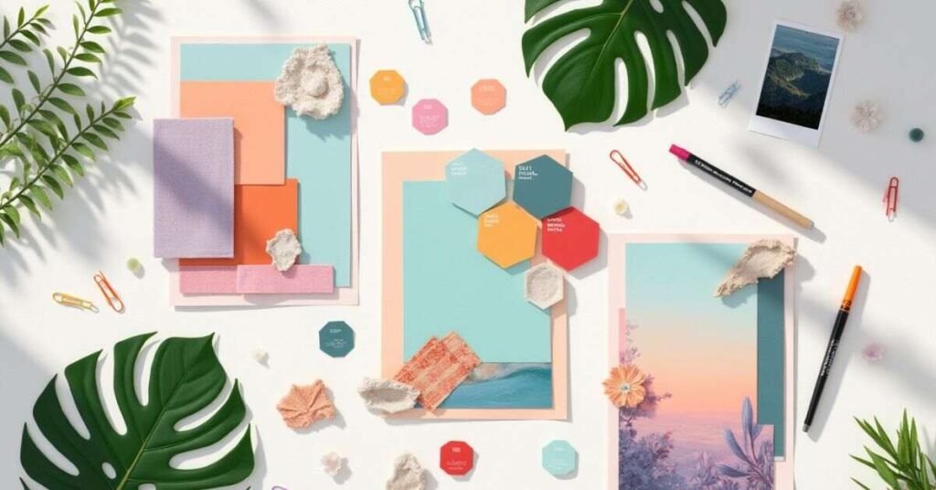
Aesthetic Color Palette Ideas
An aesthetic color palette is all about creating a specific mood or “vibe” for your page. Many people love using “dreamy” colors like soft lilac and dusty rose. These shades make your graphics look very gentle and artistic. When you pair these with a clean white or a light silver, your whole feed starts to look very balanced and pretty. It is a great way to show off a creative and calm personality to your followers.
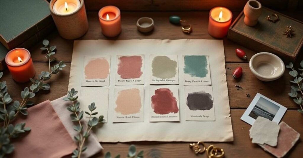
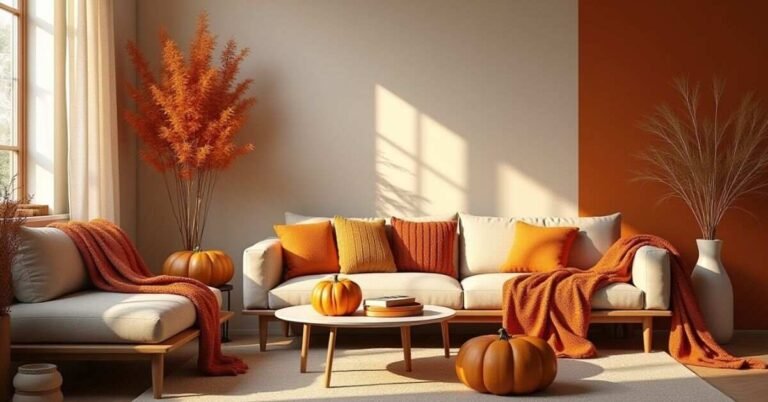
Another popular aesthetic is the “vintage” look, which uses warmer, muted tones. Think of colors like mustard yellow, olive green, and a deep burnt orange. These colors feel nostalgic and cozy, like an old photograph. They work perfectly for lifestyle blogs or brands that want to feel very “down-to-earth” and friendly. Using a mix of these soft and warm colors helps your content feel unique and high-quality. Here are a few aesthetic combinations you might like:
- Dusty Rose and Sage Green: A very popular “boho” look that feels soft and natural.
- Deep Plum and Gold: Perfect for a moody, “dark academic” aesthetic.
- Soft Peach and Sky Blue: This mix feels like a bright summer morning and is very cheerful.
- Creamy White and Coffee Brown: A “minimalist” palette that looks very clean and modern.
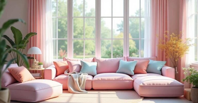
Color Palette Ideas for Home
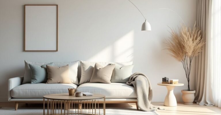
Choosing colors for your home is all about how you want each room to feel. Many people are moving toward “Warm Neutrals” like soft beige, creamy white, and light oak. These colors make a living space feel much larger and more open. They also catch the natural sunlight beautifully throughout the day. Using these calm shades helps your home feel like a peaceful escape from the busy world outside.
If you want to add some personality, you can try “Nature-Inspired” accents in specific rooms. A deep forest green or a dusty terracotta works perfectly for a cozy bedroom or a home office. These earth tones feel very grounded and pair well with indoor plants and wooden furniture. Adding a few dark metal touches like matte black can also give your home a very modern and polished look.
Color Palette Ideas with Hex Codes
Using hex codes is the best way to get the exact same color every time you design. A hex code is a six-digit code that starts with a hashtag, like #FFFFFF for white. When you use these specific codes, your social media posts and website will always look consistent. This helps your brand look professional because your colors will not shift or change between different apps.
Finding a good mix of hex codes can make your graphics pop. You usually want one main color, a lighter neutral, and a bright accent for buttons or links. For example, a deep navy looks great with a soft gray and a splash of bright orange. Using these codes together creates a balanced look that is easy on the eyes. Here is a long list of popular color combinations and their hex codes to help you get started:
| Palette Style | Color 1 (Primary) | Color 2 (Secondary) | Color 3 (Accent) | Color 4 (Neutral) |
| Modern Corporate | #003366 (Navy) | #B0C4DE (Light Blue) | #FF8C00 (Orange) | #F5F5F5 (White) |
| Earth Rose | #8E443D (Clay) | #E29578 (Peach) | #006D77 (Teal) | #EDF6F9 (Pale) |
| Forest Edge | #2D5A27 (Green) | #A3B18A (Sage) | #DAD7CD (Beige) | #344E41 (Dark) |
| Sunset Glow | #FF4E50 (Coral) | #FC913A (Orange) | #F9D423 (Yellow) | #EDE574 (Cream) |
| Ocean Breeze | #0077B6 (Blue) | #00B4D8 (Sky) | #90E0EF (Light) | #CAF0F8 (Ice) |
| Vintage Vibes | #6B705C (Olive) | #A5A58D (Stone) | #B7B7A4 (Tan) | #FFE8D6 (Sand) |
| Berry Punch | #9D0208 (Red) | #D00000 (Bright) | #FFBA08 (Gold) | #370617 (Plum) |
| Minimalist Tech | #212529 (Black) | #ADB5BD (Gray) | #007BFF (Blue) | #F8F9FA (Snow) |
| Lavender Dream | #7400B8 (Purple) | #6930C3 (Violet) | #5E60CE (Lavender) | #48BFE3 (Cyan) |
| Desert Warmth | #BC6C25 (Brown) | #DDA15E (Tan) | #606C38 (Green) | #FEFAE0 (Corn) |
Dark vs Light Color Palette Ideas
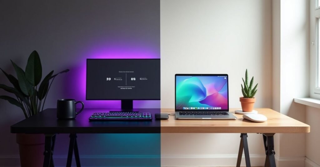
Choosing between a dark or light palette depends on the feeling you want to create. Light palettes use colors like soft whites, pale grays, and pastels. These make a design feel open, clean, and very easy to read. They are great for blogs and websites where people need to read a lot of text. A light background feels friendly and helps your content look fresh and professional.
Dark palettes use deep colors like charcoal, navy blue, or forest green. These palettes look very modern and high-end. They are often used for gaming sites, creative portfolios, or apps used at night. Dark backgrounds make bright colors pop and can reduce eye strain in low light. Choosing the right one helps you connect with your audience and sets the right mood for your brand.
| Palette Type | Best Use Case | Main Feeling | Pros | Cons |
| Pure Light | Blogs & News | Clean & Airy | Very easy to read | Can be too bright |
| Soft Light | Lifestyle Brands | Calm & Gentle | Feels welcoming | Needs good contrast |
| Minimalist | Tech Support | Professional | No distractions | Can feel cold |
| Deep Dark | Luxury Brands | Bold & Rich | Looks expensive | Hard to read long text |
| Night Mode | Mobile Apps | Modern & Sleek | Saves battery life | Colors can look dull |
| High Contrast | Action Sports | Exciting | Grabs attention fast | Can tire the eyes |
| Soft Dark | Creative Studios | Moody & Artistic | Very trendy | Needs careful spacing |
| Neutral Mix | Business Portals | Balanced | Very safe choice | Can be a bit boring |
Choose Color Palette Ideas Easily
Finding the perfect colors does not have to be a struggle. You can start by looking at a photo that you really like. Pick out the three main colors from that image and see how they look together. Another easy way is to use a color wheel to find shades that sit across from each other. These simple tricks help you find combinations that already look natural and balanced to the human eye.
You can also use online tools to generate ideas in just a few clicks. Many websites allow you to lock in one color you love and then suggest other colors that match it. This takes away all the guesswork and ensures your design looks professional. Sticking to a small number of colors will keep your project from looking messy. Here are a few quick tips to help you choose easily:
- Use the 60-30-10 Rule: Use your main color for 60% of the space, a secondary for 30%, and an accent for 10%.
- Check the Contrast: Make sure your text color is easy to read against your background.
- Look at Nature: Flowers, sunsets, and forests always have perfect color combinations.
- Limit Your Choices: Try to stick to three or four colors so your brand stays recognizable.
Free Ideas Tools
You do not need to be a professional designer to find great color combinations. There are many free tools online that can help you create a beautiful look in seconds. These websites do the hard work for you by suggesting colors that naturally go well together. Many of them even let you upload a photo to extract the colors directly from your favorite images. Using these tools ensures your graphics always look polished and consistent across all your social media pages.
Most of these tools are very easy to use and work right in your web browser. You can explore thousands of ready-made palettes or generate your own by clicking a single button. Some tools even use artificial intelligence to learn what styles you like best. This makes it much faster to find the right “vibe” for your brand or project. Here are some of the best free tools you can use right now:
- Coolors: A super fast tool where you just hit the spacebar to generate new palettes instantly.
- Canva Color Palette Generator: Perfect for uploading a photo and getting the exact colors from that image.
- Adobe Color: A more advanced tool that uses a color wheel to create harmonious schemes based on design rules.
- Color Hunt: A curated collection of thousands of trendy palettes that are updated every day by other creators.
- Khroma: An AI-powered tool that learns your personal tastes to create limitless color combinations just for you.
Unique Color Palette Ideas
If you want to stand out, try using colors that people do not see every day. Most brands use standard blues or reds, but you can be different. Try mixing a soft, pale mint with a deep, moody purple. This creates a look that is both fresh and a bit mysterious. Using unexpected pairs makes your content more memorable as people scroll through their feeds. It shows that your brand is creative and not afraid to try something new.
Another way to be unique is to use colors found in very specific parts of nature. Think about the colors of a desert at night or a tropical bird. These palettes feel natural but also very bold and exciting. You can even try “Neon Neutrals,” which means using a very bright color next to a very dull one. This contrast makes your graphics pop and look very modern. To get you started, here are a few unique ideas:
- Electric Lime and Midnight Blue: A high-contrast mix that looks very tech-focused.
- Soft Peach and Burnt Charcoal: A warm, sophisticated look that feels very high-end.
- Icy Blue and Copper: A cool and metallic combination that feels very balanced.
- Mustard Yellow and Plum: An artistic, “boho” style that is very popular for lifestyle blogs.
Conclusion
Choosing the right colors is a simple way to make your brand look much better. It helps you tell a story and connect with your audience without using words. When you keep your colors consistent, people will start to recognize your work instantly. You do not need to be an expert to start making beautiful choices for your graphics today.
The best way to learn is to start experimenting with different combinations. Use the tools and ideas we talked about to find a look that feels right for you. Do not be afraid to try something unique or stick to a simple, clean style. Your perfect color palette is waiting to help your social media pages grow and stand out.
FAQs
1. How many colors should I have in my palette?
It is best to stick to 3 or 4 colors. This keeps your design clean and helps people recognize your brand easily.
2. What is a hex code?
It is a six-digit code that identifies a particular color, like #FF5733. Using these codes ensures your colors look the same on every screen.
3. How do I make sure my text is easy to read?
Always use a high contrast between your text and the background. For example, use dark text on a light background or white text on a very dark background.
4. Can I change my color palette later?
Yes, you can update your colors as your brand grows. However, staying consistent for a long time helps build trust with your followers.
5. Where can I find inspiration for new colors?
You can look at nature, fashion magazines, or use free online tools like Coolors. Even a beautiful photo can give you great ideas for a new palette.

Welcome to Digital Pin Media! I’m Usama Ijaz, an AI-Powered SEO, and Content Write with 4 years of experience.
I help websites rank higher, grow traffic, and look amazing. My goal is to make SEO and web design simple and effective for everyone.
Let’s achieve more together!
One Comment