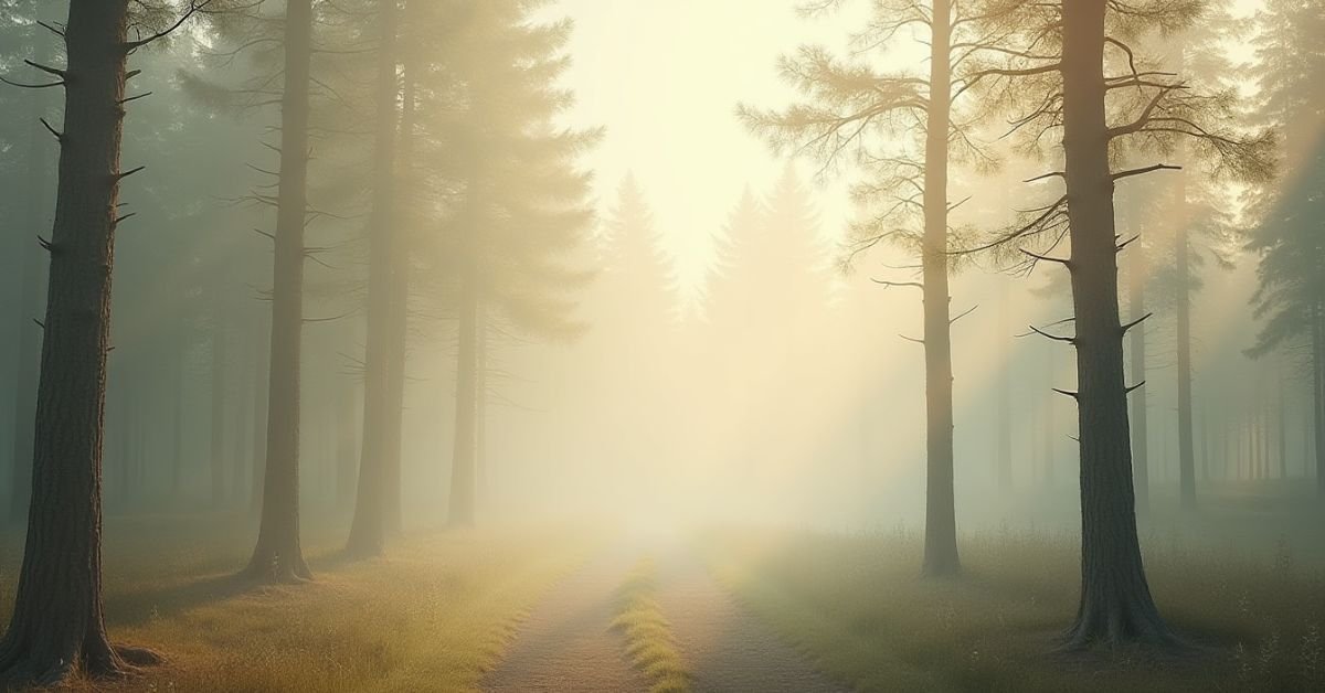
Introduction
A forest color palette is a collection of colors pulled directly from the deep woods. It features rich mossy greens, warm wood browns, and soft stone grays. These colors represent the natural world and help create a feeling of balance and peace in any design.
Have you ever noticed how your stress seems to melt away during a walk in the woods? That isn’t a coincidence. By bringing these earthy neutrals into your home or brand, you can capture that same calm, grounded energy every single day.
In this guide, we will explore how to mix deep shadows with soft, organic highlights. You will find practical ways to use these forest tones to transform your space into a quiet sanctuary.
Forest Color Palette: Meaning
A forest color palette represents the deep connection between nature and our emotions. It is more than just a list of greens and browns. These colors carry the meaning of growth, stability, and renewal. When you use these shades, you are telling a story of endurance and the quiet strength found in the wild.
In a fast-paced world, this palette also symbolizes a return to simplicity. The deep mossy tones represent comfort, while the lighter earthy neutrals suggest clarity and fresh air. Choosing these colors means you value a space that feels grounded, authentic, and naturally timeless.
Tips to Create a Forest Color Palette
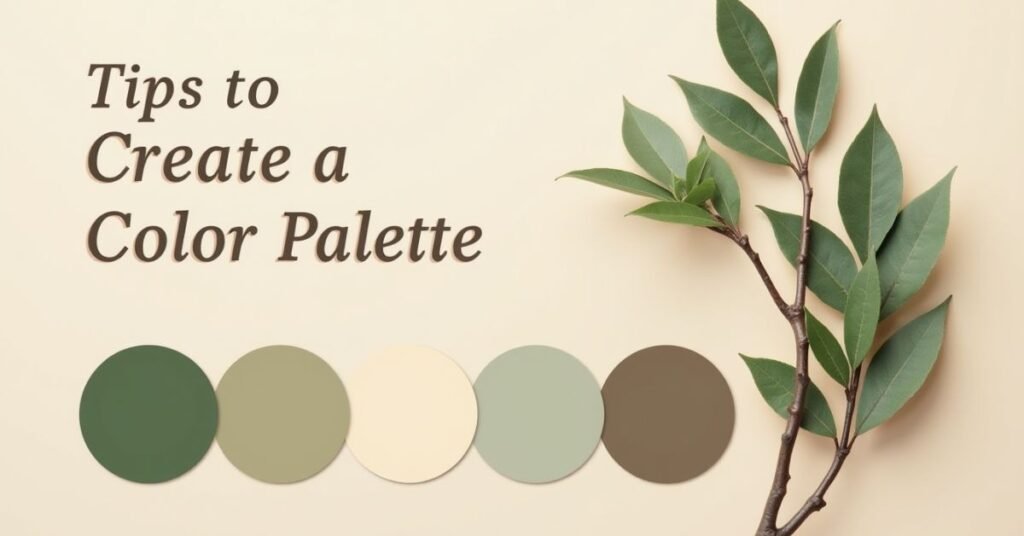
To start, look at a real photo of a woodland scene for inspiration. Don’t just stick to bright green. Real forests have layers of color like dark shadows, damp soil, and pale sunlight. Pick one main “anchor” color, like a deep pine, and then find lighter shades to balance it out.
Mixing different textures helps these colors look their best. Use soft fabrics for your mossy greens and rougher wood grains for your browns. This adds depth and makes the palette feel more alive. A few quick tips to keep in mind:
- Look at the bark: Use various shades of brown and gray for a grounded feel.
- Add “Misty” tones: Include soft grays or light teals to mimic forest fog.
- Use pops of life: Small hints of mustard yellow or berry red can represent forest flowers.
- Balance with neutrals: Use creamy whites or sand colors so the dark greens don’t feel too heavy.
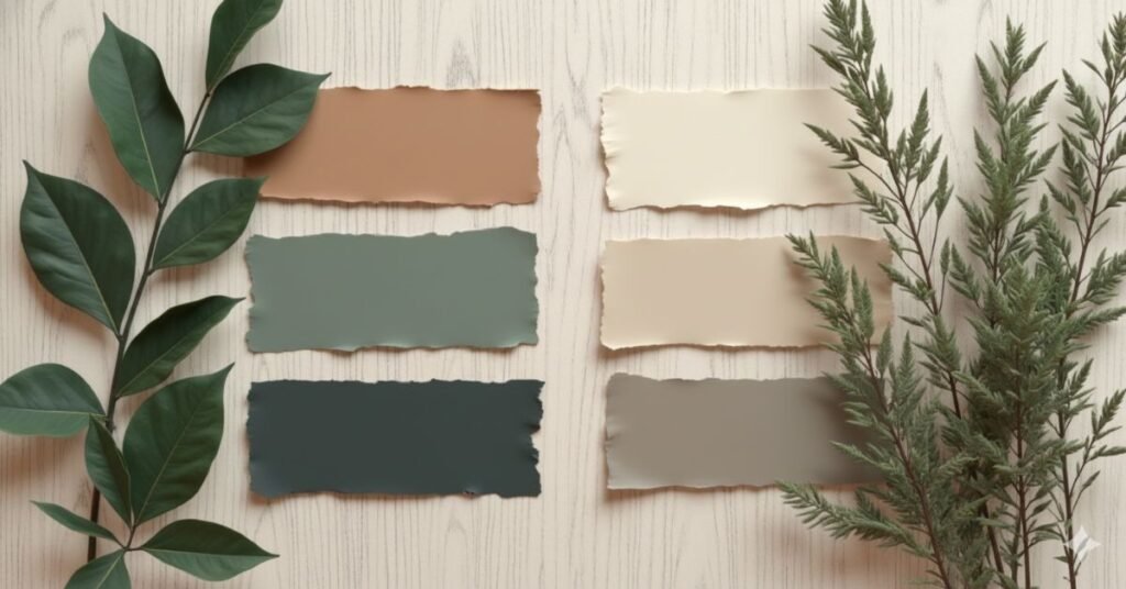
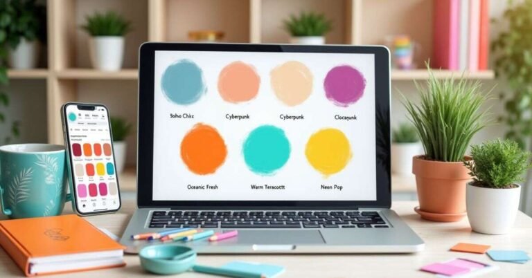
Forest-Inspired Color Palettes You’ll Love

Finding the right mix of colors can be a fun adventure. You don’t have to stick to just one style of green. Think about the different moods a forest can have, from a sunny morning in the trees to a dark, misty evening. Each version offers a unique way to make your project feel organic and fresh.
Below is a list of curated palettes inspired by different parts of the woods. These combinations blend deep tones with soft neutrals to give you a perfect balance. Whether you are painting a room or designing a website, these sets will bring that peaceful outdoor feeling to your work.
| Palette Name | Key Colors | Best For | Mood |
| Deep Pine Grove | Dark Green, Bark Brown, Slate Gray | Study or Office | Focused & Strong |
| Misty Morning | Pale Sage, Foggy White, Soft Pebble | Bedroom or Spa | Calm & Airy |
| Autumn Trail | Burnt Orange, Moss Green, Golden Oak | Living Room | Warm & Cozy |
| Sun-Drenched Glade | Fern Green, Creamy Sand, Leaf Yellow | Kitchen or Cafe | Bright & Happy |
| Midnight Woodland | Juniper Blue, Charcoal, Deep Spruce | Accent Walls | Moody & Elegant |
| Winter Woods | Silver Birch, Frosty Blue, Pine Needle | Modern Branding | Clean & Crisp |
| Enchanted Moss | Emerald, Velvet Green, Earthy Clay | Creative Studios | Rich & Artistic |
Moody Greens & Earth Tones Aesthetic Vibes
The moody green and earth tone aesthetic is all about creating a sense of mystery and comfort. It uses darker, desaturated colors that make a room feel like a cozy hideaway. Instead of bright and loud shades, these tones are quiet and deep. They remind us of the shadows under thick trees or the rich color of damp soil after it rains.
This style is perfect if you want a space that feels sophisticated but still very natural. By layering dark greens with warm wood tones, you create a look that feels “lived-in” and high-end at the same time. It is a great way to bring a touch of drama to your design without it feeling overwhelming. Here is what makes this vibe work:
- Deep Emerald & Hunter Green: These act as the heavy, moody base for your design.
- Warm Terracotta & Clay: These add a much-needed earthy warmth to balance the cool greens.
- Charcoal & Black Accents: Use these in small amounts to add definition and “moodiness.”
- Natural Textures: Think of velvet, dark stained wood, and matte pottery to complete the look.
Calm & Grounded Forest Mood
A calm and grounded forest mood is all about finding peace in the middle of a busy day. It uses soft greens and gentle browns that help your mind slow down. These colors act like a deep breath for your home or project. They don’t shout for attention, but instead, they create a steady and reliable environment.
When you use this mood, you are choosing to stay connected to the earth. It feels like standing on a soft path of pine needles where everything is quiet and still. This style works best when you keep things simple and avoid clutter. It is the perfect choice for any space where you want to feel safe, relaxed, and completely at home.
Deep Woods Color Palette for Projects
Using a deep woods color palette is a great way to add professional depth to your work. These colors are inspired by the thickest parts of the forest where the light is dim and the colors are saturated. They feel serious, expensive, and very sturdy. Whether you are building a website or painting a room, these tones give your project a strong foundation.
Because these colors are so dark, they work best when you use them as a “base.” You can use a deep evergreen for your main background and then add lighter wood tones for the details. This contrast makes your design easy to look at and very memorable. It creates a bold look that still feels connected to the natural world.
| Color Name | Hex Code | Best Application | Why It Works |
| Old Growth Pine | #1B3022 | Main Backgrounds | Provides a rich, dark canvas |
| Wet Bark Brown | #3E2723 | Borders & Frames | Adds a sturdy, organic feel |
| Shadowed Moss | #2E3B23 | UI Elements / Buttons | Looks professional and soft |
| Charcoal Fern | #262D26 | Text or Icons | High contrast against light hues |
| Earth Mud | #4B3832 | Secondary Accents | Adds warmth to cool greens |
| Midnight Leaf | #132018 | Bold Typography | Very dark and authoritative |
| Spruce Shadow | #2D3A3A | Large Surface Areas | Modern, moody, and sleek |
How to Use Forest Color Palettes in Branding
Using forest colors in your branding tells your customers that your business is stable and eco-friendly. These tones work perfectly for brands that want to seem honest and reliable. A deep green logo can feel very high-end and timeless. It helps people trust your brand because it feels like it has deep roots in the real world.
When you design with these colors, try to use one dark forest green as your primary color. You can then use a soft sand or light pebble gray for your background. This creates a clean look that is easy to read on a screen or a business card. It makes your brand feel professional, calm, and naturally beautiful all at once.
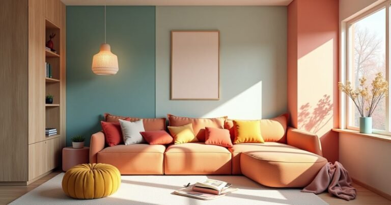
Forest Color Palette for Interior Design
Using a forest color palette in your home is like bringing a piece of the outdoors inside. It helps create a space that feels fresh and full of life. You can use deep greens on your walls to make a room feel cozy and private. When you mix these with soft wood furniture, the whole room starts to feel balanced and natural.
This style works in almost any room, from the kitchen to the bedroom. It is a great way to make a large space feel more intimate or a small space feel like a garden. The goal is to layer different shades so the room doesn’t feel too flat. Here are a few simple ways to use these colors in your home:
- Paint an Accent Wall: Use a dark spruce or hunter green to create a focal point.
- Natural Textiles: Add olive green rugs or mossy throw blankets for a soft touch.
- Wood Elements: Use oak or walnut tables to bring in essential earthy brown tones.
- Indoor Plants: Use real greenery to blend your color palette with actual nature.
- Metallic Touches: Add some gold or brass hardware to make the forest colors look elegant.
Light vs Dark Forest Color Palettes
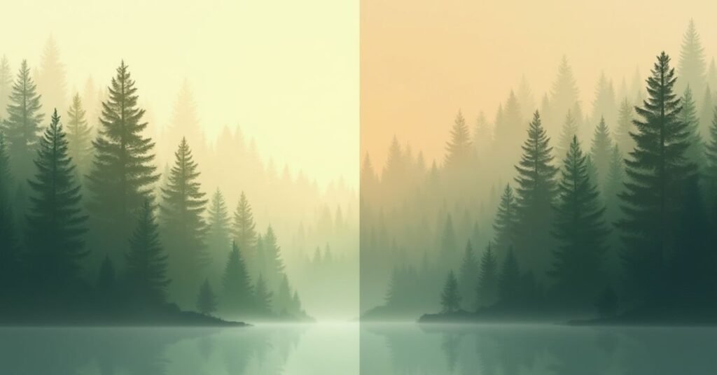
Choosing between a light or dark forest palette depends on the energy you want to create. Light forest palettes feel like a sunny morning in a clearing. They use pale greens and soft tans to make a space feel open and breezy. These colors are perfect if you want to make a small room feel larger or more cheerful.
Dark forest palettes focus on the mystery of the deep woods. They use heavy shades like charcoal, navy-green, and rich chocolate brown. These colors make a room feel very cozy, private, and high-end. While light colors bring the “fresh air” inside, dark colors provide a sense of “shelter” and quiet strength.
| Feature | Light Forest Palette | Dark Forest Palette |
| Main Colors | Sage, Mint, Birch White, Sand | Emerald, Pine, Bark, Charcoal |
| Best Room | Small Bathrooms, Kitchens, Nurseries | Offices, Master Bedrooms, Libraries |
| Visual Effect | Makes spaces feel bright and airy | Makes spaces feel snug and moody |
| Energy Level | High, Refreshing, Active | Low, Calm, Sophisticated |
| Lighting Needs | Works well in low-light rooms | Needs good lighting to avoid feeling “heavy” |
| Common Accents | Light Oak, Linen, Silver | Walnut, Velvet, Gold/Brass |
| Vibe | “A Walk in the Park” | “A Hidden Cabin” |
Forest Green Color Shades Explained
Forest green isn’t just one single color. It is a whole family of greens that change depending on the light and the season. Some shades are very dark and look almost black in the shadows. Others are lighter and look like new leaves in the springtime. Understanding these differences helps you pick the right “vibe” for your project.
When you look closely at the woods, you see that every tree has its own unique tint. Some greens have a lot of blue in them, making them feel cool and crisp. Others have a hint of yellow or brown, which makes them feel warm and earthy. Here are a few common shades you will see in a forest palette:
- Hunter Green: A very dark, traditional green that feels formal and steady.
- Sage Green: A soft, grayish-green that looks like dried herbs and feels very calming.
- Moss Green: A warm, yellowish-green that mimics the soft carpet on the forest floor.
- Pine Green: A cool, sharp green with blue undertones that feels like a mountain breeze.
- Fern Green: A bright, lively green that represents new growth and energy.
Minimal Forest Color Palette Aesthetic
A minimal forest aesthetic is all about doing more with less. It focuses on just a few key colors to keep things clean and simple. Instead of using every shade of green, you might pick one soft sage and pair it with a crisp white. This style feels very modern and helps your mind feel less cluttered.
In this aesthetic, neutral tones like light wood and pebble gray play a big role. These colors act as a quiet background for small pops of nature. It is a perfect choice for people who love the forest but want a bright, tidy look. This approach makes your design feel intentional, peaceful, and very fresh.
Conclusion
Choosing a forest color palette is a beautiful way to bring the peace of nature into your daily life. Whether you like dark, moody tones or light, airy greens, these colors help you feel more balanced. They turn any simple project or room into a calm space that feels both modern and timeless.
In the end, there are no strict rules when you are inspired by the woods. You can experiment with different shades of moss, bark, and stone until the mix feels just right for you. By using these earthy neutrals, you create a look that is not only stylish but also deeply relaxing for everyone to enjoy.
FAQs
1. What colors make up a forest color palette?
It mainly includes various shades of green, like moss and pine, paired with earthy neutrals like wood brown, stone gray, and misty white.
2. Is a forest color palette good for small rooms?
Yes, if you use lighter shades like sage or mint to keep the space feeling open, while using darker greens only for small accents.
3. What accent colors pair well with forest greens?
Warm metallics like gold and brass look elegant, while soft terracotta or mustard yellow add a nice earthy pop of color.
4. Why is this palette trending in 2026?
People are moving toward “biophilic design,” which focuses on bringing nature indoors to reduce stress and improve mental well-being.
5. Can I use these colors for professional branding?
Absolutely. Forest tones suggest that a brand is sustainable, reliable, and high-end, making it perfect for organic or luxury businesses.

Welcome to Digital Pin Media! I’m Usama Ijaz, an AI-Powered SEO, and Content Write with 4 years of experience.
I help websites rank higher, grow traffic, and look amazing. My goal is to make SEO and web design simple and effective for everyone.
Let’s achieve more together!


One Comment