Introduction
Turquoise green color blends the calming properties of blue with the growth-oriented energy of green. This color sits perfectly between the two on the color wheel. Most people describe it as a bright, refreshing teal that mimics the look of clear tropical waters.There is a sense of earthiness and sophistication in it.
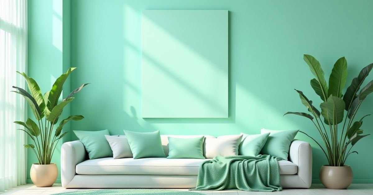
Have you ever walked into a room and felt an immediate sense of peace and clarity? Turquoise green possesses a unique power to transform a dull space into a vibrant sanctuary. Designers often use this shade to spark creativity and reduce stress in high-pressure environments. It catches the eye without overwhelming the senses, making it a favorite for those who want to stand out gracefully.
This guide explores the deep symbolism behind this enchanting hue. You will discover the various shades that range from soft pastels to deep, moody teals. Finally, I will share practical style ideas to help you incorporate turquoise green into your wardrobe and home decor.
What Is Turquoise Green Color?
Turquoise green combines the cool essence of blue with the fresh energy of green. Think of it as a bright, tropical shade that looks like the ocean on a sunny day. This color sits right in the middle of the spectrum between teal and cyan. It has a natural, clean, and vibrant feel.
People often associate this color with balance and emotional healing. It creates a sense of calm while still looking bold and modern. You will find it in ancient jewelry and high-end fashion because it never goes out of style. It brings a refreshing pop of color to any design or outfit.
Turquoise Green Color Code (HEX, RGB, CMYK)

Designers use specific codes to find the perfect version of turquoise green for digital and print projects. The HEX code acts as a digital fingerprint for web design and social media graphics. These numbers ensure the color looks the same on every screen. Using the right code prevents your design from looking too dull or too blue.
For physical printing, you need to use different sets of values like RGB or CMYK. RGB works best for digital displays, while CMYK ensures the ink matches your vision on paper. Professionals often mix these values to get the exact brightness they want. Having these codes handy makes your branding consistent across all your creative work.
| Color Name | HEX Code | RGB (Red, Green, Blue) | CMYK (Cyan, Magenta, Yellow, Black) |
| Turquoise Green | #A0D6B4 | (160, 214, 180) | (25, 0, 16, 16) |
| Bright Turquoise | #00CED1 | (0, 206, 209) | (100, 1, 0, 18) |
| Pale Turquoise | #AFEEEE | (175, 238, 238) | (26, 0, 0, 7) |
| Medium Turquoise | #48D1CC | (72, 209, 204) | (66, 0, 2, 18) |
| Dark Turquoise | #00CED1 | (0, 206, 209) | (100, 1, 0, 18) |
| Deep Turquoise | #008B8B | (0, 139, 139) | (100, 0, 0, 45) |
| Aquamarine | #7FFFD4 | (127, 255, 212) | (50, 0, 17, 0) |
| Teal | #008080 | (0, 128, 128) | (100, 0, 0, 50) |
Turquoise Green Color Meaning and Feel
Turquoise green represents a perfect balance between peace and renewed energy. People often connect this color with emotional healing and mental clarity. It reminds us of nature and helps us feel grounded during busy days. Many cultures believe this shade brings good luck and protection to those who use it.
When you look at this color, you feel an instant sense of refreshment. It clears the mind and encourages creative thinking without causing stress. The hue feels friendly and approachable, making it a great choice for open communication. It creates a space where everyone feels calm and welcome.
Turquoise Green Color Palette Ideas
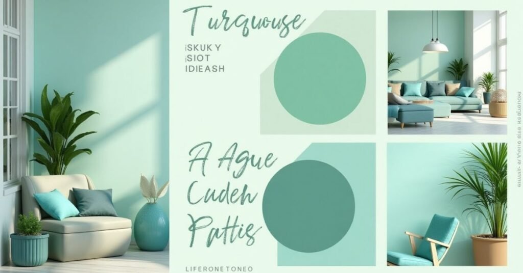
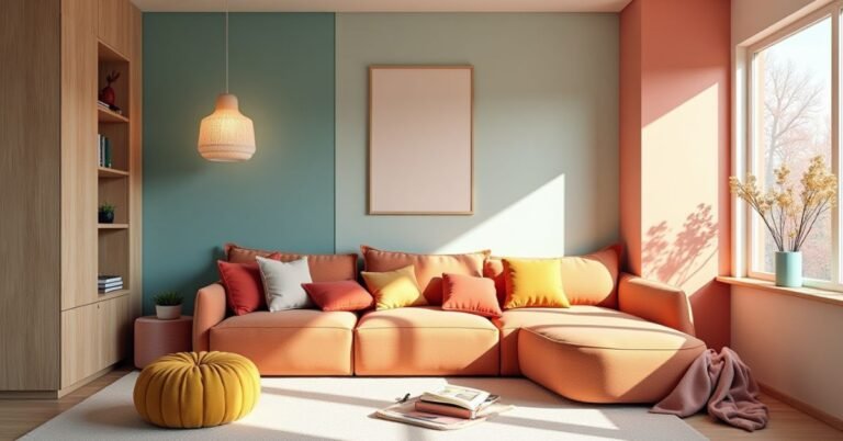
Choosing the right colors to pair with turquoise green changes the entire mood of your project. You can create a soft, airy look by mixing it with neutrals like cream or light gray. If you want something more energetic, try adding a pop of warm coral or soft gold. These combinations help the turquoise green stand out without making the design feel cluttered.
Many designers draw inspiration from the natural world when building these palettes. Think about the colors you see at a beach or in a lush garden. These natural pairings always feel right to the human eye because they mimic the world around us. Here are a few simple ways to use this color effectively:
- Ocean Breeze: Pair turquoise green with sandy beige and crisp white for a coastal feel.
- Forest Light: Combine it with deep forest green and wood tones for an earthy look.
- Modern Chic: Use it alongside charcoal gray and metallic silver for a sleek finish.
- Sunset Glow: Mix it with soft peach and dusty pink to create a warm, inviting atmosphere.
Best Turquoise Green Color Combinations
Turquoise green works beautifully because it adapts to many different styles. You can pair it with soft neutrals to keep a room feeling bright and open. For a more dramatic look, try matching it with dark, bold tones like navy or charcoal. The right combination makes the turquoise pop and gives your design a professional finish.
Mixing this color with warm tones creates a cozy and welcoming environment. Colors like gold, copper, or warm wood bring out the richness of the green. These pairings feel balanced because they mix cool and warm elements together. Here are some of the best combinations to try:
- Crisp White: This creates a clean, beachy look that feels very fresh.
- Deep Mustard Yellow: This bold contrast adds a vintage and energetic touch.
- Soft Lavender: These two colors together feel calm, dreamy, and sophisticated.
- Rich Terracotta: Earthy orange tones ground the brightness of the turquoise green.
- Silver and Chrome: Use these for a modern, high-tech, and polished aesthetic.
Turquoise Green Color Shades, Tints, and Tones
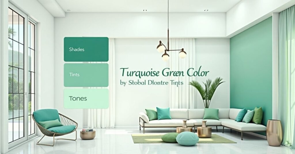
Changing the light and dark levels of turquoise green creates a whole family of beautiful colors. You make a tint by adding white to the original color. This produces soft, airy versions that work well for backgrounds and light fabrics. Adding black creates a shade, which makes the color look deeper and more mysterious. These darker versions often feel very elegant and expensive in home decor.
Tones happen when you mix gray into the turquoise green. This softens the brightness and makes the color look more muted and mature. Using a variety of these versions prevents a room or a design from looking flat. Mixing different levels of light and dark adds depth and keeps the eye moving. Among the common variations you may encounter are:
- Minty Turquoise: A light tint that feels fresh, youthful, and very energetic.
- Deep Sea Shade: A dark version that looks nearly like forest green or deep teal.
- Dusty Turquoise Tone: A muted gray-green that looks sophisticated and calm.
- Electric Turquoise: A highly saturated version that grabs attention immediately.
- Pale Aqua Tint: A very light, almost white version that offers a hint of color.
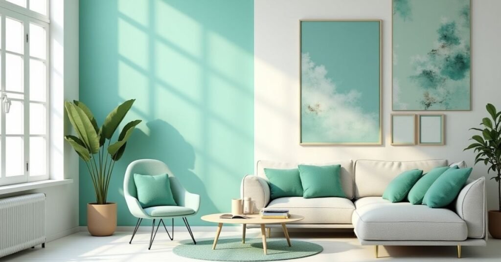
Where to Use Turquoise Green Color
Turquoise green brings a refreshing touch to almost any part of your life. You can use it in your home to create a relaxing space for resting or working. It works particularly well in bathrooms and bedrooms because it mimics the peaceful feeling of water. In the world of fashion, this color suits many different skin tones and adds a cheerful pop to a simple outfit.
Businesses often choose this shade for their branding to build trust and show creativity. It looks great on websites, business cards, and social media posts. The color grabs attention without being too aggressive or loud. Whether you want to decorate a room or design a logo, this versatile hue fits perfectly. Here are some great places to apply it:
- Living Rooms: Use it on accent walls or throw pillows to liven up the space.
- Kitchens: Try turquoise green tiles or glassware for a vintage, clean look.
- Office Spaces: Add this color to your desk area to help lower stress and boost focus.
- Graphic Design: Use it for call-to-action buttons to guide users’ eyes naturally.
- Summer Wardrobes: Wear it in dresses, ties, or jewelry for a bright, seasonal feel.
Turquoise Green Color vs Similar Colors
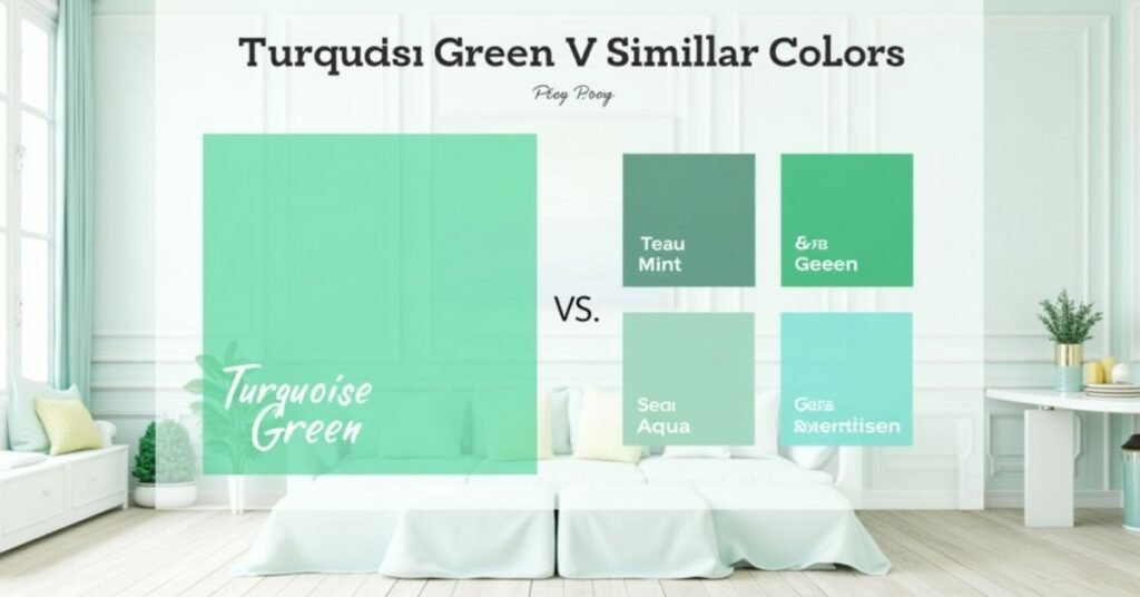
Many people confuse turquoise green with other shades like teal, aqua, or cyan. While they all look similar, each color has a different amount of blue or green mixed in. Turquoise green stands out because it leans more toward the green side of the scale. This gives it an earthy, natural feel that purely blue shades lack. Knowing these small differences helps you choose the right mood for your project.
Comparing these colors side-by-side makes it much easier to see their unique personalities. Some shades look very bright and digital, while others feel dark and heavy. You might prefer a softer version for a nursery but a bolder version for a brand logo. This table shows how turquoise green compares to its closest relatives in the color family.
| Color Name | Main Base | Key Characteristic | Common Feel |
| Turquoise Green | Green | Balanced mix with heavy green | Refreshing and natural |
| Teal | Blue-Green | Darker and more saturated | Sophisticated and deep |
| Aqua | Blue | Very light and watery | Airy and transparent |
| Cyan | Blue | Bright and neon-like | Digital and high-energy |
| Mint Green | Green | Very pale and pastel | Sweet and youthful |
| Seafoam Green | Green | Muted with a gray undertone | Vintage and soft |
| Emerald Green | Green | Pure, rich green | Luxurious and royal |
| Sky Blue | Blue | Light, clear blue | Open and calm |
Turquoise Green Color vs Teal Color
Many people find it hard to tell the difference between turquoise green and teal. Turquoise green contains more yellow, which makes it look brighter and more cheerful. It feels like a tropical sea or a fresh plant leaf. Teal, on the other hand, contains much more blue and a hint of black. This gives teal a deeper, moodier, and more serious personality.
Choosing between these two depends on the energy you want to create. Turquoise green works best for spaces where you want to feel active and inspired. Teal works better for formal settings where you want to feel grounded and focused. Both colors are beautiful, but they serve very different purposes in design. Here are the main differences:
- Brightness: Turquoise green reflects more light, while teal absorbs it.
- Undertones: Turquoise green leans toward yellow, but teal leans toward dark blue.
- Vibe: Use turquoise green for a playful feel and teal for a sophisticated look.
- Pairing: Turquoise green loves bright whites; teal looks great with rich golds and woods.
Turquoise Green Color vs Mint Color
Turquoise green and mint green belong to the same color family, but they have very different strengths. The turquoise green looks much darker and more saturated. It contains a strong mix of blue that gives it a tropical, watery feel. Mint color looks much lighter because it contains a lot of white. It feels like a soft pastel that reminds people of spring or vintage candy.
You should choose between these two based on the light in your room. Turquoise green creates a bold statement and adds depth to a space. Mint works better in small rooms because it makes everything feel larger and brighter. Both colors look fresh, but they create different moods for your home or outfit. Here are the key differences to remember:
- Depth: Turquoise green is a medium-dark shade, while mint is a light pastel.
- Energy: Turquoise green feels vibrant and bold; mint feels soft and gentle.
- Blue Content: Turquoise has a lot of blue, but mint stays closer to a light, cool green.
- Best Use: Use turquoise for accent walls and mint for entire rooms or nurseries.
Turquoise Green Color in Design Trends
Designers currently embrace turquoise green as a top choice for modern interiors and digital spaces. This color fits perfectly with the rising trend of “biophilic design,” which brings nature indoors. People want their homes to feel like sanctuaries, and this hue provides that organic, calming connection. It appears frequently on kitchen cabinets, velvet sofas, and bold accent walls in the most stylish homes.
In the digital world, this color dominates social media and app interfaces. Creative professionals use it to make brands feel fresh, eco-friendly, and forward-thinking. It stands out against the minimal white backgrounds that many websites use today. As we move toward 2026, expect to see this versatile shade in everything from high-end tech packaging to sustainable fashion collections.
Read More Information |https://digitalpinmedia.com/beige-layout/
Why Turquoise Green Color Feels Fresh and Calm
Turquoise green feels fresh because it reminds our brains of the natural world. It brings to mind images of clear ocean water and lush plant life. This connection to nature makes us feel more alive and energized. The color acts like a breath of fresh air for your eyes after a long day of looking at screens.
At the same time, this shade has a very calming effect on the human mind. The blue tones within the color help lower stress and slow down a racing heart. It creates a quiet space where you can think clearly and feel at peace. Many people find that being around this color helps them relax and stay focused on the present moment.
FAQs
Q1. What is the hex code for turquoise green?
The most common hex code for this color is #A0D6B4. You can use this digital fingerprint to get the exact shade for your websites or social media graphics.
Q2. How does turquoise green differ from teal?
Turquoise green contains more yellow and looks much brighter than teal. Teal has a heavier blue base and a darker, more serious feel.
Q3. Which colors pair best with turquoise green?
This shade works beautifully with crisp white, warm gold, and earthy neutrals like beige. These combinations create a balanced and professional look.
Q4. Does turquoise green work well in small rooms?
Yes, it works great as an accent color in small spaces to add depth. If you want the room to feel larger, use a lighter tint or pair it with plenty of white.
Q5. What is the psychological meaning of this color?
Turquoise green represents emotional balance, mental clarity, and renewal. It helps reduce stress while encouraging creative thinking and a sense of calm.
Conclusion
Turquoise green offers a unique mix of calm and energy that works in any setting. It bridges the gap between the natural world and modern style perfectly. Whether you use it in your home or for your brand, it always leaves a lasting impression. This color truly brings a sense of balance and freshness to your creative projects.
Choosing this hue means you value both peace and creativity. It stands out without being loud and feels timeless despite changing trends. Experiment with different shades and pairings to find the look that fits your personality. You will find that turquoise green transforms your space into a more vibrant and relaxing place to be.

Welcome to Digital Pin Media! I’m Usama Ijaz, an AI-Powered SEO, and Content Write with 4 years of experience.
I help websites rank higher, grow traffic, and look amazing. My goal is to make SEO and web design simple and effective for everyone.
Let’s achieve more together!


One Comment