Introduction
Fall colors palette represent the changing shades of nature during the autumn season. These palettes usually feature deep reds, burnt oranges, golden yellows, and earthy browns. Designers use these tones to mimic the natural transformation of leaves and landscapes.
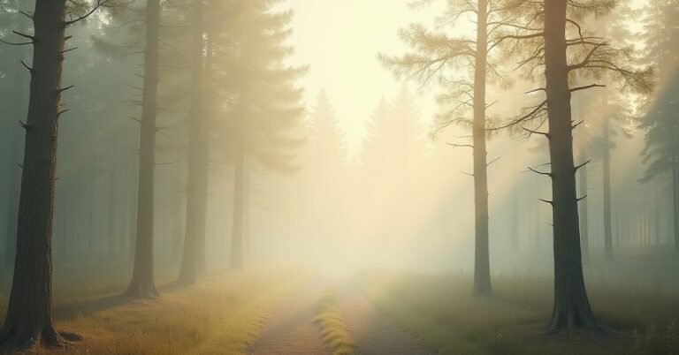
Imagine walking through a crisp forest where every leaf tells a story of change. This vibrant transition offers the perfect mood for your next home project. Can you capture that cozy, fireside feeling inside your own living room?
Modern styles use these autumn hues to create sleek, sophisticated spaces. Meanwhile, rustic designs lean into the raw, organic textures of the season. Both styles rely on specific color combinations to bring warmth and character to a home.
Fall Colors Palette Ideas You Will Love
Autumn brings a beautiful change to the world outside. This season offers a rich mix of deep reds, warm oranges, and soft gold tones. Designers often use these colors to create a sense of comfort and peace. You can use these palettes to make any room feel more inviting and grounded.
Many people enjoy mixing different textures with these seasonal colors. Wood, wool, and stone work perfectly with earthy shades to create a balanced look. These combinations help bring the beauty of nature right into your home. Consider these popular color choices for your next project:
- Deep Burgundy and Forest Green: This pair creates a moody and sophisticated atmosphere.
- Burnt Orange and Cream: These tones offer a bright yet cozy feeling for any space.
- Mustard Yellow and Charcoal Gray: This mix provides a modern twist on traditional fall colors.
- Copper and Muted Brown: These shades add a touch of rustic charm and warmth.
Trending Fall Colors Palette Combinations
Current trends focus on blending traditional autumn tones with unexpected pops of color. Designers now mix deep, saturated hues with soft neutrals to create a fresh look. This approach keeps a space feeling modern while still honoring the warmth of the season. Many people find that adding one unique accent color makes the entire palette stand out.
Mixing different shades helps you achieve a specific mood for your branding or home decor. Some combinations feel energetic and bold, while others provide a calm and serene environment. Choosing the right pair allows you to reflect your personal style through the changing seasons. These combinations work well across digital designs, textiles, and interior paint.
| Palette Name | Primary Color | Accent Color | Vibe / Style |
| Golden Harvest | Amber Yellow | Slate Blue | Modern & Energetic |
| Midnight Forest | Hunter Green | Copper | Moody & Luxurious |
| Rustic Spice | Terracotta | Cream | Warm & Traditional |
| Berry Orchard | Plum | Sage Green | Sophisticated & Organic |
| Cider Press | Burnt Orange | Muted Teal | Trendy & Playful |
| Desert Sunset | Dusty Rose | Sandstone | Minimalist & Soft |
| Toasted Nut | Walnut Brown | Champagne | Classic & Elegant |
| Frosted Maple | Crimson Red | Cool Gray | Sharp & Contemporary |
Warm Fall Colors Palette for Cozy Designs
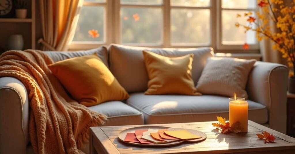
Warm fall colors focus on the soft, glowing side of the autumn season. These shades often include creamy beige, soft peach, and deep cinnamon browns. They remind people of a hot drink or a thick wool blanket on a chilly afternoon. You use these tones to make a small space feel much more intimate and friendly.
These palettes work best when you want to create a sense of safety and relaxation. The gentle heat in these colors draws people in and makes them want to stay longer. Designers frequently choose these combinations for bedrooms or cozy reading corners. They provide a perfect background for a quiet and peaceful lifestyle.
Classic Fall Colors Palette That Always Works
Classic fall colors remain popular because they reflect the true essence of nature. These timeless shades include deep scarlet, goldenrod, and rich chocolate brown. You see these colors every year as the leaves change and the weather cools. They provide a reliable foundation for any design that needs to feel authentic and grounded.
Using these standard tones ensures your project never goes out of style. They create a familiar and comforting atmosphere that people instantly recognize and love. These colors work harmoniously together without overwhelming the eyes. You can easily incorporate them into your home or digital graphics using these staples:
- Scarlet Red: This bold color adds energy and a traditional autumn feel.
- Golden Yellow: It mimics the afternoon sun and brings a cheerful glow to your space.
- Earthway Brown: This shade provides stability and pairs well with almost any accent.
- Deep Orange: It serves as the quintessential harvest hue for a vibrant look.
Modern Fall Colors Palette for Stylish Looks
Modern fall palettes use sleek and unexpected combinations to create a fresh appearance. These designs often pair traditional autumn tones like burnt orange with cool navy or charcoal gray. This contrast breaks away from older styles and feels very current. You use these sharp color choices to make a bold statement in any digital or physical space.
Clean lines and minimalist vibes define this contemporary approach to the season. Many stylists now favor muted shades like olive green and dusty rose for a sophisticated finish. These colors look great on website layouts and in modern living rooms. They offer a trendy way to celebrate the harvest season without feeling too heavy or cluttered.
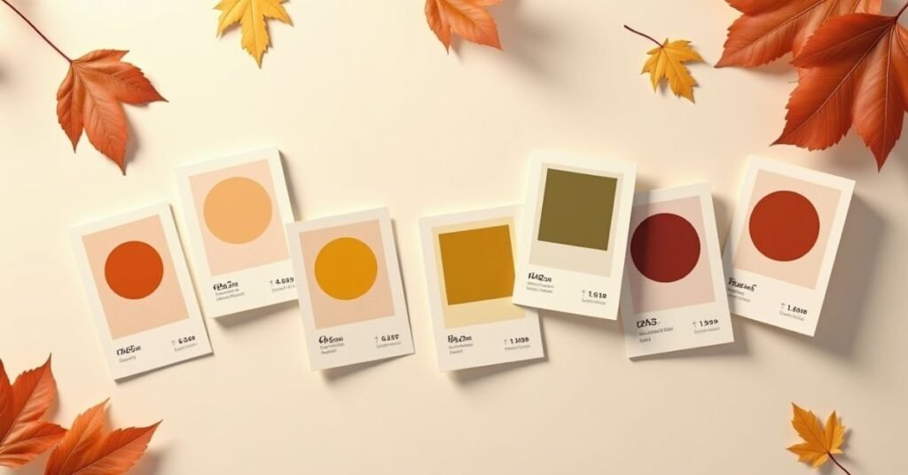
Fall Colors Palette with Hex Codes
Using hex codes allows you to bring the exact colors of autumn into your digital work. These six-digit codes ensure that your website or social media posts look consistent across all screens. You can match the deep reds of a forest or the bright gold of a harvest with perfect precision. Designers rely on these specific values to maintain a professional and polished brand identity.
A well-chosen palette makes your content feel more cohesive and visually appealing. You can mix warm earth tones with cool accents by simply copying and pasting these codes into your design software. This approach saves time and removes the guesswork from your creative process. Use the table below to find the perfect autumn shades for your next project.
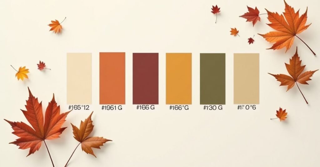
| Color Name | Hex Code | Visual Description |
| Rust Orange | #B7410E | A rich, burnt earthy orange. |
| Goldenrod | #DAA520 | A bright, warm harvest yellow. |
| Deep Burgundy | #800020 | A dark, sophisticated wine red. |
| Forest Green | #228B22 | A natural, deep evergreen shade. |
| Cinnamon | #D2691E | A spicy, medium reddish-brown. |
| Slate Gray | #708090 | A cool, muted blue-gray accent. |
| Cream | #FFFDD0 | A soft, warm neutral for balance. |
| Olive | #808000 | A classic, earthy yellowish-green. |
| Plum | #673147 | A deep, moody purple-toned red. |
| Wheat | #F5DEB3 | A light, sandy autumn tan. |
How to Choose the Right Fall Colors Palette
Choosing the right fall colors depends on the mood you want to create. Start by looking at the lighting in your room or the style of your brand. Warm tones like amber and terracotta make a space feel smaller and cozier. Cooler autumn shades like sage green or slate gray keep things feeling airy and modern.
You should also consider how different colors interact with each other. A good palette usually has one strong main color and two softer supporting shades. This balance prevents the design from looking too busy or overwhelming. Use these simple tips to pick your perfect combination:
- Check Your Lighting: Natural light makes warm colors glow, while artificial light can change how deep reds look.
- Pick a Focal Point: Choose one bold color like burnt orange to stand out against neutral backgrounds.
- Use the 60-30-10 Rule: Use your main color for 60% of the space, a secondary color for 30%, and a bright accent for the final 10%.
- Look to Nature: Take a walk outside and find a leaf or landscape that inspires you.
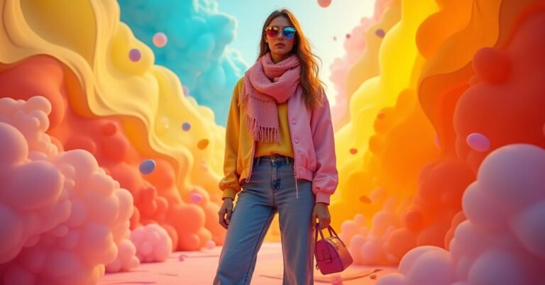
Fall Colors Palette for Fashion and Outfits
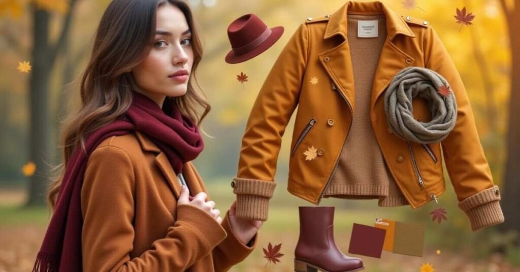
Autumn fashion allows you to play with deep and rich layers. You can mix heavy fabrics like wool and corduroy with the beautiful colors of the season. Many people choose to wear mustard yellows, burnt oranges, and olive greens during these cooler months. These shades reflect the changing leaves and help you blend perfectly with the autumn scenery.
Building a seasonal wardrobe becomes much easier when you stick to a cohesive palette. You can easily swap different pieces when your tops and bottoms share similar earthy tones. Adding a bright scarf or a bold pair of boots can make a simple outfit look very stylish. Consider adding these essential fall colors to your closet:
- Emerald Green: This jewel tone adds a touch of luxury to any sweater or coat.
- Rust Red: This warm shade works beautifully for trousers and knitwear.
- Camel Tan: A classic neutral that makes every outfit look more expensive and polished.
- Plum Purple: Use this deep color to add a bit of mystery and sophistication to your look.
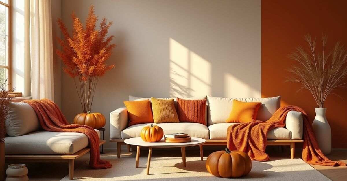
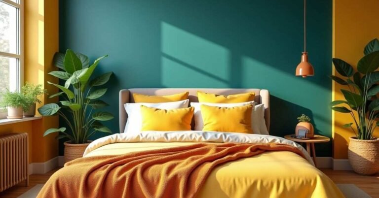
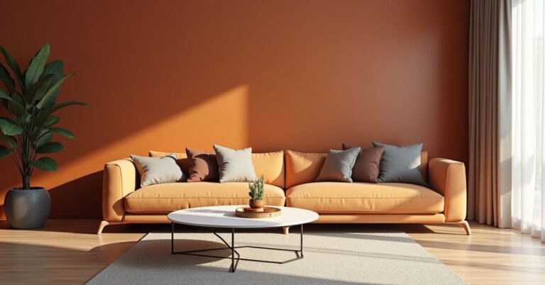
Fall Colors Palette for Home and Interior Design
Autumn colors transform a house into a warm and welcoming sanctuary. You can use deep clay tones and soft wood finishes to ground your living spaces. These hues work perfectly for accent walls, throw pillows, or cozy blankets. Adding these natural shades makes every room feel more connected to the world outside.
Interior designers often use a mix of textures to make these palettes stand out. You might pair a burnt orange velvet chair with a rough jute rug for a balanced look. This combination creates a rich sensory experience that feels both high-end and comfortable. Using fall colors in your home brings a sense of seasonal rhythm to your daily life.
Mistakes to Avoid in Fall Colors Palette
Many people make the mistake of using too many dark colors at once. If you only choose deep browns and heavy maroons, your design can look dull or gloomy. You need to balance these rich tones with lighter neutrals like cream or soft beige. This keeps your project feeling fresh and prevents the colors from clashing.
Another common error is ignoring the importance of lighting and contrast. Colors look very different under warm indoor bulbs compared to natural sunlight. Sometimes a palette looks great on a screen but feels overwhelming in a physical room. Avoiding these simple mistakes will help you create a much more professional and pleasing look:
- Overloading on Orange: Using too much bright orange can make a design look like a costume rather than a style.
- Forgetting Neutrals: A palette without white, gray, or tan often lacks a place for the eyes to rest.
- Ignoring Texture: Flat colors can look boring, so remember to mix in different materials or patterns.
- Strictly Seasonal Thinking: Do not feel limited to just red and yellow; adding a “cool” color like navy can actually make the fall tones pop.
Read More Information | https://digitalpinmedia.com/turquoise-green-color/
Soft vs Bold Fall Colors Palette
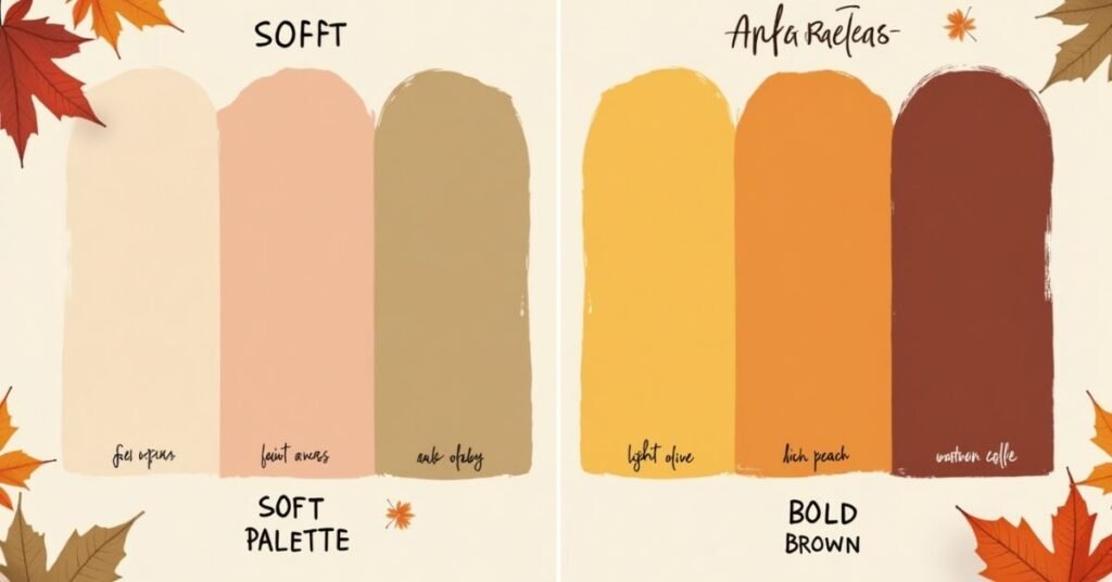
Soft fall palettes use gentle and muted tones to create a peaceful feeling. These colors often include dusty rose, sage green, and light tan. They remind people of a misty morning or dried flowers. You choose these shades when you want a design that feels calm and does not overwhelm the senses.
Bold fall palettes focus on high energy and deep saturation. These combinations feature vibrant colors like bright crimson, mustard yellow, and deep navy. They grab attention immediately and make a strong statement in any space. Use these powerful colors when you want to celebrate the most exciting parts of the autumn season.
| Feature | Soft Fall Palette | Bold Fall Palette |
| Main Feeling | Calm, Serene, Airy | Energetic, Strong, Dramatic |
| Common Colors | Mauve, Sage, Sand, Peach | Ruby, Gold, Charcoal, Burnt Orange |
| Best Use Case | Bedrooms, Minimalist Brands | Living Rooms, Marketing Ads |
| Light Style | Works well in bright, natural light | Stands out in dim or moody lighting |
| Texture Match | Linen, Silk, Light Wood | Velvet, Leather, Dark Metal |
| Visual Impact | Subtle and sophisticated | Eye-catching and vibrant |
| Pairing Style | Pairs with white and light gray | Pairs with black and dark brown |
| Atmosphere | Quiet autumn morning | Festive harvest celebration |
Best Fall Colors Palette for Branding and Design
Strong branding uses fall colors to build trust and warmth with an audience. You can choose deep forest greens or rich burgundies to make your business look established and professional. These shades work very well for logos, social media posts, and physical packaging. They help your brand feel grounded and reliable during the busy holiday shopping season.
Designers often mix these traditional autumn tones with clean white space to keep a modern look. This balance prevents your website or flyers from feeling too heavy or old-fashioned. You can use a bright pop of goldenrod yellow to highlight important buttons or calls to action. A thoughtful fall palette makes your brand feel both seasonal and timeless at the same time.
FAQs
Q1. What is a fall colors palette?
A fall colors palette includes warm and earthy shades like orange, red, brown, and mustard that reflect the autumn season.
Q2. Which colors work best in a fall colors palette?
You can use colors like burnt orange, deep red, golden yellow, olive green, and warm brown for the best results.
Q3. How do I choose the right fall colors palette?
You should match colors with your theme, mood, and purpose, like cozy tones for home or bold shades for design.
Q4. Can I use a fall colors palette for modern designs?
Yes, you can mix muted tones and soft neutrals to create a clean and modern autumn look.
Q5. Where can I use a fall colors palette?
You can use it in fashion, home decor, branding, graphic design, and seasonal projects.
Conclusion
Choosing the right fall colors makes any project feel more welcoming and complete. You can mix traditional tones with modern accents to find a look that fits your unique style. These palettes help you bring the beauty of the outdoors into your daily life and work. Using these shades is a simple way to celebrate the warmth and comfort of the season.
Do not be afraid to experiment with different combinations until you find what works for you. Whether you prefer bold reds or soft neutrals, the right colors will set the perfect mood. Remember that great design should always make you feel at home. Start playing with these autumn hues today to create something truly beautiful.

Welcome to Digital Pin Media! I’m Usama Ijaz, an AI-Powered SEO, and Content Write with 4 years of experience.
I help websites rank higher, grow traffic, and look amazing. My goal is to make SEO and web design simple and effective for everyone.
Let’s achieve more together!

One Comment